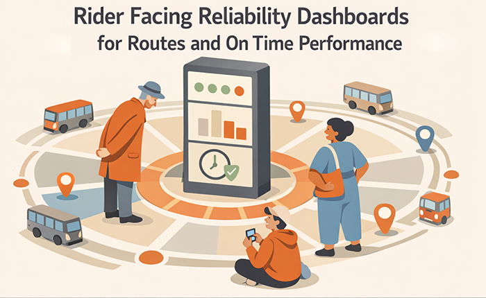
Rider Facing Reliability Dashboards for Routes and On Time Performance
Reliability is the core promise of public transit. Riders plan their lives around whether a bus or train will arrive when expected, whether transfers will work, and whether service will run consistently across the day. Many agencies measure reliability internally, but rider trust improves when reliability is also communicated in a way the public can understand and use.
A rider-facing reliability dashboard is not a technical performance report. It is a communication tool that turns operational metrics into decision support. Done well, it helps riders choose routes, adjust departure times, and set realistic expectations during known problem windows. It also helps agencies build credibility by showing transparent trends, acknowledging where performance is still weak, and explaining what is being done to improve it.
Dashboards can also reduce frustration and repeat contacts. When riders can verify what is happening and see reliable patterns, they are less likely to call customer service, less likely to assume the agency is hiding information, and more likely to trust service updates during disruptions. The key is that the dashboard must be simple, consistent, and tied to rider meaning rather than internal jargon.
This article provides an evergreen framework for building rider-facing reliability dashboards focused on route-level performance and on-time reliability. It covers metric selection, plain-language definitions, visual logic, update cadence, equity considerations, and the operational practices that keep a dashboard credible over time.
Why Most Reliability Dashboards Do Not Work for Riders
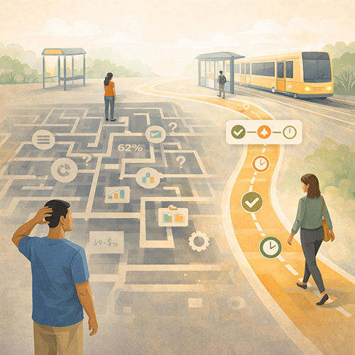 Many dashboards are built for analysts, not for riders. They are designed around internal metrics and reporting standards rather than everyday travel decisions. As a result, they include too many measures, too many charts, and too much jargon, often presented without explanation or hierarchy. Riders may not know what on-time performance means in practice, how headway measures differ from schedule adherence, or why a corridor can feel unreliable even when an average looks good. These concepts require context that dashboards rarely provide, such as what counts as “on time” or how gaps between vehicles affect waiting time. When riders cannot interpret what they are seeing, the dashboard becomes another layer of confusion rather than a tool that builds trust or supports better choices.
Dashboards also fail when they rely heavily on system-wide averages. Riders experience reliability at a local and personal level, shaped by specific routes, stops, and times of day. A system average can improve while a particular route remains unpredictable during the rider’s usual travel window. This disconnect makes the data feel abstract and disconnected from reality. Riders judge credibility based on their own trips, not on a global number that smooths over variation. If the dashboard does not reflect route-level conditions or acknowledge uneven performance across the network, riders are likely to dismiss it as irrelevant or misleading, even if the overall trend is positive.
Another failure is inconsistent updates. If a dashboard is updated irregularly, or if measures change frequently, riders cannot track progress. Inconsistency creates suspicion. Riders may assume data is being withheld when performance is poor. A predictable update rhythm is essential.
Dashboards also fail when they show results without explanation. Riders want to know what the numbers mean for their trip and what the agency is doing about problems. A dashboard that does not connect data to actions feels like a public relations artifact. A dashboard that includes plain-language meaning statements and action links feels accountable.
Finally, dashboards fail when they are not mobile-friendly. Many riders will check reliability information on a phone, often while traveling. If the dashboard is hard to use on mobile, it will not be adopted, and riders will return to informal sources.
From Detours to Understanding: Effective Communication Strategies for Transportation Agencies to Improve Safety and Drive Behavioral Change
This article is part of our series on strategic communication for Transportation Agencies, Transit Authorities, and Public Works departments. To learn more and to see the parent article, which links to other content just like this, click the button below.
Define a Rider-Facing Dashboard as Decision Support and Trust Support
A rider-facing dashboard should help riders make practical decisions. It should answer questions such as which routes are most reliable, when a route is least reliable, what to expect during peak periods, and how performance is trending over time. It should also help riders verify whether a bad day is an unusual incident or part of a recurring pattern.
Trust support means transparency and consistency. The dashboard should use stable definitions, publish on a predictable cadence, and clearly time-stamp every update. It should also avoid exaggeration. Riders are sensitive to overconfident language that does not match lived experience. A credible dashboard is honest about variability and acknowledges remaining challenges.
Decision support also includes route-level context. Riders should be able to find the route they use and see reliability patterns by direction and time of day. Where feasible, it should also show measures that reflect rider pain, such as long gaps, bunching, and missed trips. On-time performance alone is not enough for routes where frequency is more important than schedules.
Finally, a rider-facing dashboard should connect to what the agency is doing. A short “what we are doing” section linked to problem areas can strengthen trust and reduce cynicism. Riders may still be frustrated, but they are more likely to accept difficult conditions when they see clear accountability and a path to improvement.
Choose Rider-Relevant Reliability Measures and Keep Them Stable
Dashboard trust starts with measure selection. Riders do not benefit from every internal metric. They benefit from a small set of measures that map to lived experience and can be interpreted consistently over time. The goal is not to prove analytic sophistication. The goal is to make reliability understandable and comparable.
For many agencies, on-time performance is still a useful measure, especially for lower-frequency routes and rail service where schedules drive rider planning. However, on-time performance should be defined in plain language and paired with context. Riders need to know what counts as on time, how early and late thresholds work, and what time window is being reported.
For higher-frequency routes, headway-based reliability is often more meaningful than schedule adherence. Riders care about whether arrivals are evenly spaced and whether long gaps and bunching are occurring. Measures that capture long gaps, bunching frequency, and missed trips often reflect what riders feel most directly.
A practical rider-facing set might include on-time performance, long-gap share, missed trip rate, and a simple reliability rating for each route and time window. Agencies should avoid changing these measures frequently. Stability is a trust practice. If measures must change, changes should be explained clearly and applied consistently going forward.
Measure selection should also include accessibility-related reliability when relevant. If elevator uptime or station access affects the usability of a route, riders benefit from seeing that reliability element alongside vehicle performance, especially for key hubs.
Define “On Time” in Plain Language and Show It Consistently
On-time performance can be confusing because riders do not know how the agency defines it. A rider-facing dashboard should define it clearly, such as the window used to count a trip as on time. That definition should be visible and consistent across all reports.
The dashboard should also clarify whether early arrivals are counted. Early departures can be more harmful than late arrivals because riders miss the vehicle. Riders need to understand how the agency treats early performance, and the dashboard should communicate that clearly.
Consistency also includes time framing. If the dashboard reports monthly performance, it should always use the same monthly window and label it clearly. If it reports rolling averages, it should explain that method plainly.
Plain definitions reduce skepticism. Riders are more likely to trust a number when they can understand what it represents.
Add Headway Reliability Measures Where Frequency Matters More Than Schedules
On routes with frequent service, riders often do not plan by the schedule. They plan by expected waiting time. For these routes, headway reliability measures, such as even spacing, long gaps, and bunching, are more meaningful than on-time performance.
A rider-facing dashboard can use a simple long-gap threshold measure. For example, the share of service intervals that exceeded a defined threshold during a time window. The threshold should be explained in plain language and chosen to reflect real rider frustration.
Headway measures should also be presented by time of day and direction where possible. A route can be reliable in one direction and unreliable in another. Riders need that detail to make decisions.
Including headway measures improves credibility because it reflects what riders actually experience. It also reduces the common disconnect where on-time performance looks acceptable but riders still face long gaps.
Build a Dashboard Structure Riders Can Understand in Under One Minute
The structure of the dashboard matters as much as the data. Riders will not invest time deciphering complex visuals, especially on mobile. A rider-facing dashboard should be scannable, predictable, and oriented toward quick interpretation.
A practical structure begins with a route selector and a simple route summary. The summary should include a rider meaning statement, such as whether the route has been more reliable, stable, or less reliable recently. It should then show the key measures for that route, using consistent visual logic.
The dashboard should also show reliability by time of day. Morning peak, midday, evening peak, and late night often have different patterns. Riders need to know when reliability is weakest so they can plan buffer time or consider alternatives.
Trend visibility is also important. Riders want to see whether conditions are improving. A simple trend indicator over a consistent time window can help. The dashboard should avoid confusing charts and instead show clear movement over time.
The dashboard should also include a clear time stamp, a data freshness statement, and a verification path. Riders should know how current the data is and how often it updates. Predictability reduces suspicion and increases use.
Finally, the structure should include a short “what we are doing” section that connects problem areas to operational actions. This reinforces accountability and makes the dashboard feel less like a passive report.
Use Rider Meaning Statements to Interpret the Numbers
Numbers do not speak for themselves. A rider meaning statement should interpret what the measures mean for the rider’s experience. For example, whether riders should expect longer waits during certain windows, or whether spacing has become more consistent recently.
Meaning statements should be honest and bounded. They should avoid overpromising. Riders will compare the statement to their daily trips. A cautious, accurate statement builds more trust than a bold claim that riders cannot feel.
Meaning statements also reduce misinterpretation. Riders may misread a chart or assume a small change is large. A clear interpretation helps them focus on what matters.
Meaning statements should be consistent across routes. The same phrasing patterns should be used so riders learn how to read the dashboard quickly.
Make Time-of-Day and Direction Filters Simple and Visible
Time-of-day and direction matter. A route can perform differently inbound versus outbound. Reliability can also shift by peak and off-peak windows. Riders need to filter without digging through menus.
Filters should be visible and intuitive. They should not require multiple clicks. Clear labels help, such as “weekday morning” and “weekday evening,” rather than internal operational terms.
Filters also support transparency. If a route is unreliable in a specific window, the agency should show it rather than hiding it in averages. Riders trust dashboards that reveal variation.
Simple filters also support equity. Riders who travel off-peak, late night, or weekend hours often face higher unreliability. Showing these windows visibly prevents their experience from being erased.
Use Clear Visual Logic That Highlights Trends, Thresholds, and Variability
 A rider-facing dashboard should make the story obvious. Riders want to know whether reliability is improving, where it is weak, and how consistent the experience is. Visual logic should therefore emphasize trends, thresholds, and variability, rather than overwhelming riders with dense charts.
Trends show direction. If a route is improving, riders can build confidence that conditions may stabilize. If a route is worsening, riders can plan buffer time and may adjust their choices. The dashboard should show trends over a consistent time window, such as the last 4, 8, or 12 weeks, and it should use the same window across all routes.
Thresholds make reliability more tangible. Riders often experience unreliability as long gaps and missed trips, not as a percentage on a chart. A threshold view, such as the share of intervals that exceeded a long-gap threshold, communicates the worst experience riders are trying to avoid. Thresholds should be stable and explained in plain language.
Variability is the bridge between data and lived experience. A route can have acceptable averages while still producing severe outliers. Riders remember outliers. Dashboards should therefore include a simple variability view. This can be done through long-gap share, bunching indicators, or consistency ratings that reflect stability across a time window.
Visual clarity also depends on consistency. The same measures should appear in the same locations on each route page, and the same interpretation pattern should be used across the dashboard. Riders should not have to learn a new layout for each route.
Show Reliability in a Way That Matches Rider Planning Behavior
Riders plan differently depending on frequency. On a low-frequency route, on-time performance and schedule adherence matter because a missed trip can add significant delay. On a high-frequency corridor, spacing and long gaps matter more because riders are not planning by a specific scheduled time.
A dashboard can reflect this by presenting a small set of measures that adapt to route type while remaining consistent in structure. For example, all routes can show an overall reliability score and a trend. Lower-frequency routes can emphasize on-time performance and missed trips. Higher-frequency routes can emphasize long gaps and bunching.
This approach improves trust because riders feel that the dashboard reflects their experience. It also prevents confusion because riders do not have to interpret irrelevant measures.
The dashboard should also avoid presenting “perfect” numbers that are difficult to believe. If riders see a high on-time score but experience frequent gaps, they will assume the dashboard is meaningless. Including measures aligned to planning behavior prevents this disconnect.
Keep Explanations Short and Avoid Technical Chart Overload
A rider-facing dashboard should not require training. Each chart or indicator should have a short plain-language label and a brief explanation that can be understood quickly. Long paragraphs and complex annotations reduce usability.
Explanations should focus on what the rider should do with the information. For example, advising that a route is most reliable in a certain window, or that riders should expect longer waits at certain times. Explanations should avoid blaming riders and should avoid overstating certainty.
Chart overload is a common failure. A smaller set of well-chosen visuals is more effective than a comprehensive set of metrics. Riders will engage more when the dashboard feels like a tool they can use, not a report they must interpret.
This simplicity also supports multilingual access and accessibility. Short, structured explanations translate more reliably and are easier for assistive technologies to present.
Build Credibility With Transparency, Context, and Action Links
Riders trust dashboards when they believe the agency is being honest. Honesty includes showing weak performance where it exists, explaining context without using it as an excuse, and linking performance changes to specific actions. This combination makes the dashboard feel accountable rather than promotional.
Transparency starts with publishing the same measures for every route and time window, even when results are poor. If riders suspect selective reporting, the dashboard loses value. A consistent structure protects against that suspicion.
Context should be short and practical. It can acknowledge factors such as construction phases, major incidents, seasonal variation, or staffing impacts. However, context should not become a long justification. Riders want to know what to expect and what the agency is doing.
Action links are a strong trust builder. If a corridor has reliability problems, the dashboard can link to a short description of reliability initiatives, such as schedule adjustments, headway management practices, priority signal work, bus lane enforcement coordination, or staffing stabilization efforts. This shows that the agency is actively managing the issue.
Finally, credibility depends on predictable updates. Riders should know how often the dashboard updates and how fresh the data is. A clear time stamp and update schedule reduces confusion and prevents the dashboard from appearing abandoned.
Acknowledge Where Performance Is Not Improving Yet
Dashboards that only highlight improvement feel like marketing. Riders often know where service is weak. If the dashboard avoids those areas, riders will dismiss it. A credible dashboard names where performance remains challenging and describes what is being done next.
This acknowledgment should be calm and factual. It should avoid defensive language. It should also avoid overpromising. Riders prefer an honest statement that an issue is being addressed over a vague statement that everything is fine.
Acknowledging challenges also supports equity. Underperforming routes are often in areas where riders have fewer alternatives. Transparency about these routes is a fairness practice.
This approach also supports internal accountability because it ties public reporting to operational focus.
Connect the Dashboard to a “What We Are Doing” Reliability Program Page
A dashboard becomes more meaningful when it is connected to a clear explanation of improvement work. A reliability program page can describe the agency’s approach in plain language and provide updates on key initiatives.
The program page should be concise and grounded in rider outcomes. It can explain what the agency is doing to reduce long gaps, improve spacing, and reduce missed trips. It can also explain how the agency is monitoring progress and when riders can expect updates.
Linking the dashboard to this program page reduces cynicism. Riders see that numbers are connected to action. It also reduces repeat questions, because riders have a place to find the agency’s current focus.
The program page should also maintain the same time stamp discipline as the dashboard. Consistency across pages preserves trust.
Update Cadence, Data Freshness, and Source-of-Truth Governance
A reliable dashboard becomes untrusted when it feels stale. Riders will not rely on a dashboard if they cannot tell how current it is. Data freshness and update cadence are therefore core design choices, not technical afterthoughts.
A practical model defines the update cadence and communicates it clearly. Some measures may update daily, while others may be updated weekly or monthly depending on data pipelines and validation needs. Riders do not need every metric in real time. They need to know what is current, what is delayed, and when the next update will occur.
Time stamps should be visible on every route view. The dashboard should also include a short “data as of” statement and a clear description of the reporting window. This reduces confusion and prevents riders from interpreting the dashboard as a live service alert tool.
Governance is equally important. Agencies should define one owner for the dashboard and a clear workflow for updates, corrections, and definition changes. If a data issue is discovered, the agency should correct it transparently and maintain stable definitions. Hidden revisions reduce trust.
The dashboard should also align with other sources of truth. If the service alert system shows major disruptions, the dashboard should not contradict. The dashboard is not a real-time incident feed, but it should be consistent with known conditions and not create conflicting narratives.
Finally, governance should include a sunset approach for old views. If route structures change, the dashboard should explain how reporting will handle the change, and what historical comparability means. Riders want continuity. Clear explanation prevents confusion during network redesigns and service adjustments.
Publish a Clear Update Schedule and Keep It Predictable
Riders trust dashboards that update on a predictable schedule. The dashboard should state how often it updates, such as weekly route reliability updates and monthly trend summaries. The schedule should be realistic and consistently met.
Predictable schedules reduce speculation. When riders know updates arrive regularly, they are less likely to assume the agency is hiding poor performance or abandoning reporting.
A schedule also supports internal alignment. Staff can reference the same update cycle in public conversations, and customer service can route riders consistently.
If an update is delayed, the dashboard should state that plainly and provide the next expected update time. Transparency is better than silence.
Use Version Control for Definitions and Route Changes
Definition drift undermines trust. A dashboard should maintain stable definitions for on-time, long gaps, and missed trips. When definitions change, the dashboard should explain what changed and how it affects comparisons.
Route changes also require clear handling. If a route is split, consolidated, or renamed, riders need to know how the dashboard will reflect the new structure. The agency can maintain continuity by mapping historical data to new labels when feasible, or by clearly stating when a trend series begins.
Version control should be visible. A small “definitions updated” note with a date and a short explanation can prevent confusion and prevent accusations of moving the goalposts.
Version control also supports internal teams. Staff can answer questions consistently and avoid conflicting explanations.
Equity and Accessibility Considerations for Rider-Facing Dashboards
Reliability is not experienced equally. Riders who travel off-peak, late night, and weekends often face longer gaps and fewer alternatives. Riders in areas with fewer routes have higher stakes when a route is unreliable. A rider-facing dashboard should therefore make equity visible rather than hiding it in averages.
Equity begins with time-of-day and day-of-week views. Off-peak reliability and late-night reliability should not be buried. The dashboard should allow riders to see patterns by time window so they can plan realistically. When these views are visible, the agency signals that it recognizes the experience of riders with nontraditional schedules.
Accessibility also matters. Dashboards should be designed for mobile use and compatible with assistive technologies. Clear headings, plain text alternatives, and readable layouts improve usability. If the dashboard includes charts, it should also provide plain-language interpretations so the content is usable for riders who cannot interpret complex visuals easily.
Language access is part of accessibility. While a dashboard may not be translated fully at launch, key definitions and how-to guidance should be available in the languages commonly used by riders. Consistent terminology improves translation accuracy and reduces unequal comprehension.
Equity also includes transparency about underperforming corridors. Riders in higher-burden areas often already know service is weak. A dashboard that shows their routes honestly, and that links to improvement actions, can build more trust than silence.
Make Late-Night and Weekend Reliability Visible and Interpretable
Late-night riders often experience the greatest unreliability and the highest cost of missed trips. A dashboard should provide clear views for these time windows, not only weekday peaks.
These views should include measures that matter in low-frequency conditions, such as missed trips and on-time. They should also include plain-language guidance about what riders should expect and how to plan buffer time.
Making these windows visible is also a fairness practice. It signals that the agency is not focusing only on peak commuter experience.
Visibility also helps partners. Employers, institutions, and community organizations often need to understand off-peak reliability patterns. The dashboard can support these conversations with transparent data.
Ensure the Dashboard Is Usable on Mobile and Accessible to Assistive Tools
Most riders will access reliability information on a phone. A rider-facing dashboard must load quickly, use clear navigation, and allow route selection without excessive scrolling. If it is difficult to use on mobile, riders will abandon it.
Accessibility also requires clear structure. Text alternatives for key information should exist, and visual information should be accompanied by plain-language summaries. Color should not be the only indicator of performance status. Clear labels and simple wording improve usability for a wide range of riders.
These choices also improve trust. When the agency invests in usability, riders interpret the dashboard as designed for them, not as a technical report.
Accessibility improvements also reduce customer service burden. When riders can interpret dashboard information themselves, fewer riders call for clarification.
Promoting Long-Term Transportation Outcomes Through Communication
Rider-facing reliability dashboards strengthen transit outcomes when they function as decision support, not as internal reporting. Riders can plan more confidently when they can see route-level reliability patterns by time of day and direction, understand what the measures mean, and verify when data was last updated. Over time, this improves trust because riders experience the agency as transparent and consistent rather than vague or defensive.
Trust grows when dashboards reflect lived experience. On-time performance can matter for low-frequency routes, but headway reliability, long gaps, missed trips, and variability often matter more on high-frequency corridors. Dashboards that show these realities honestly, including weaker performance windows, are more credible than dashboards that rely on averages and optimistic framing.
Equity improves when dashboards make late-night, weekend, and off-peak performance visible and interpretable. Riders with nontraditional schedules often face the highest planning risk. A dashboard that includes their experience and provides practical guidance reduces unequal information gaps. Accessibility and mobile usability also matter. Riders are more likely to use the dashboard when it is easy to read, compatible with assistive tools, and written in plain language.
Operational outcomes improve as well. When riders can verify reliability trends and understand expected variability, they place fewer repeat contacts to customer service. When agencies connect dashboard results to clear improvement actions, they reduce cynicism and improve cooperation with service changes designed to improve reliability. Governance and predictable update cadence protect credibility and prevent the dashboard from becoming stale or contradictory.
Strategic Communication Support for Your Transportation Agency
 Transportation agencies often have strong internal reliability analytics, but turning those metrics into a rider-facing dashboard that people actually use requires more than data. Agencies must decide which measures translate to lived experience, define them in plain language, design visuals that work on mobile, and maintain a predictable update rhythm with visible time stamps and version cues. Without a cross-functional system, dashboards can become dense, inconsistent across channels, or stale. That can reduce trust rather than build it.
That is why people at transportation agencies often choose to partner with an external resource like Stegmeier Consulting Group (SCG) when building rider-facing reliability dashboards. An outside partner can help align data, content, and governance into one coherent public tool, including a stable metric set, rider-meaning statements, update cadence rules, and a clear link between performance trends and reliability improvement actions. This support helps agencies move faster while keeping definitions consistent across web, alerts, staff scripts, and public updates.
SCG supports transportation agencies by developing dashboard-ready message spines, plain-language definitions, and usability-first structures that riders can interpret quickly. That includes designing route-level views with time-of-day and direction filters, integrating equity-critical windows like late-night and weekend performance, and establishing review checklists and source-of-truth workflows that prevent drift as routes and definitions evolve. Over time, these practices reduce confusion, reduce repeat contacts, and strengthen credibility by making reliability reporting both transparent and usable.
Conclusion
Rider-facing reliability dashboards build trust when they are simple, consistent, and honest. Agencies can improve dashboard effectiveness by selecting rider-relevant measures, defining on-time and headway reliability in plain language, and presenting route-level views that show time-of-day and direction patterns clearly. Visual logic should emphasize trends, thresholds, and variability rather than dense charts. Credibility increases when the dashboard includes time stamps, stable definitions, transparent context, and links to what the agency is doing to improve reliability.
A dashboard is a living communication system. Update cadence, source-of-truth governance, and accessible mobile design determine whether riders will actually use it. When agencies publish reliability data in ways riders can interpret and act on, they strengthen planning confidence and rebuild long-term trust in the transit system.
SCG’s Strategic Approach to Communication Systems
Align your agency’s messaging, processes, and public engagement strategies
Agencies that communicate effectively build stronger trust with staff, stakeholders, and the public. Whether you are improving reliability dashboards, strengthening internal workflows, or aligning agency-wide messaging, SCG can help you develop a communication system that supports consistent decision-making and long-term organizational success. Use the form below to connect with our team and explore how a strategic communication framework can elevate your agency’s impact.