Route Reliability Dashboards Riders Actually Use: What to Publish and How to Explain It
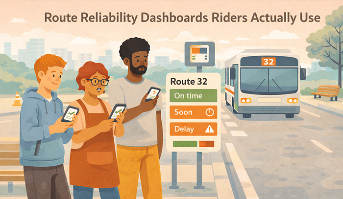
Transit agencies publish reliability data with good intentions, but many dashboards are not used by the people they are meant to serve. Riders want to know whether a route will show up, how long they might wait, and whether a transfer is likely to work today. If the dashboard feels technical, inconsistent, or hard to interpret on a phone, riders will abandon it and rely on informal sources instead.
A rider-used dashboard is not an analytics showcase. It is a decision-support tool that helps riders plan with reasonable confidence. It should translate reliability into simple, repeatable meaning. It should also build trust by being transparent about variability and by updating on a predictable rhythm.
This article provides an evergreen framework for route reliability dashboards that riders actually use. It focuses on what to publish, how to explain it without jargon, and how to structure the dashboard so it becomes a practical habit instead of a rarely visited page.
Why Riders Ignore Most Reliability Dashboards
 Most dashboards fail because they are built for internal performance review rather than rider decision-making. They tend to prioritize what agencies want to track instead of what riders actually need in the moment. As a result, they present numerous measures, multiple chart types, and dense terminology without clearly guiding riders toward what to do with the information. Even when the data is accurate, the presentation often lacks context or prioritization. Riders may understand that a number went up or down, but they are left unsure about its practical implications, such as whether they should leave earlier, choose a different route, or expect delays. Without clear cues or actionable insights, the dashboard becomes something to glance at rather than something to rely on.
Dashboards also lose credibility when the public experience does not match the story being told. A system-wide average can appear stable or even improving, while a specific route, stop, or time window remains consistently unreliable. This mismatch creates a gap between reported performance and lived experience. Riders who regularly encounter delays or inconsistencies begin to question the validity of the data itself, not just its presentation. Over time, they may assume the dashboard is selective, overly generalized, or simply irrelevant to their daily commute. Once that perception takes hold, trust erodes quickly, and it becomes difficult to regain riders’ attention or confidence, even if the underlying data improves.
Riders Need One-Minute Clarity, Not a Data Tour
Riders check reliability quickly, often while they are already traveling. A dashboard that requires exploration and interpretation will not become a habit. A rider-used dashboard should answer the core meaning fast, then offer deeper detail only if the rider chooses to explore.
One-minute clarity does not require oversimplification. It requires a consistent structure that leads with a plain-language summary and clear time framing. Riders can handle complexity when it is presented in layers. They will not tolerate complexity that blocks basic understanding.
Inconsistent Definitions and Irregular Updates Break Trust
A dashboard that changes definitions frequently, or updates unpredictably, signals instability. Riders interpret that as moving the goalposts or hiding weak performance. Even when the intent is benign, the effect is loss of confidence.
Consistency can be achieved with stable definitions, visible time stamps, and a published update schedule. Riders do not need perfection. They need to know what the number means, which period it represents, and when it will be refreshed next. That predictability is a trust feature.
From Detours to Understanding: Effective Communication Strategies for Transportation Agencies to Improve Safety and Drive Behavioral Change
This article is part of our series on strategic communication for Transportation Agencies, Transit Authorities, and Public Works departments. To learn more and to see the parent article, which links to other content just like this, click the button below.
Define Dashboard Success as Rider Use and Better Decisions
The most important dashboard outcome is usage tied to better rider decisions. A successful dashboard helps riders choose the right departure window, pick a more reliable route option, and understand where variability is most likely. When riders can plan more confidently, frustration declines even if service is still improving.
Success also includes credibility and reduced confusion. A rider-used dashboard reduces repeat contacts because riders can verify patterns and understand what the agency is measuring. It also creates a shared reference for staff and community partners, which improves consistency across public conversations.
Make the Dashboard a Planning Tool, Not a Scoreboard
A scoreboard mentality focuses on whether the agency is winning or losing. Riders are not looking for that. They are looking for how to plan a trip. A planning tool emphasizes what to expect and how to adapt, especially in time windows where reliability is weaker.
This framing changes what you publish and how you explain it. It prioritizes time-of-day patterns, threshold measures that reflect long gaps, and plain-language guidance about what riders should do in high-variability windows. It also discourages overly broad claims that riders cannot feel on the ground.
Build a Habit Through Predictable Layout and Predictable Rhythm
Riders will only return if the dashboard feels familiar and current. Familiar means the same route view structure every time, with the same labels and the same interpretation pattern. Current means a visible time stamp and a cadence that is met consistently.
Habit formation also depends on routing. Riders should encounter the dashboard through stable links in service alerts, route pages, and customer service responses. When the dashboard is treated as the reliable source of truth, more riders will learn to use it, and fewer will rely on screenshots and rumors.
What to Publish: A Small Set of Measures That Match Rider Experience
Rider-used dashboards publish fewer measures, but they publish them consistently. The goal is to reflect what riders feel and what riders need to plan. A small, stable set of measures is easier to interpret and easier to compare over time.
For lower-frequency routes and many rail services, on-time performance can remain meaningful because riders plan around scheduled times. However, it must be defined plainly and paired with context. Riders should know the on-time window, how early departures are treated, and the reporting period.
For frequent routes, schedule adherence is often less meaningful than spacing. Riders care about long gaps, bunching, and missed trips. Publishing headway-based reliability measures makes the dashboard feel real. It also prevents the common disconnect where on-time performance looks acceptable while riders still face unpredictable waits.
A practical core set for many agencies includes four items. On-time performance for schedule-based routes, long-gap share for frequent routes, missed trip rate for all routes where it is measurable, and a simple reliability trend indicator over a consistent window. The agency can add crowding reliability or transfer reliability later, but it should not launch with a dozen measures that dilute attention.
Measure stability is a trust practice. If definitions change, riders lose their ability to track progress. Changes should be rare, clearly explained, and implemented with version notes.
Publish On-Time Performance Only With a Clear Definition and Context
On-time performance should never be presented as a single number without explanation. The dashboard should state the exact on-time window and whether early departures count as on time. Early departures are a high-frustration failure mode because they cause missed trips, so they should be handled transparently.
Context should also explain when on-time performance is most relevant. On a high-frequency corridor, riders may not care about schedule adherence. On a low-frequency route, riders care deeply. A dashboard can reflect this by emphasizing on-time on low-frequency routes and emphasizing long-gap measures on high-frequency routes.
On-time performance should also be shown by time of day. A route can be reliable in the morning and unreliable in the evening. Riders need that detail to plan, and it increases credibility because it reflects lived experience.
Finally, on-time performance should be paired with a short meaning statement. Riders should understand whether the number suggests steady arrivals or frequent late trips during the time window they care about.
Publish Long-Gap and Bunching Measures Where They Matter Most
Long gaps are often the reliability failure riders remember. A long-gap share measure translates reliability into a question riders care about. How often did a wait exceed a painful threshold during this time window?
The threshold should be defined plainly and remain stable. The dashboard should explain why the threshold exists and how riders should interpret it. It should also show long-gap patterns by time of day and direction.
Bunching is another experience-based measure. Riders experience bunching as two vehicles arriving close together followed by a long gap. A simple bunching indicator can help explain why a route feels unpredictable, even when average frequency appears acceptable.
Publishing these measures increases trust because riders see metrics that match reality. It also helps riders plan. If long gaps are common in a certain window, riders may adjust departure time or choose a different route.
How to Explain It: Plain Language That Turns Metrics Into Meaning
Riders need interpretation, not only numbers. The dashboard should explain each measure in plain language and connect it to what riders should expect. This explanation should be short, consistent, and placed next to the measure.
A useful pattern is three lines. What the measure means. What the current result suggests for riders. What to do if the route is unreliable in the rider’s time window. This keeps explanations actionable and prevents it from sounding like public relations.
Explanations should also avoid internal jargon. Terms like “headway adherence” can be translated into “more evenly spaced arrivals.” “Run time variability” can be translated into “travel time is less predictable.” Riders can understand the concepts, but they need the translation.
Tone matters. Dashboards should sound factual and calm. They should avoid exaggerated claims. Riders will compare the dashboard to their experience, and the dashboard will lose credibility if the language feels promotional.
Finally, explanations should remain consistent across routes. A dashboard becomes usable when riders learn the pattern and can scan quickly.
Lead With “What This Means for Your Trip” on Every Route Page
Every route page should begin with a short summary that interprets the route’s current reliability. This summary should be time-stamped and tied to the reporting period. It should identify the route’s strongest and weakest time windows in plain language.
A route summary also helps riders decide whether to scroll deeper. Many riders only need the top meaning statement. They should not have to interpret charts to understand whether a route is more stable or less stable.
This summary should also avoid absolutes. Reliability varies day to day. A better approach is to describe patterns and trends, not guarantees. Riders will trust a cautious summary more than an overconfident claim.
A route summary can also include a routing suggestion. For example, pointing to a more reliable trunk corridor or suggesting buffer time during the weakest window. This turns the dashboard into a planning tool.
Use Consistent Threshold Language and Avoid Over-Precision
Over-precision can reduce trust. Riders do not need decimals and complex statistical explanations. They need clear categories and thresholds that communicate practical meaning.
For example, a dashboard can describe reliability as more stable, mixed, or less stable for a given time window, backed by the underlying measure. The measure should still be available, but the primary communication should be interpretive.
Threshold language should also be consistent. If “long gap” is defined as a specific threshold, that definition should not change casually. Consistency allows riders to build intuition over time and compare results across months.
Avoiding over-precision also improves accessibility and translation. Simple language and stable definitions are easier to communicate across languages and formats.
Structure the Dashboard for Mobile Use and Fast Scanning
Riders will not use a dashboard that is difficult to navigate on a phone. Mobile-first design is therefore a core requirement. The dashboard should load quickly, avoid dense tables, and present route information in scannable blocks with clear headings.
A practical structure starts with a simple route selector and a route summary panel. The summary panel should include the reporting period, the time stamp, and a short “what this means for your trip” statement. Below that, the dashboard should present time-of-day reliability in a simple format, such as a set of blocks for morning, midday, evening, and late night.
After the time-of-day view, the dashboard can provide a deeper section with the key measures and a trend view. Each measure should include a short definition and a plain-language interpretation. Riders should not have to click away to learn what a metric means.
The dashboard should also support quick comparison. Many riders want to compare two routes or compare two corridors. A simple compare function, even if limited, can increase usefulness. If a compare function is not feasible, the dashboard can provide a consistent layout for every route so riders can compare mentally.
Finally, the dashboard should include a clear link to service alerts. A reliability dashboard is not a real-time incident feed. Riders need to know where to check for today’s disruptions. Routing riders to alerts prevents misuse and reduces confusion.
Use a Route Summary Card With Three Essential Elements
The route summary card is the most important dashboard component. It should include three essentials. A clear time stamp and reporting period. A plain-language reliability summary. A simple pointer to the weakest time window and the strongest time window.
This card should also include the key rider action. If the route is least reliable during a certain window, the card can advise riders to allow buffer time or consider an alternative route. The advice should be practical and not judgmental.
Keeping the card short increases adoption. Riders who only read the summary still gain value. Riders who need detail can scroll.
The card also supports sharing. Riders will screenshot and share summaries. A clear time stamp and consistent wording reduce misinterpretation when content circulates.
Show Time-of-Day Patterns First, Then Show the Metric Detail
Time-of-day patterns are what riders can use immediately. Riders often do not need to see the full metric definition first. They want to know whether mornings are stable, whether evenings are unpredictable, and whether late-night service is fragile.
A time-of-day panel can present a simple reliability label for each window, backed by the underlying measure. The dashboard can then provide the metric details below for riders who want to understand why.
This sequencing reduces cognitive load. It also aligns with rider planning behavior. People choose when to leave and which route to take. Time-of-day information supports those decisions directly.
Time-of-day views also support equity. Riders with shift work and late-night travel need those patterns to be visible. Hiding those windows in a technical chart would erase their experience.
Build Trust With Transparency, Context, and Stable Definitions
 Riders use a dashboard when they believe it is honest. Honesty includes showing weak performance areas, explaining context briefly, and using stable definitions over time. If the dashboard only highlights improvement or avoids underperforming routes, riders will assume it is marketing and stop using it.
Transparency begins with consistency. Every route page should show the same measures and the same layout. Riders should not feel that certain routes are treated differently. When performance is poor, the dashboard should still show it, and the agency should interpret it calmly.
Context should be short and practical. If a major construction project affected travel time, the dashboard can note that. If a seasonal pattern is expected, the dashboard can state that. Context should not become an excuse. It should help riders interpret patterns without feeling misled.
Stable definitions are essential. If on-time performance is defined one way this month and another way next month, riders cannot track progress. If a long-gap threshold changes, riders lose intuition. Definition changes should be rare and clearly versioned.
Finally, trust improves when the dashboard connects to improvement actions. A short “what we are doing” link can explain reliability initiatives in plain language. This shows accountability and reduces cynicism.
Include a “How to Read This” Panel With Simple Definitions
Many riders will use the dashboard more if they can learn it quickly. A “how to read this” panel should provide simple definitions for the core measures, explain the reporting period, and clarify how often updates occur.
The panel should be brief and written in plain language. It should avoid technical terms. It should also be consistent across route pages so riders do not have to relearn it each time.
A “how to read this” panel also supports accessibility and translation. Short, structured definitions are easier to translate and easier for assistive tools to present.
This panel can also include a reminder that the dashboard is trend information, while real-time alerts are the source for today’s disruptions. That distinction reduces confusion.
Acknowledge Weak Windows and Explain What Is Being Done
A dashboard gains credibility when it names weak windows clearly. For example, if evenings have higher long-gap share, the dashboard can say that plainly and suggest how riders should plan. It can also link to what the agency is doing to improve evening stability, such as staffing adjustments or headway management efforts.
This acknowledgment should be factual and calm. It should not sound defensive. It should also avoid promising immediate improvement unless the agency can deliver.
Naming weak windows also supports equity. Late-night and weekend riders often have the least flexibility. A dashboard that treats those windows seriously signals fairness and inclusion.
Linking weak windows to improvement actions reduces cynicism. Riders may still be frustrated, but they are more likely to trust an agency that is transparent and accountable.
Make the Dashboard a Living Product With Governance and Update Discipline
A reliability dashboard will only be used if it stays current and consistent. That requires governance. Governance defines who owns the dashboard, how updates are published, how errors are corrected, and how definition changes are handled. Without governance, the dashboard becomes stale and riders stop trusting it.
Update discipline starts with a published cadence. Riders should know whether the dashboard updates weekly, monthly, or on another predictable schedule. The dashboard should show a clear “data as of” date and the reporting window for each route view. If an update is delayed, the dashboard should state that plainly and provide the next expected update.
Governance should also include correction protocols. Data systems are not perfect. If a data issue is discovered, the agency should correct it transparently, note the correction, and avoid silent revisions that create suspicion. Transparency in corrections builds trust because riders see that the agency is managing the product responsibly.
Definition governance is another core requirement. On-time performance thresholds, long-gap thresholds, and missed trip definitions should remain stable. If they must change, the dashboard should include a version note and explain how comparisons are affected. Riders need continuity to build intuition.
Finally, governance should coordinate dashboard messaging with other public channels. A dashboard is not a real-time alert feed, but it should not contradict the agency’s broader reliability story. When the agency publishes a reliability initiative update, the dashboard should reflect the same definitions and language so riders experience one coherent narrative.
Publish an Update Calendar and Treat Missed Updates as a Risk
An update calendar creates accountability and reduces speculation. It can be as simple as stating the day of week or day of month when new data is posted. The calendar should remain stable across seasons.
Missed updates should be treated as a trust risk. When a dashboard goes quiet, riders assume the agency stopped reporting because performance is poor. A short notice explaining a delay preserves credibility better than silence.
An update calendar also supports internal alignment. Staff and customer service teams can tell riders when new information will be available, which reduces repeated questions.
The calendar should be paired with visible time stamps. Riders should never have to guess whether a dashboard view is current.
Use Version Notes for Definition Changes and Route Restructures
Route changes happen. A route may be split, consolidated, renamed, or altered in a way that affects comparability. A rider-used dashboard should explain how the route change affects reporting.
Version notes should be brief and specific. They should state what changed and when the new series begins. If historical comparability is maintained through mapping, the dashboard should explain that simply. If comparability is not maintained, the dashboard should say so.
Definition changes should follow the same approach. The dashboard should state which definition changed, when it changed, and what it means for trends. This prevents accusations of moving the goalposts.
Version notes also help partners and media share information accurately. Clear version cues reduce misinterpretation and prevent outdated screenshots from being treated as current truth.
Integrate the Dashboard Into Rider Communication and Customer Service
A dashboard will not be used if riders do not know it exists or if it is hard to find. Adoption increases when the dashboard is integrated into the places riders already look, and when staff use it as the reliability reference in conversations.
Integration begins with route pages, trip planning tools, and service alert templates. Reliability dashboard links should be placed where riders are already seeking route information. Customer service scripts should route riders to the dashboard for trend understanding and to service alerts for real-time incidents.
Integration also includes public education. Riders need a brief explanation of what the dashboard is for. It is a trend tool that shows typical reliability patterns by route and time window. It is not a guarantee for a specific trip. This expectation setting prevents misuse and reduces frustration.
Customer service integration is especially valuable. Representatives can use the dashboard to provide consistent explanations, such as why a route feels unreliable in certain windows. They can also direct riders to the dashboard rather than repeating long explanations in every contact.
Integration also supports trust because it creates a shared reference. Riders, staff, and partners can point to the same source of truth when discussing reliability.
Use the Dashboard to Reduce Repeat Contacts and Clarify Expectations
Repeat contacts often occur because riders cannot get a consistent answer about reliability. A dashboard can help by providing clear time-of-day patterns and a stable explanation of what the agency measures.
Customer service scripts can include routing language that explains how to use the dashboard. For example, directing riders to the route summary card and the time-of-day panel. This helps riders find what they need quickly.
Routing also reduces conflict. When riders can see patterns, they are less likely to assume the agency is hiding information. They may still be frustrated, but they are more likely to accept verified trends.
The dashboard can also support closure. When a representative explains the next steps and routes a rider to the dashboard for ongoing monitoring, the rider feels more informed and less likely to contact again for the same issue.
Pair the Dashboard With a Reliability Improvement Story in Plain Language
Dashboards become more credible when they are paired with a simple explanation of what the agency is doing to improve reliability. This should not be a long strategy document. It should be a concise reliability program page linked from the dashboard.
The improvement story should focus on outcomes riders care about, such as fewer long gaps and more stable spacing. It should also describe actions in plain language, such as schedule adjustments, headway management, bus priority improvements, and staffing stabilization.
The page should also include update discipline. Riders should see when the agency last updated the improvement story and when the next update will occur. This reinforces the dashboard’s credibility and reduces cynicism.
Pairing the dashboard with an improvement story also supports partners and leadership. They can discuss reliability using consistent terms and shared references.
Promoting Long-Term Transportation Outcomes Through Communication
Route reliability dashboards build trust when riders actually use them to plan. Riders return to dashboards that provide one-minute clarity, stable definitions, and honest visibility into time-of-day variability. When the dashboard reflects lived experience, such as long gaps and missed trips on frequent routes and on-time performance on schedule-based routes, riders can make better decisions and feel less exposed to surprise.
Trust improves when dashboards are consistent and current. Clear time stamps, a published update cadence, and visible reporting windows reduce suspicion and prevent outdated sharing. Transparency about weak windows, paired with calm interpretation and practical planning guidance, increases credibility. Riders can accept difficult reliability conditions more readily when the agency is honest and provides usable next steps.
Equity improves when dashboards make off-peak, late-night, and weekend reliability visible. Riders with nontraditional schedules often face the highest planning risk and have fewer alternatives. A dashboard that shows these windows clearly, uses plain language, and is mobile-accessible reduces unequal information gaps. Accessibility-friendly design and concise explanations also improve usability for a wider range of riders.
Operational outcomes improve as well. Dashboards that riders can interpret reduce repeat contacts and reduce rumor cycles. Customer service and field staff can use the dashboard as a shared reference, which improves consistency in public conversations. When dashboards link reliability patterns to improvement actions, they reduce cynicism and improve public cooperation with changes designed to strengthen reliability.
Strategic Communication Support for Your Transportation Agency
 Route reliability dashboards often stall because agencies try to solve a communications problem with a data product. Riders need one-minute clarity, stable definitions, and time-of-day meaning that matches how they plan trips. Agencies also need update discipline, governance, and cross-channel alignment so route pages, service alerts, customer service scripts, and partner communications all point to the same interpretation and the same reporting windows.
That is why teams at transportation agencies often bring in an external partner like Stegmeier Consulting Group (SCG) to help dashboards become rider-used tools instead of rarely visited pages. An outside partner can help define a publishable metric set, create plain-language explanations and route summary cards, establish version control for thresholds and definitions, and build an update rhythm that holds up over time. This makes the dashboard easier to adopt, easier to maintain, and easier to trust.
SCG supports transportation agencies by designing dashboard-ready message spines, rider-meaning language, and governance workflows that keep reporting consistent as service patterns change. That includes mobile-first route layouts, time-of-day and direction framing, “how to read this” panels, and reliability improvement story links that connect the numbers to what the agency is doing. Over time, these practices reduce confusion, reduce repeat contacts, and strengthen public confidence in reliability reporting.
Conclusion
Rider-used reliability dashboards are planning tools, not data tours. Agencies can increase adoption by publishing a small, stable set of rider-relevant measures, defining them in plain language, and presenting route-level time-of-day patterns first. Dashboards should emphasize trends, thresholds, and variability rather than dense charts. Credibility grows when weak windows are acknowledged calmly, updates are predictable, and definitions remain stable through version control.
Governance and integration matter. A clear update calendar, correction transparency, and coordination with service alerts prevent confusion. Routing the dashboard through route pages and customer service scripts builds habit and reduces repeat contacts. When reliability reporting is built for rider decision-making, it becomes a practical trust tool that improves daily planning confidence.
SCG’s Strategic Approach to Communication Systems
Align your agency’s messaging, processes, and public engagement strategies
Agencies that communicate effectively build stronger trust with staff, stakeholders, and the public. Whether you are improving reliability dashboards, strengthening internal workflows, or aligning agency-wide messaging, SCG can help you develop a communication system that supports consistent decision-making and long-term organizational success.
Use the form below to connect with our team and explore how a strategic communication framework can elevate your agency’s impact.