
How Financial Regulatory Agencies Should Organize Their Websites Around Consumer Needs
Financial regulatory agency websites are typically organized the way government agencies organize themselves: by division, bureau, program area, and statutory function. The navigation reflects the agency’s internal chart, the content reflects what each unit considers important to communicate about its own work, and the homepage features what the agency most wants the public to know about rather than what the public most needs to find. This internal orientation produces websites that work well for regulatory professionals who know what they are looking for and understand how the agency is structured. It does not work well for consumers who arrive at the site with a specific need and who do not know, and should not need to know, how the agency has organized its internal functions.
A consumer who visits a state insurance department website because they have a dispute with their insurer should be able to find the complaint process without knowing whether the department handles complaints through a Consumer Affairs Division, an Office of Consumer Services, or a Market Conduct Section. A borrower who visits a financial regulatory agency website because they believe their lender charged improper fees should be able to find the complaint option without navigating through licensing, market regulation, and examination information that is not relevant to their immediate need. A consumer who wants to verify that a financial company is licensed should be able to perform that verification from the agency’s home page without knowing whether the licensing function is administered by the Licensing Bureau, the Division of Financial Institutions, or the Market Entry Section.
Organizing a financial regulatory agency website around consumer needs means making the most fundamental organizational decision differently: instead of organizing the site around what the agency does internally, organize it around what consumers are most likely to come to the site to accomplish. This is an inversion of the natural institutional instinct, because institutions understand themselves better than they understand their customers, and because internal audiences who use the website regularly tend to have more influence on its design than the consumers who use it infrequently and who do not have standing to advocate for their own needs. The inversion requires deliberate effort, specific research into consumer behaviors and tasks, and sustained commitment to maintaining a consumer-centered organization even as internal pressures to prioritize institutional communication reassert themselves over time.
This article addresses how financial regulatory agencies can organize their websites around consumer needs, covering the research methods that reveal what consumers need from the site, the navigation structures that serve consumer tasks, the content design that makes information findable and usable, the search functionality that serves consumers who cannot navigate to what they need, and the ongoing practices that keep a consumer-centered website aligned with consumer needs as those needs and the agency’s services evolve.
Understanding What Consumers Need From the Agency Website
 Designing a consumer-centered website begins with understanding what consumers actually need when they visit the site. That understanding cannot be assumed from the agency’s view of its own services. Consumers may use the site for purposes the agency did not anticipate, may search for information in language the agency does not use to describe its services, and may have urgent needs that are satisfied by a fraction of the site’s content but frustrated by navigation that requires them to encounter a much larger fraction before finding what they are looking for.
Consumer task analysis identifies the specific things consumers most commonly come to the website to do. This analysis can be conducted through several methods: reviewing the search terms that lead consumers to the site through search engines, analyzing the internal site search queries that consumers conduct once they arrive at the site, reviewing the phone and email inquiries that agency staff receive to identify questions that the website should be answering but is not, observing consumers interacting with the site in usability testing sessions, and surveying consumers who have used the site about what they were trying to accomplish and whether they succeeded. Each of these methods reveals a different dimension of consumer task patterns, and using multiple methods produces a more complete and more reliable picture of what consumers need the site to do.
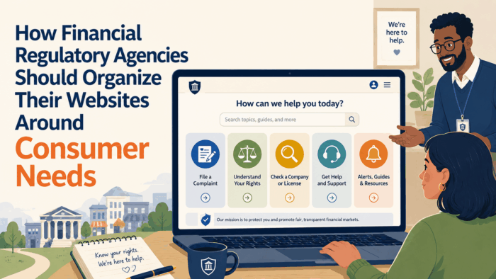
The top consumer tasks for most financial regulatory agency websites converge on a relatively small number of high-frequency needs: file a complaint, check whether a company or professional is licensed, find consumer education about a specific financial product or right, report a suspected fraud or scam, find contact information for the agency, and understand what the agency can and cannot do for a consumer in a specific situation. These top tasks should receive disproportionate prominence in the site’s navigation and home page, because they are what the majority of consumers who visit the site are trying to accomplish. Content and navigation optimized for the top tasks serves most visitors well even when it gives less prominence to the full range of the agency’s work.
Consumer task analysis also reveals the gaps between what consumers expect to find on the site and what actually exists there. A consumer who searches for how to appeal a claim denial and finds only general consumer education about insurance rights, but no specific guidance about the claims appeal process, has an unmet need that the site should address. A consumer who searches for how to report a scam and reaches a complaint form that is designed for disputes with regulated companies but not for reporting fraud schemes that may not involve regulated entities, has been sent to the wrong resource. Identifying these gaps and addressing them systematically is part of consumer-centered site organization.
Protecting the Public Interest: Communication Strategies for Financial Regulation, Insurance, and Consumer Protection Agencies
This article is part of our series on strategic communication for Financial Regulatory Agencies, State Insurance Departments, and Consumer Protection Agencies. To learn more and to see the parent article, which links to other content just like this, click the button below.
Home Page Organization Around Consumer Tasks
The home page is the most visible expression of the agency’s choice about how to organize its website, and it is the first impression that most consumers have of whether the site is designed to serve them or to serve the agency. A home page that prominently features the agency’s press releases, its leadership bios, and its enforcement announcements may be responsive to media and oversight audiences, but it does not prioritize the consumers who visit the site with urgent needs. A home page that prominently features the three to five most common consumer tasks, with a clear path to fulfilling each, communicates immediately to consumers that the site is designed for them.
Consumer task features on the home page should use consumer language rather than regulatory terminology. File a Complaint is clear to a consumer. Consumer Complaint Intake Portal is not. Find a Licensed Company is clear. License Verification System is not. Check if an Agent is Licensed is clear. License Database Query is not. Every label that requires the consumer to decode regulatory terminology before understanding what it means is a navigation friction point that reduces the probability the consumer will click through to the resource they need. Consumer language on the home page is not dumbing down; it is accurate communication to the actual audience.
A consumer help section on the home page, prominently placed and clearly labeled, that provides quick access to the most frequently needed consumer resources, serves consumers who are not sure where to start. This section should include links to complaint filing, license verification, consumer education on major product types, fraud reporting, and contact information, with brief descriptions of each that tell the consumer what they will find if they click rather than requiring them to guess from a label alone. A consumer help section that is immediately visible and immediately useful on the home page signals clearly that consumer service is a primary purpose of the site.
Visual hierarchy on the home page should reflect task priority rather than institutional priority. The complaint filing option should be more visually prominent than the agency’s annual report. The consumer education resources should be more prominent than the regulatory research library. The license verification tool should be more prominent than the list of recent regulatory actions. Institutional content, including news, publications, and regulatory history, has a legitimate place on the site but should not compete visually with the consumer task features that serve the majority of visitors’ immediate needs.
Mobile-first design for the home page acknowledges that a significant proportion of consumers, particularly those from lower-income households and communities with limited broadband access, are most likely to visit the site from a smartphone rather than a desktop computer. A home page that is designed primarily for desktop viewing and that requires significant scrolling or pinch-zooming on a mobile device is not accessible to this population. Designing the home page for mobile viewing first, ensuring that consumer task features are immediately visible without scrolling on a typical smartphone screen, and then extending the design to work well on larger screens, produces better mobile accessibility than the reverse approach of designing for desktop and then adapting for mobile.
Navigation Structure Organized Around Consumer Experience
The primary navigation of a financial regulatory agency website should reflect the topics and tasks that consumers most commonly encounter rather than the agency’s organizational structure. A navigation that includes Consumer Help, File a Complaint, Check a License, and Learn About Your Rights as primary categories tells consumers immediately how to find what they need. A navigation that includes the Commissioner’s Office, Market Regulation Division, Consumer Affairs Bureau, and Legislative Affairs requires consumers to know which internal unit handles which consumers need before they can navigate to the right section.
Topic-based navigation, organized around the financial products and services that consumers use rather than around the regulatory functions the agency performs, is more intuitive for consumer audiences. A navigation organized around insurance, mortgages and loans, investments and retirement, consumer rights, and fraud and scams maps to how consumers think about their financial lives rather than how the regulatory agency organizes its work. Each of these topic areas contains the consumer education, complaint filing, license verification, and other resources relevant to that specific financial domain, so consumers can navigate to the domain most relevant to their situation and find everything they need within it.
Breadcrumb navigation that shows consumers where they are in the site’s structure at every page helps consumers who have navigated deep into the site reorient themselves and navigate back to a higher level when they discover they are in the wrong section. A consumer who followed a search result to a page about insurance licensing requirements and who realizes they are looking for information about their rights as a policyholder should be able to navigate back to the insurance topic area easily without returning to the home page. Breadcrumbs make the site’s structure transparent and navigable for consumers who have not arrived at the site through the home page and who may need to reorient.
A site map that presents the full content of the site in a structured, accessible format serves consumers who prefer to browse the site’s full content to find what they need, and it helps search engines index the full site content to improve the organic search visibility that brings consumers to the site from external searches. The site map should be organized by consumer task and topic rather than by internal organizational unit, reflecting the same consumer-centered organization as the primary navigation.
Designing Consumer-Facing Content for Findability and Usability
The most important consumer-facing content on a financial regulatory agency website is content that helps consumers take specific actions: file a complaint, understand their rights, verify a license, report fraud, or access specific consumer assistance. This action-oriented content requires a specific design approach that prioritizes the information needed to take the action, presents that information in the order the consumer needs it, and provides all the specific details necessary to complete the action without requiring the consumer to navigate elsewhere for additional information.
Action page design should lead with the action itself, not with explanatory preamble. A complaint filing page that begins with three paragraphs explaining the regulatory history of consumer complaints, the agency’s mission, and the types of situations that may warrant complaints is a page that delays the action the consumer came to take. That same page beginning with the complaint submission form or a clear link to it, followed by brief explanatory content about what to expect, serves the consumer who is ready to file a complaint immediately without requiring the consumer who needs more information to navigate elsewhere to find the contextual material.
Consumer rights pages that describe specific rights in plain language, organized around the situations consumers are most likely to face, with specific examples that make abstract rights concrete, serve the consumers who need to understand their rights in the context of a specific dispute or financial decision. Rights content that is organized around the structure of the underlying law, uses regulatory terminology, or requires consumers to read large amounts of context before reaching the specific right relevant to their situation, is rights content designed for regulatory specialists rather than for the consumers who need it most.
License verification tools that allow consumers to check whether a company or professional is licensed in real time, with immediate display of the license status, license expiration date, and any disciplinary history, provide the consumer with the specific information they need to make an informed decision about whether to do business with the entity they are checking. A license verification system that returns a technical database record with dozens of fields, many of which are meaningless to a non-specialist consumer, provides less consumer value than one that returns a simple license status summary with the most important information prominently displayed.
Search functionality that understands consumer language and returns results relevant to the consumer’s intent, rather than results based only on literal keyword matching, is essential for a site where the gap between consumer vocabulary and regulatory terminology is significant. A consumer who searches for what to do if my insurance claim is denied should find consumer rights information and complaint filing options, not pages about market conduct examination procedures or unfair claims practices regulations. Investing in search configuration that bridges the vocabulary gap between consumer language and regulatory language produces significantly better consumer outcomes than a generic search function.
Consumer Education Content Organization
Consumer education content is among the most visited and most valuable content on financial regulatory agency websites, and its organization significantly affects whether consumers can find and use it effectively. A consumer education library that is organized by regulatory topic area rather than by consumer situation is less accessible than one organized by the questions consumers actually have about their financial products and relationships. A consumer education section that contains dozens of publications without an effective filtering or search mechanism asks consumers to browse through content that may be largely irrelevant to their specific situation before finding the specific guidance they need.
Organizing consumer education content around life stages and financial decisions, such as buying a home, purchasing insurance, choosing a financial advisor, and managing debt, places content in contexts that consumers recognize as relevant to their own situations. A consumer who is thinking about purchasing homeowners insurance will navigate to insurance buying resources more readily than to an insurance consumer guide that does not signal its relevance to the specific decision the consumer is making. Life-stage and decision-based organization creates pathways through the consumer education content that match how consumers approach their financial lives rather than how the agency categorizes its own work.
Featured content on the consumer education landing page should highlight the topics most relevant to current consumer protection priorities. When a specific type of fraud is active in the community, consumer education about that fraud type should be prominently featured. When a major regulatory change affects consumers, the consumer education about that change should be easy to find. Dynamic featuring of timely content, updated regularly to reflect current consumer protection priorities, makes the consumer education section a living resource rather than a static library.
Readability of consumer education content should be assessed and maintained at a level appropriate for a general audience. Financial regulatory agencies tend to produce content at reading levels much higher than the populations they serve can comfortably read. Annual readability review of core consumer education content, with rewriting of content that exceeds the target reading level, is a quality maintenance practice that keeps consumer education accessible over time as content is updated and expanded.
Search Engine Optimization for Consumer Queries
The organic search visibility of financial regulatory agency websites determines how easily consumers who search for help with financial problems find the agency as a resource. A consumer who searches for how to complain about my insurance company and who finds the agency’s complaint page in the first few results is a consumer who has been served by the agency’s search visibility investment. A consumer who searches for the same thing and who reaches a private lawyer’s website, a complaint aggregation service, or another resource before finding the agency’s page is a consumer who may receive information of varying quality and who may not find the agency’s regulatory services at all.
Search engine optimization for consumer-facing regulatory websites requires the same consumer language focus that effective navigation and content design requires. Pages that use consumer language in their titles, headings, and content will appear in searches conducted in consumer language. Pages that use regulatory terminology will appear in searches conducted in regulatory terminology. Since consumers search in their own language rather than in regulatory language, consumer language pages will be found by consumer searchers while regulatory language pages will not. This alignment between page language and consumer search language is the most important single factor in organic search visibility for consumer-facing regulatory content.
Local search visibility is particularly important for state regulatory agencies whose jurisdiction is geographically defined. Consumers searching for help with a financial problem will often include their state in the search query, or they will search from a geographic location that search engines can identify. Optimizing state regulatory agency pages to appear prominently in searches from within the state, including the state name prominently in page titles and metadata, and ensuring that the agency’s presence in local search directories is current and complete, improves the probability that state residents find the state agency’s services rather than federal or private alternatives.
Monitoring search visibility through regular review of the agency’s ranking in consumer-relevant search queries reveals both strengths and gaps in the site’s organic search performance. Queries where the agency ranks well should be identified and the practices that support those rankings should be maintained. Queries where the agency ranks poorly despite offering highly relevant resources should be investigated to identify the content and technical factors that are limiting visibility, and those factors should be addressed through targeted content improvement and technical optimization.
Accessibility and Mobile Optimization
Digital accessibility for consumers with disabilities is a legal requirement for government agency websites under Section 508 of the Rehabilitation Act and comparable state laws, and it is an equity obligation that the agency owes to all consumers who need its services. Common accessibility failures on financial regulatory agency websites include images without alternative text that screen readers can announce, forms that cannot be completed by keyboard navigation alone, video content without captions, color coding that conveys information without a non-color alternative, and PDF documents that are not structured for screen reader accessibility. Regular automated and manual accessibility testing identifies these failures before they are reported as complaints.
Mobile optimization is not just a technical standard but a consumer equity issue. Consumers from lower-income households, younger consumers, and consumers in rural areas with limited broadband infrastructure are significantly more likely to access the internet primarily through smartphones rather than desktop computers. A website that is not effectively accessible and usable on a smartphone is a website that is less accessible to exactly the populations that are most likely to face financial protection challenges. Prioritizing mobile optimization as a core accessibility investment, not a secondary refinement for an already-functional desktop site, reflects an equity commitment that matches the agency’s consumer protection mission.
Load speed is an accessibility dimension that disproportionately affects consumers with older devices or slower internet connections. A website that loads quickly for consumers with fast broadband and modern devices may be frustratingly slow or even non-functional for consumers with slower connections or older smartphones. Optimizing page load speed through image compression, efficient code, and content delivery network use ensures that the site is usable for the full range of consumers who need its services, not just those with premium technology access.
Ongoing Consumer-Centered Site Maintenance
 A website that is organized around consumer needs when it is launched will drift back toward institutional organization over time if it is not actively maintained with consumer needs as a guiding principle. As staff turn over, as internal pressures to add institutional content increase, as new content is added without consistent consumer-centered design guidance, and as the site’s original consumer-centered architecture is supplemented with content that follows different organizational logic, the consumer experience degrades gradually and often invisibly from the perspective of staff who know the site well and do not experience it as a first-time visitor.
Regular usability testing with consumers who have never used the site before, conducted annually or semi-annually, identifies the usability regressions that gradual site drift produces. A consumer who is asked to perform a specific task on the site and who encounters difficulty finding or completing it is providing evidence of a usability failure that the agency’s staff would not notice because they already know where to look. These usability tests are relatively low-cost and high-value investments in maintaining the consumer experience that the site was designed to provide.
Content audits that review all consumer-facing content annually for accuracy, readability, and relevance identify content that has become outdated, that requires revision, or that no longer serves a consumer need and should be removed. Outdated content that describes processes that have changed, contact information that is no longer current, or regulatory rights that have been modified, is worse than no content because it actively misleads consumers who rely on it. Content audits produce the inventory of improvement needs that allows the agency to prioritize and execute the ongoing content improvements that maintain site quality over time.
Analytics review that tracks how consumers navigate the site, where they exit without finding what they need, and which pages have high bounce rates, provides ongoing evidence of the consumer experience that complements periodic usability testing. A page with high bounce rates may indicate that consumers arrive expecting to find something they do not find, that the content is not accessible or usable, or that the navigation leading to the page is misleading consumers who need something different. Analytics data does not explain what is causing the problem but it identifies where problems are occurring and allows the agency to prioritize usability investigation where consumer experience is most compromised.
Contact Information and Agency Accessibility
Contact information is among the most urgently needed content on a financial regulatory agency website, and it is frequently among the most poorly organized. A consumer who needs to speak with someone at the agency should be able to find the relevant phone number, email address, or mailing address from any page on the site within two clicks or less. A contact page that lists every unit of the agency with its own phone number and email, without guidance about which contact is appropriate for which consumer need, is a contact page that creates confusion rather than resolving it.
A consumer-centered contact page organizes contact options by consumer need rather than by internal unit. Consumers who want to file a complaint are directed to one contact. Consumers who want to check on an existing complaint are directed to a different contact or the same contact with different instructions. Consumers who want to verify a license, report a suspected scam, or ask a general consumer question are each directed to the appropriate resource for their specific need. This task-based contact organization matches how consumers experience their need to contact the agency with the specific information they need to do so effectively.
After-hours contact options are important for consumers who experience urgent situations outside business hours, such as a disaster loss that requires emergency claims guidance, or a fraud situation that is unfolding in real time. An agency website that provides only a phone number that operates during business hours serves consumers who are in crisis at 9 p.m. with no assistance. Providing after-hours information, including emergency contact options where they exist, referral to state emergency services where appropriate, and guidance on what steps the consumer can take independently until the agency is available, serves the consumer’s immediate need while being honest about the limits of after-hours agency availability.
Physical location information, including the agency’s office address, public transportation directions, parking information, and ADA accessibility information, serves consumers who need or prefer to interact with the agency in person. For consumers who do not have reliable internet access, who are dealing with complex situations that are better handled in person, or who are from communities where in-person government interaction is the trusted norm, knowing that they can visit the agency in person and understanding how to get there is important access information that the website should provide prominently.
Multiple contact channel options, including phone, email, online form, postal mail, and in-person, serve the full range of consumers with different communication preferences and different levels of access to specific channels. A consumer who does not have a reliable email address needs a phone option. A consumer who is hard of hearing needs a TTY option or a text-based alternative. A consumer without internet access needs an option that does not require digital submission. Providing genuinely functional options across multiple channels, rather than nominally listing alternatives that are actually much less functional than the primary digital channel, demonstrates commitment to equitable access.
Regulatory Transparency and Public Information on the Website
Consumer-centered website organization does not mean that non-consumer content has no place on the site. Regulated entities, researchers, advocates, journalists, and members of the public who are interested in the agency’s regulatory activities have legitimate information needs that the website should also serve. The challenge is organizing the site so that consumer content and regulatory information content are both accessible without one obscuring or interfering with the other.
A regulatory information section, clearly labeled and distinct from the consumer services sections, can contain the enforcement records, regulatory guidance, examination information, rulemaking notices, and licensing data that non-consumer audiences need, without requiring those audiences to navigate through consumer-oriented content to find it and without cluttering the consumer-oriented sections with content that most consumers do not need. This organizational separation serves both audiences by giving each clear navigation pathways to the content most relevant to them.
Enforcement records that are publicly available should be organized to serve both consumer and regulatory audiences. Consumers who want to know whether a specific company has been the subject of enforcement action should be able to search by company name and receive a clear, plain-language summary of any enforcement history. Regulated entities and their legal counsel who want detailed enforcement records should be able to access the full legal record. Organizing enforcement records to serve both audiences may require different views of the same underlying data: a consumer-facing view that provides a plain-language summary and a regulatory-facing view that provides the full record.
Annual reports and performance data published on the website provide public accountability information that both consumer advocates and oversight bodies value. These documents should be published in formats that are accessible and easily searchable, not only in large PDF files that are difficult to navigate. Key data from annual reports, including consumer complaint volumes, enforcement action counts, and recovery amounts, should also be available in a structured data format that allows advocates and researchers to work with the data without having to extract it manually from PDF documents.
Integrating Consumer Tools and Self-Service Functionality
The most effective consumer-centered websites go beyond information provision to offer interactive tools that allow consumers to take specific protective actions directly on the site without requiring staff assistance. License verification databases that provide real-time license status, complaint submission portals that guide consumers through the complaint process step by step, fraud reporting tools that allow consumers to report suspected fraud with the information the agency needs to investigate it, and consumer rights guides that adapt to the specific product type and situation the consumer describes, are all interactive tools that extend the agency’s consumer service capacity beyond what information pages alone can provide.
License verification tools should return results that are immediately understandable to a non-specialist consumer. A consumer who searches for a specific insurance agent by name should receive a result that clearly states whether the agent is currently licensed, when the license expires, what lines of insurance the agent is authorized to sell, and whether any complaints or disciplinary actions have been filed against the agent. This information, presented clearly with the most critical status information prominent, gives the consumer everything they need to make an informed decision about whether to do business with the agent.
Complaint submission portals that guide consumers through the submission process, explaining what information is needed at each step and why, are more effective than standalone complaint forms that ask for the same information without context. A guided portal that begins by asking the consumer what type of company they are complaining about, then tailors subsequent questions to that company type, then explains what the agency will do with the complaint and what the consumer can expect, converts the complaint submission from an opaque form-filling exercise into a comprehensible process that consumers can complete with confidence.
Consumer calculators and comparison tools that help consumers evaluate financial products before purchasing them, such as a tool that helps consumers calculate the effective cost of different insurance options or compare the total cost of different loan products, provide pre-transaction consumer protection value that complaint tools cannot. A consumer who uses a comparison tool to identify that one loan product is significantly more expensive than another over the life of the loan has received consumer protection before they are harmed rather than after. These tools require development investment but produce ongoing consumer protection value at scale.
Chatbot and virtual assistant tools that can answer common consumer questions, guide consumers to the appropriate section of the site for their specific need, and help consumers begin the complaint submission process, extend the site’s interactive capability beyond static tools to provide a responsive, personalized consumer service experience. The quality of these tools depends entirely on the quality of the information they are programmed to provide; a chatbot that gives incorrect information about consumer rights or complaint processes is worse than no chatbot at all, because it creates consumer harm through misinformation rather than merely failing to provide assistance.
Analytics-Driven Consumer Experience Improvement
Website analytics provide continuous data about how consumers are actually using the site, which sections they visit, how long they spend on each page, where they click, and where they abandon their session without completing the task they came to the site to accomplish. This data is the most objective source of information about whether the site is working for consumers, because it reflects consumer behavior rather than consumer preferences expressed in a survey or usability test. Analytics-driven improvement uses this behavioral data to identify where the site is failing consumers and to prioritize the specific changes that will produce the most consumer benefit.
Session analysis that examines the pathways consumers follow through the site can identify navigation failures that are invisible in aggregate page view data. A consumer who visits the home page, navigates to a section labeled Regulatory Actions, cannot find the complaint option there, returns to the home page, navigates to a different section, and eventually exits without finding the complaint portal has left a trace in the session data that identifies a navigation failure. Aggregate data about which pages are most visited does not reveal this failure; session analysis is needed to identify the pattern.
Exit rate analysis for key consumer pages reveals where consumers are abandoning their sessions without completing the action they came to the site to accomplish. High exit rates from the complaint submission page before submission is complete may indicate that the form is too long, too confusing, or has technical problems that prevent completion. High exit rates from the consumer rights page may indicate that the content is not answering the specific question the consumer had when they arrived. Exit rate analysis, combined with the context of what page led the consumer to the exit point, identifies the specific content and design problems that are driving the abandonment.
A/B testing of alternative page designs, navigation labels, and content formats allows the agency to make evidence-based decisions about which design choices better serve consumers rather than relying on internal preference or assumption. Showing half of the site’s visitors an alternative home page layout and comparing complaint filing rates between the two versions, or testing two different navigation labels for the complaint section and measuring which label results in more successful navigation to complaint filing, converts website design decisions from judgment calls into data-driven choices. A/B testing infrastructure is more complex than basic analytics, but it produces the strongest evidence of which design choices produce better consumer outcomes.
Coordinating the Website With the Agency’s Broader Communication
The agency website does not exist as a standalone communication platform. It is the hub of a broader communication ecosystem that includes social media, email, partner networks, media relations, and direct consumer assistance. A consumer who encounters the agency through social media, through a partner organization referral, or through a media story about an enforcement action, is likely to visit the website to learn more or to take action. The website must be coordinated with these other communication channels to provide a consistent, complete experience for consumers who encounter the agency through multiple touchpoints.
Social media links from agency posts should lead to landing pages that are specifically designed to receive visitors from social media rather than to generic section pages of the site. A social media post about an enforcement action against a specific company should link to a page that tells consumers who may have been affected by the company’s conduct what they should do, not to the enforcement database home page where consumers must search for the specific action. This campaign-specific landing page design, which coordinates the social media communication with the website destination, ensures that consumers who follow the link from social media find what the social media post implies they would find.
Email communications that direct consumers to the website should link to the specific page most relevant to the email’s content rather than to the home page. A consumer who receives an email about a new fraud scheme targeting insurance policyholders and who clicks through should arrive at a page that describes the specific scheme, the warning signs, and the complaint filing option, not the home page where they must navigate to find the relevant information. Deep linking from email to specific, relevant pages on the site reduces the navigation burden on consumers who follow email links and increases the probability that they reach and act on the relevant content.
Partner organization referrals to the website should be supported by landing pages designed specifically for the referral context. A social worker who refers a client to the agency’s website should be able to provide the client with a specific URL that leads to a page addressing the specific type of situation the client is facing, not the generic home page. Creating and maintaining specific referral landing pages for the most common partner organization referral situations, and providing partner organizations with those specific URLs, makes the website a more effective destination for referrals and ensures that consumers who are referred arrive at a page that immediately addresses their specific situation.
Building Institutional Support for Consumer-Centered Website Maintenance
A consumer-centered website organization requires ongoing institutional support to maintain itself against the pressures that naturally pull websites back toward institutional organization over time. Each time a new program is launched and needs to be communicated about on the website, a choice is made about where it fits in the existing consumer-centered architecture and whether it receives a consumer-appropriate label and placement or is given a label and placement that reflects the program’s internal designation. Each time content is added by a staff member who is more familiar with the agency’s internal structure than with the consumer experience, the consumer-centered architecture is at risk of being diluted. Building institutional support for maintaining consumer-centeredness requires making the case for it repeatedly and providing the guidance that allows staff to make consumer-centered choices even when consumer-centered choices are not their first instinct.
A website style guide that establishes the agency’s standards for consumer-centered language, navigation labeling, content structure, and page design gives staff who add content to the website the guidance they need to make consumer-centered choices consistently. The style guide should include positive examples of consumer-centered language and navigation alongside negative examples of regulatory language and internal-structure navigation, with explanation of why the consumer-centered approach is preferable. Staff who understand why the standards exist are more likely to apply them correctly in novel situations than those who have only the standards without the rationale.
A designated website coordinator or editorial team with authority over consumer-facing content organization and language, who can review new content additions before publication and advise content creators on how to make their content consumer-centered, maintains the quality of the consumer experience across the full site rather than only in sections managed by communication specialists. This editorial function does not require rejecting content; it provides specific, constructive guidance that helps subject matter experts present their content in ways that serve consumer audiences without compromising the substantive accuracy that subject matter experts care about.
Leadership communication about the importance of consumer-centered website organization, reflecting a genuine commitment from agency leadership to the principle that the website exists primarily to serve consumers, is the institutional signal that makes consumer-centered organization a sustained organizational priority rather than a one-time project. When leadership asks about website accessibility, consumer experience, and the findability of consumer resources alongside questions about page views and regulatory content, they communicate that consumer experience is a performance dimension that the agency takes seriously. That leadership signal is what sustains the institutional commitment to consumer-centered website organization over time.
Strategic Communication Support for Financial and Insurance Regulators
 A financial and insurance regulatory website should help consumers solve problems, answer questions, and find appropriate assistance without requiring them to understand how the agency itself is organized. When websites are structured around internal departments, program names, or regulatory terminology, consumers may struggle to determine where their question belongs or which resource applies to their situation. Reorganizing the experience around consumer needs can make the same agency information significantly easier to find, understand, and use.
A consumer-centered website combines user research, task-based navigation, plain-language content, intuitive information architecture, accessible design, clear calls to action, and ongoing content governance. Consumers may arrive with questions about filing a complaint, verifying a license, understanding insurance coverage, reporting suspected fraud, or finding financial assistance. Organizing content around these real-world questions helps visitors move from a problem to the information, tool, or service that can address it without requiring them to navigate the agency’s internal structure.
Developing this type of communication system requires specialized expertise in user research, content strategy, information architecture, plain-language communication, accessibility, digital communication, and website evaluation. Many financial and insurance regulators choose to partner with external communication specialists such as Stegmeier Consulting Group (SCG) because these capabilities complement the agency’s regulatory expertise while providing the strategic communication and user-centered perspective needed to turn complex agency information into a digital experience consumers can navigate independently.
Working alongside financial and insurance regulatory agencies, SCG helps agencies assess and improve the consumer experience across their websites. Support may include conducting user and content research, identifying navigation barriers, developing task-based information architectures, reorganizing content around consumer questions, improving plain-language explanations, strengthening calls to action, reviewing accessibility and usability, and establishing measurement frameworks that track whether consumers can successfully find and use the information and services they need.
A consumer-centered website also requires ongoing management after the initial redesign. Regulatory requirements, programs, contacts, forms, deadlines, and consumer concerns change over time, and outdated or poorly maintained content can gradually undermine an otherwise effective website. SCG helps agencies establish content governance, ownership structures, review schedules, and performance monitoring practices that keep the website accurate, useful, and aligned with evolving consumer needs.
The objective is to create a digital communication environment where consumers can arrive with a question or problem and quickly identify the information, service, or next step that applies to them. By organizing the website around consumer tasks rather than agency structure, financial and insurance regulators can strengthen self-service, reduce avoidable confusion, improve access to regulatory resources, and make their most visible public communication channel more effective.
Future Trends in Consumer-Centered Regulatory Websites
Personalization technology that allows websites to present content relevant to the specific user based on their location, prior interactions with the site, or explicit preferences is becoming more accessible to government agencies and will play an increasing role in consumer-centered website design. A consumer who visits the site for the third time this month while navigating an ongoing insurance dispute might receive a different home page emphasis than a first-time visitor who is exploring consumer rights resources. This personalization can reduce the navigation burden on returning consumers while maintaining the welcoming, orientation-appropriate experience for new visitors.
Voice search optimization is an emerging requirement for websites that serve populations who are more comfortable searching by voice than by typing. Consumers who use smart speakers or voice search on their smartphones to ask how to file a complaint against my insurance company or whether my financial advisor is licensed expect to receive useful, specific answers to voice queries. Optimizing the agency’s content to appear in voice search results requires structuring answers to common consumer questions in the concise, direct formats that voice search engines prefer.
Conclusion
A consumer-centered regulatory website does not require agencies to create an entirely separate information system. It requires them to rethink how existing information is organized and presented from the perspective of the person trying to use it. A consumer should not need to understand which division oversees a particular issue, know the agency’s terminology, or determine which internal department owns a service before finding help. The website should do that work for them by organizing information around the questions, decisions, and actions that matter to consumers.
The benefits extend beyond a better online experience. When consumers can find answers and complete basic tasks independently, agencies can reduce unnecessary inquiries, make services available beyond staff operating hours, and provide a more consistent experience across the populations they serve. A website designed around consumer needs therefore becomes more than a digital information repository. It becomes an accessible extension of the agency’s consumer protection function and a practical demonstration that the agency has designed its public services around the people who rely on them.
Stegmeier Consulting Group’s Strategic Approach to Communication Systems
Align your website with the consumers it is designed to serve.
Financial regulatory agency websites need consumer task-centered navigation, home pages that prioritize what consumers most need to find, content organized around consumer experience rather than regulatory structure, multilingual accessibility, and ongoing maintenance practices that sustain consumer-centeredness over time. SCG helps agencies assess their current site, design consumer-centered improvements, and implement the practices that keep websites working for consumers year after year.
Use the form below to connect with our team and explore how a consumer-centered website redesign can make your agency’s services more accessible and more effective for the consumers who need them.