Task-Based Website Design for Revenue and Tax Administration Agencies: Organizing Around Taxpayer Questions, Not Agency Divisions
There is a reliable way to identify whether a government website was organized for the people who built it or the people who use it. Visit the homepage and look at the navigation. If the top-level categories correspond to the agency’s internal divisions, its statutory functions, or the tax types it administers in the sequence they appear in the tax code, the site was organized for the agency. If the top-level categories correspond to the tasks a taxpayer needs to accomplish, the questions they most commonly ask, and the situations they typically face when they interact with the agency, the site was organized for the taxpayer. The difference between these two organizational philosophies is not cosmetic. It determines whether a taxpayer who arrives at the website with a specific need can find what they are looking for quickly, or whether they must first learn the agency’s internal structure before they can navigate to the information or service they came for.
State and local revenue and tax administration agencies build websites that are, in the vast majority of cases, organized around the agency rather than the taxpayer. Individual income tax has its own section. Business taxes have their own section. Each tax type, sales tax, property tax, excise tax, withholding tax, may have its own navigation category, its own forms library, its own set of instructions. The agency’s payment options may be in one section, its filing options in another, its account services in a third. A taxpayer who arrives with a straightforward question, such as how to file their first sales tax return, may have to navigate through multiple levels of a taxonomy that reflects how the agency administers taxes rather than how the taxpayer thinks about their obligation.
The cost of this organizational mismatch is measured in failed website sessions, avoidable phone calls, and taxpayer confusion that precedes non-compliance. A taxpayer who cannot find the information they need on the agency’s website does not simply move on. They call the agency, they search for the information through unofficial sources that may be inaccurate, or they give up on completing the task that brought them to the site. Each of these outcomes represents a cost that better website organization could have prevented.
This article examines how state and local revenue and tax administration agencies can reorganize their websites around taxpayer tasks and questions rather than agency divisions and tax type inventories. It explores the research, design, and content decisions that make task-based website organization effective, and it addresses the organizational and cultural challenges that make this kind of redesign more difficult than it might appear.
Why Tax Agency Websites Default to Internal Organization
 Understanding why tax agency websites default to internal organization is necessary context for understanding why changing that organization is genuinely difficult. When a revenue agency builds or redesigns its website, the people responsible for the content are typically agency staff members who know the tax system well and who think about tax administration in the categories the agency uses internally. They know that individual income tax and business income tax are different tax types administered under different statutes. They know that sales tax has its own compliance cycle, its own forms, and its own audit process. They know that the payment options for one tax type may differ from those for another. From their perspective, organizing the website by tax type is logical because tax type is the organizing principle of everything they do.
The taxpayer’s perspective is different. A small business owner who has just hired their first employee does not arrive at the revenue agency website thinking about withholding tax as a distinct tax type they need to learn about. They arrive thinking about the practical question of what they now need to do with respect to their employee’s pay and the government. The answer to that question spans several tax types and may involve registration, withholding calculation, filing, and payment obligations that exist across different parts of the agency’s internal structure. A website organized by tax type requires the taxpayer to already know the answer before they can find the guidance they came looking for.
The other factor driving internal organization is the website development process itself. Agency websites are often built incrementally, with different sections developed by different teams at different times, each section reflecting the priorities and vocabulary of the team responsible for it. Over time, the website accumulates content that is internally consistent within each section but inconsistent across sections, with navigation that reflects the accumulation of individual team decisions rather than a unified taxpayer-facing architecture. Reorganizing that accumulated structure into a task-based design requires both a design vision and an organizational process for revisiting decisions that were made under different assumptions.
The Vocabulary Problem in Tax Agency Navigation
One of the most immediate symptoms of internally organized tax websites is navigation language that uses agency vocabulary rather than taxpayer vocabulary. A navigation label that says Taxpayer Services means something inside the agency because there is a Taxpayer Services division. To a taxpayer who does not know the agency’s organizational structure, it could mean almost anything. A label that says Compliance and Enforcement tells a taxpayer that the agency has a compliance function but does not tell them whether this section contains information they need for a routine filing, a response to a notice, or an appeal. A label that says IFTA, for International Fuel Tax Agreement, is meaningful to commercial carriers who already know what IFTA stands for and meaningless to everyone else.
Navigation vocabulary should be chosen based on what taxpayers say and search for, not on what the agency calls things internally. If taxpayers who have just opened a business consistently search for how to register my business for taxes rather than business tax registration, the navigation label and page title should reflect the taxpayer’s language. If taxpayers who receive a balance due notice consistently search for what to do if I owe taxes rather than balance due account resolution, the guidance page should be findable under the language the taxpayer uses. This alignment between navigation vocabulary and taxpayer search behavior is one of the most direct ways to improve website findability without changing any of the substantive content.
Clearer Taxpayer Communication: Strategies for State and Local Assessors, Treasurers, Revenue Departments, and Finance Offices
This article is part of our series on strategic communication for State and Local Assessors, Treasurers, Revenue Departments, and Finance Offices. Clear, timely, and accessible taxpayer communication helps government agencies improve compliance, reduce confusion, strengthen public trust, and enhance the citizen experience. To learn more and to see the parent article, which links to additional resources and best practices for taxpayer outreach and engagement, click the button below.
Researching What Taxpayers Actually Need From the Website
Task-based website organization cannot be designed from the inside. It requires information about what taxpayers actually come to the website to do, what questions they arrive with, what language they use to describe their situations, and where the current website fails to help them find what they need. Agencies that skip this research step and design a task-based architecture based on internal assumptions about what taxpayers need are likely to produce a website that is organized around a different version of the agency’s perspective rather than a genuine taxpayer perspective.
The most direct source of information about taxpayer website needs is call center data. When taxpayers call the agency because they could not find something on the website, or when they call with questions that the website should be able to answer, those calls represent a direct record of website failure. Agencies that track the topics of incoming calls, the specific questions taxpayers ask, and the information they were looking for when they called have a rich dataset for identifying the highest-priority gaps in their website’s task coverage. If a large volume of calls asks how to make a payment online, the website’s payment guidance is not doing its job. If calls frequently ask what forms are needed for a specific business registration, the forms and registration guidance may be in a section taxpayers cannot find.
Search analytics from the website itself provide another valuable data source. The search terms taxpayers enter into the agency’s website search function are direct evidence of what they were looking for and could not find through navigation. A search term that appears frequently in the site search log represents a navigation failure, a case where the taxpayer expected to find something through the menu structure but had to fall back to search instead. Analyzing the most common search terms gives agencies a prioritized list of the tasks and questions their navigation is failing to surface prominently enough.
Usability research with actual taxpayers, including structured testing sessions where taxpayers attempt to complete specific tasks on the current website, provides the most direct evidence of where navigation fails. Watching a taxpayer attempt to find the page for filing a quarterly sales tax return, or trying to locate the form for updating their business address, reveals failure points that are invisible to agency staff who know exactly where those things are. Even a small number of usability sessions with representative taxpayers can surface the most significant navigation problems and provide the basis for a reorganization that addresses real barriers rather than assumed ones.
Identifying the Core Task Set for Revenue Website Organization
The foundation of a task-based website architecture is a defined set of core taxpayer tasks that the website should support. This task set is not the full inventory of everything the agency does. It is the set of tasks that a significant portion of the taxpayer population needs to complete through the website, that are currently difficult to find or complete, and that represent the highest value for improvement in terms of reduced call volume, increased digital service use, and improved taxpayer experience.
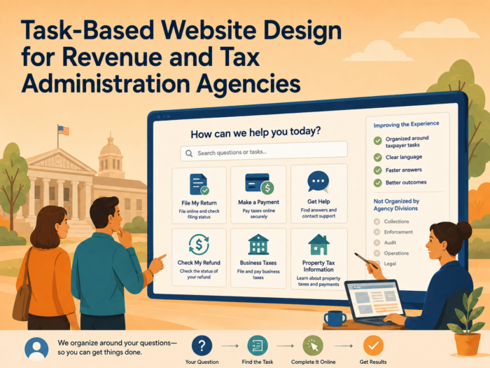
For most state and local revenue agencies, the core task set includes some version of the following: registering a new business for tax purposes, filing a return for a specific tax type, making a payment, checking account status or balance, responding to a notice, setting up a payment plan, updating contact or registration information, finding forms and instructions for a specific tax type, understanding what tax obligations apply to a specific business situation, and accessing help when a task cannot be completed independently. Each of these tasks should have a clear, findable entry point on the agency’s website that uses the language the taxpayer would use to describe the task, not the language the agency uses internally.
Designing Navigation Around Questions, Not Categories
One of the most effective shifts in tax agency website design is moving from category-based navigation to question-based navigation for the most common taxpayer entry points. Category-based navigation organizes the website around what the agency has, which is a collection of tax types, forms, publications, services, and programs. Question-based navigation organizes the website around what the taxpayer is trying to find out, which is typically some version of what do I need to do, how do I do it, and what happens if I do not.
A question-based navigation approach for a revenue agency website might use top-level categories such as Starting a Business, Filing Returns, Making Payments, Managing Your Account, Responding to a Notice, and Getting Help. Within each of those categories, the content is organized around the specific situations taxpayers face within that broader task area. Starting a Business might include guidance on registering for each relevant tax type, understanding which taxes apply to different business types, setting up withholding for employees, and understanding the filing and payment calendar for new businesses. This organization lets a taxpayer who is starting a business navigate to a section specifically designed for their situation rather than having to reconstruct their obligations from separate sections covering each tax type.
The shift to question-based navigation does not eliminate the need for tax-type-specific content. It reorganizes access to that content around the taxpayer’s entry point rather than the agency’s organizational structure. A taxpayer who knows they need to file a sales tax return can still navigate to the sales tax section directly. But a taxpayer who does not yet know which tax types apply to their situation, or who is trying to understand all of their obligations at once, has a path that serves their question rather than requiring them to visit multiple separate sections to assemble a complete picture.
The Role of Search in a Task-Based Website
A task-based navigation structure significantly reduces the burden on website search because it gives taxpayers a clear navigation path to the most common tasks. But search remains an important component of the website experience for taxpayers whose needs fall outside the core task set or who prefer to search rather than navigate. The design of the search experience should be aligned with the same task-based and plain-language principles that govern the navigation structure.
Search results on a revenue agency website should prioritize the pages that are most likely to answer the taxpayer’s actual question, not the pages that contain the most keyword matches in the technical SEO sense. A search for how to pay my taxes should return the payment options page prominently, not a list of every page on the site that mentions the word pay. A search for what happens if I file late should return the penalty and interest information page, not the filing instructions for every tax type. Tuning the search experience to deliver task-relevant results requires ongoing attention to actual search queries and their outcomes, but it significantly improves the website’s utility for taxpayers who cannot find what they need through navigation.
Agencies should also consider the role of a prominent, well-designed help or frequently asked questions section that is organized around the questions taxpayers most commonly ask rather than around topics the agency considers important. A frequently asked questions section that reflects actual taxpayer questions, including the questions that generate the most calls, the most search queries, and the most website support requests, can serve as an alternative navigation path for taxpayers who phrase their needs as questions rather than tasks. The content of this section should be drawn directly from the call center data and search analytics that identify what taxpayers are actually asking, not from an internal assessment of what the agency thinks taxpayers should know.
Content Strategy for Task-Based Revenue Websites
 Navigation structure alone does not make a tax agency website useful. The content within each section of a task-based website must also be organized and written in ways that serve the taxpayer’s need to understand and act, rather than the agency’s need to document and explain. A website section that is correctly labeled around a taxpayer task but filled with dense legal text, unordered lists of forms, and explanations organized around statutory authority rather than taxpayer experience has improved the navigation without improving the communication.
Content for each major taxpayer task should be organized around a clear action sequence: what the taxpayer needs to understand before they begin, what information or materials they need to have available, the specific steps to complete the task, what confirmation or outcome to expect, and what to do if they encounter a problem or have a question. This sequence mirrors the taxpayer’s actual experience of completing the task and gives them the information they need at each point in the process rather than requiring them to read through background context before finding the practical guidance they came for.
Forms and instructions should be integrated into the relevant task sections rather than maintained as a separate forms library that taxpayers must navigate to independently. A taxpayer who arrives at the quarterly sales tax filing section should find the relevant form, the filing instructions, the due date, the payment options, and the link to the online filing system all within that section. A taxpayer who has to navigate to a separate forms page, search for the correct form number, download the form, then navigate back to the filing section for instructions is experiencing unnecessary friction that a better-organized content structure would eliminate.
Writing Tax Guidance in Plain Language for a General Audience
The language of tax guidance on agency websites is one of the most persistent barriers to taxpayer self-service. Agencies that have reorganized their navigation around taxpayer tasks but maintained their existing content in statutory language, technical terminology, and passive-voice constructions have addressed the structural problem without addressing the communication problem. A taxpayer who can find the right page quickly but cannot understand the guidance on that page has not been well served by the website redesign.
Plain-language tax guidance on a revenue website means writing in the second person, addressing the taxpayer directly as you rather than describing taxpayers in the abstract third person. It means using active voice constructions that tell the taxpayer what to do rather than describing what the agency requires. It means replacing statutory terms with plain-language equivalents wherever that substitution does not change the meaning, and explaining statutory terms in plain language when they must be used. It means organizing guidance around the sequence of actions the taxpayer takes rather than the legal framework under which those actions are required.
Plain language also means calibrating the level of detail to the taxpayer’s actual needs at each stage of the process. A taxpayer who needs to know how to make a payment does not need a full explanation of the penalty and interest structure before they reach the payment instructions. That information can be available for taxpayers who need it, but it should not be the required reading before the primary task guidance. Organizing content so that the most essential guidance is immediately accessible, with supporting detail available but not mandatory, serves a broader range of taxpayers than content that presents every relevant detail in a single undifferentiated block.
Mobile and Accessibility Considerations in Tax Website Design
A tax agency website organized around taxpayer tasks must also be accessible to taxpayers using a wide range of devices and with a wide range of accessibility needs. A task-based navigation structure that works well on a desktop browser may collapse or become unusable on a smartphone screen if the navigation is not designed for mobile. A plain-language guidance page that serves sighted taxpayers may be confusing for a taxpayer using a screen reader if the page structure does not include proper heading hierarchy, descriptive link text, and appropriate alt text for any images or diagrams.
Mobile design for tax agency websites is increasingly important as the share of taxpayers accessing government services through smartphones continues to grow. This is especially true for taxpayers who rely on smartphones as their primary or only internet-capable device, a population that tends to have lower incomes and less access to desktop computing resources. A website that is nominally accessible on mobile but requires extensive scrolling, small-target navigation, and pinch-and-zoom reading of dense text is not genuinely mobile-accessible. Task-based content that is designed with mobile reading in mind, with short paragraphs, clear headings, prominent action links, and forms that work on touch screens, serves the full range of the taxpayer population more equitably than content designed for desktop use.
Accessibility for taxpayers with disabilities requires attention to both the technical standards governing government web accessibility and the practical experience of taxpayers who use assistive technology. Compliance with technical standards is necessary but not sufficient. A page that passes automated accessibility checks may still be difficult to navigate for a taxpayer using a screen reader if the page’s content structure does not follow a logical sequence, if the form labels are not properly associated with their inputs, or if the interactive elements do not respond predictably to keyboard navigation. Including taxpayers with disabilities in usability research is one of the most reliable ways to identify accessibility problems that automated testing does not catch.
Maintaining a Task-Based Website Over Time
A tax agency website redesigned around taxpayer tasks will drift back toward internal organization if the processes that govern content development and maintenance are not also redesigned. When new content is added by different teams without a shared organizational framework, when pages are updated by subject matter experts who prioritize technical accuracy over task-based organization, or when navigation changes are made reactively to accommodate new programs without reference to the overall architecture, the task-based structure erodes over time.
Maintaining a task-based website requires governance structures that embed the task-based and plain-language principles into the content development and approval process for all new and updated content. This means that every new page, every revised form instruction, and every new program description should be reviewed against the question of where it fits in the taxpayer task architecture before it is published. It means that subject matter experts who provide content should work with communicators who can translate that content into taxpayer-facing language before it goes live. And it means that the website architecture should be reviewed periodically against current call center data, search analytics, and usability research to identify where the task-based organization has drifted or where new taxpayer needs have emerged that are not yet well served.
A content maintenance calendar that schedules regular reviews of high-traffic task pages helps ensure that the most important guidance stays current, plain-language, and aligned with the actual portal and filing system experience taxpayers encounter when they follow the website’s guidance. Guidance pages that reference outdated forms, discontinued processes, or portal interfaces that have been updated are a specific and common maintenance failure that task-based organization makes more manageable by providing a clear owner and update schedule for each task area.
Cross-Agency Coordination and Website Consistency
State and local revenue agencies frequently share taxpayer populations with other government entities, including state workforce agencies, business licensing offices, secretary of state offices, and local tax authorities. A taxpayer who is starting a business may need to interact with several of these entities simultaneously, and the websites of each entity may describe the taxpayer’s obligations in different ways, using different terminology, and with different levels of clarity. From the taxpayer’s perspective, this cross-agency inconsistency adds to the navigation burden of understanding their full set of obligations.
Revenue agencies that coordinate with other government entities to develop consistent taxpayer-facing language for shared obligations, cross-link their websites at relevant task entry points, and collaborate on unified starting-a-business or new-employer guides can significantly reduce the taxpayer’s burden of navigating multiple government websites independently. This coordination does not require full website integration. It requires agreement on shared plain-language descriptions of common obligations, consistent referrals between agency websites at the task entry points where taxpayers are most likely to need guidance from multiple agencies, and periodic coordination to keep cross-agency content current when requirements change.
Strategic Communication Support for Revenue and Tax Administration Agencies
 The decision to reorganize a tax agency website around taxpayer tasks rather than agency divisions is not primarily a technology decision or a design decision. It is a communication strategy decision that requires organizational commitment, clear research methodology, and an implementation process that can navigate the competing interests of different internal teams who have a stake in how their programs and functions are represented on the public website.
Agencies that attempt task-based website redesign without a structured communication strategy often find that the project stalls at the content development stage, where subject matter experts and legal reviewers who are accustomed to writing for an expert audience encounter difficulty writing for a general taxpayer audience without guidance and support. They may also find that the navigation architecture developed in the design phase does not survive contact with the internal review process, as different divisions advocate for visibility in the navigation structure that reflects their organizational priorities rather than taxpayer task patterns.
Stegmeier Consulting Group (SCG) helps state and local revenue and tax administration agencies develop and implement task-based website strategies that are grounded in taxpayer research, designed around real task patterns, written in plain language, and governed by processes that maintain the task-based architecture over time. That support may include website content audits, taxpayer task research and synthesis, navigation architecture development, plain-language content development and revision, forms and instruction integration, search optimization for taxpayer vocabulary, mobile and accessibility review, governance framework development, and cross-agency coordination support.
The goal is a website that works for the taxpayer who arrives with a question, not just the taxpayer who already knows where to look. That difference is what distinguishes a website that is a genuine self-service tool from one that is a compliance documentation repository that incidentally has a public URL.
Future Trends in Tax Agency Website Design
The expectations taxpayers bring to government websites are shaped by their experience with the best-designed commercial and government digital services they encounter in their daily lives. Those expectations are rising, and agencies whose websites fall significantly short of those expectations will see continued high call volumes and low digital service adoption regardless of how much they invest in their backend technology.
Personalized website experiences are an emerging capability that some state and local revenue agencies are beginning to explore. An authenticated taxpayer account that presents a personalized dashboard showing the taxpayer’s specific upcoming obligations, recent account activity, pending notices, and available actions is a fundamentally different kind of website experience than a generic information site that the taxpayer navigates from the homepage each time they visit. As agencies modernize their tax administration systems and build authenticated portal environments, the communication design of those personalized experiences becomes a central challenge.
Integrated service delivery, in which a single digital interaction with the government can initiate processes across multiple agencies, is a longer-term trend that has significant implications for revenue agency website design. A unified business registration process that simultaneously registers a new business for state tax purposes, files the necessary paperwork with the secretary of state, and notifies the local revenue authority would dramatically reduce the navigation burden for new business owners who currently must visit multiple agency websites to complete the same set of tasks. Building toward this kind of integration requires both technical investment and communication design work to ensure the integrated experience is as clear and task-based as its individual components.
Data-driven content optimization is becoming more accessible to government agencies through analytics tools that track page performance, user flow, and task completion in ways that were previously available only to commercial operators. Agencies that use this data systematically to identify underperforming content, optimize navigation paths, and measure the impact of specific content changes will be better positioned to continuously improve their websites than agencies that rely on periodic redesign projects to address accumulated communication failures. The discipline of continuous measurement and iteration is as important to long-term website effectiveness as the initial task-based redesign.
Conclusion
A tax agency website organized around the agency’s internal structure asks taxpayers to learn the agency before they can find what they need. A website organized around taxpayer tasks asks only that taxpayers know what they are trying to do, which they always do, and then delivers the guidance, forms, and service access they need to do it. The difference between these two approaches is the difference between a website that reduces calls and increases digital service adoption and one that generates calls and frustrates the taxpayers it was built to serve.
The work of reorganizing a tax agency website around taxpayer tasks is not a one-time project. It is a continuous discipline of listening to what taxpayers are looking for, writing guidance in language they can understand, organizing content around the sequence of actions they need to take, and maintaining the architecture against the institutional gravity that pulls government websites back toward internal organization over time. Agencies that make that discipline a sustained organizational practice build websites that serve their taxpayers, their staff, and their digital service goals more effectively than those that treat website design as a periodic technology project.
The taxpayer question is always simpler than the agency’s answer appears to be. Task-based website design is the practice of letting that simplicity shape the architecture.
SCG’s Strategic Approach to Communication Systems
Align your agency’s messaging, processes, and public engagement strategies.
State and local revenue and tax administration agencies need websites organized around what taxpayers come to do, not around how the agency is structured. That means navigation built around taxpayer tasks and questions, content written in plain language for a general audience, forms and instructions integrated into task sections rather than buried in separate libraries, search tuned to taxpayer vocabulary, and governance processes that maintain the task-based architecture as the website grows and changes over time.
SCG helps revenue agencies build and maintain task-based websites that work for the full range of their taxpayer population. Whether your agency needs a content audit, a navigation redesign, plain-language content development, mobile and accessibility review, search optimization, or governance framework development, SCG can help you build a website communication system that reduces avoidable calls, increases digital service adoption, and serves taxpayers at the moment they need guidance most.
Use the form below to connect with our team and explore how task-based website design can help your agency make its digital services more accessible, more useful, and more aligned with the real questions taxpayers bring to your door.