Task-Based Website Design for Public Benefits Agencies: Organizing Around Resident Questions, Not Agency Divisions
Public benefits websites often reflect the way agencies are organized internally. A resident may arrive looking for help with food, health coverage, child care, cash assistance, housing-related support, or a renewal notice, but the website may immediately sort them into divisions, bureaus, program names, eligibility units, policy categories, or administrative structures that make sense inside the agency. For human services agencies, public benefits agencies, county social services departments, and state benefits offices, those structures may be important for management, compliance, staffing, and accountability. For residents, they can become barriers when the website does not clearly answer what they came to do.
The problem is not that agency divisions are irrelevant. SNAP, Medicaid, cash assistance, child care assistance, aging services, disability services, child welfare, employment supports, and other programs may have different rules, funding sources, application paths, renewal timelines, documents, and contact points. Agencies need to maintain that structure behind the scenes. But the public website should not require residents to understand the agency’s organizational chart before they can complete a task. Residents usually arrive with practical needs. They need to apply, renew, upload documents, report a change, check case status, replace a card, ask about a notice, find an office, understand a deadline, or get help when something is unclear.
Task-based website design starts from that reality. It organizes information around resident questions and actions rather than internal agency divisions. Instead of asking residents to choose the right department before they know what each department does, the website helps them identify the task they need to complete and then guides them to the correct program, form, portal, office, or support channel. This approach does not erase program distinctions. It makes them easier to navigate because residents encounter the right program information after they understand the action they are trying to take.
This matters because public benefits websites are often used under pressure. A resident may be trying to keep health coverage from ending, find out why SNAP benefits changed, respond to a verification request, upload income proof before a deadline, check whether child care assistance is active, report a new job, or understand a letter that arrived in the mail. In those moments, a website organized primarily around agency divisions can make the resident work harder than necessary. They may click through several pages, open outdated PDFs, call the wrong number, submit the wrong form, or give up and seek help through a more expensive channel.
A task-based website is not just a better user experience. It is part of a stronger communication system. When residents can quickly find the action they need, agencies may see fewer basic clarification calls, fewer wrong-program inquiries, fewer duplicate submissions, fewer missed deadlines, and fewer avoidable benefit interruptions. Staff benefit because the website carries more of the basic guidance load. Community partners benefit because they can point residents to clear task pages instead of trying to interpret agency structure. Residents benefit because the website feels like a guide, not a maze.
For public benefits agencies, the strategic question is not simply whether the website contains the right information. The stronger question is whether residents can find and use that information at the moment they need it. A site can be complete and still be hard to navigate. A site can include every program page and still fail to support action. Task-based design helps close that gap by aligning the website with how residents actually think, search, decide, and act.
Agency Divisions Are Not Resident Pathways
 Agency divisions are designed for administration. They help agencies assign responsibility, manage staff, apply program rules, maintain compliance, process cases, and organize funding streams. Those functions are necessary. But residents do not usually begin with the same categories. A parent may not know whether a child care question belongs under eligibility, economic assistance, family services, workforce support, or a contracted provider page. A person trying to upload proof of income may not know whether to look under SNAP, Medicaid, cash assistance, verification, documents, renewals, or an online portal. The website creates friction when it assumes residents already understand those distinctions.
This mismatch is especially visible when a household receives multiple benefits or interacts with several programs at once. The resident may experience one overall relationship with the agency, while the website divides information across several sections. A renewal question may appear under one program, document upload instructions under another, portal login under a third, and contact information under a general “administration” page. From the agency’s perspective, those placements may follow internal ownership. From the resident’s perspective, they make the task harder to complete.
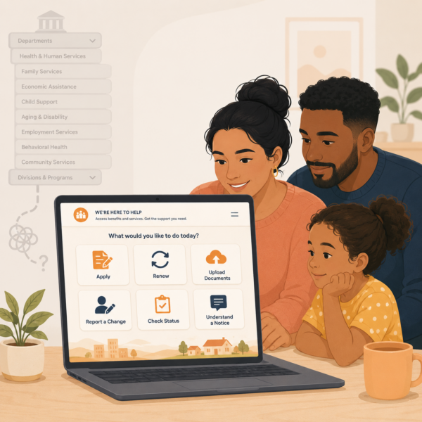
Task-based design does not require agencies to eliminate program pages. Program-specific pages are still necessary for eligibility details, benefit descriptions, rules, forms, and compliance information. The key is to avoid making program pages the only way into the website. Residents should also be able to enter through task pathways such as “Apply for benefits,” “Renew your benefits,” “Upload documents,” “Report a change,” “Check your case status,” “Find out why benefits changed,” or “Get help with a notice.” These pathways meet residents at the point of need and then route them to the correct program details.
A task-based structure also protects residents from misrouting themselves. If a person does not know which program applies, the website can help them start with the action and then narrow the path. If a person knows the program but not the task, the site can guide them from the program page to the relevant action. The strongest websites allow both forms of navigation. They respect agency structure while refusing to make it the resident’s burden.
More Than Just Applications: Human Services and Public Benefits Communication Strategies for State and Local Agencies
This article is part of our series on strategic communication for Human Services Agencies, Public Benefits Agencies, and Health and Human Services departments. To learn more and to see the parent article, which links to other content just like this, click the button below.
Residents Come to Benefits Websites With Tasks, Not Terminology
Residents rarely visit a public benefits website to browse agency information in the abstract. They usually arrive because they need to do something. They may need to start an application, finish a renewal, submit proof, respond to a notice, check whether benefits are active, replace an EBT card, update an address, find a local office, understand an interview requirement, or learn what happens after they submit documents. If the website is organized around program terminology rather than resident tasks, people may struggle to match their situation to the right page.
This is especially important because public benefits terminology can be difficult to interpret. Words such as redetermination, recertification, verification, eligibility review, adverse action, authorized representative, managed care, case closure, reinstatement, and household composition may be familiar to agency staff but unclear to residents. Even common program names may not be enough. A resident may know they receive food benefits, but not know whether the website calls them SNAP, food assistance, nutrition assistance, EBT, or economic support. A task-based site reduces the need for residents to know the official term before they can find help.
Task-based navigation uses plain-language labels that match what residents are trying to accomplish. “Renew benefits” is easier to use than “recertification.” “Send documents” is easier to use than “verification submission.” “Tell us about a change” is easier to use than “change reporting requirements.” “Check your case” is easier to use than “eligibility status inquiry.” Agencies can still include formal terms where required, but the primary navigation should use language residents can recognize quickly.
This resident-centered language also supports search behavior. Many residents arrive through Google or through the website’s internal search bar rather than through a homepage menu. They may search for phrases like “upload documents,” “food stamps renewal,” “Medicaid letter,” “change address,” “EBT stolen benefits,” or “case closed.” A website organized around agency divisions may not surface the right result because the page titles and headings use internal labels. Task-based content improves findability because it reflects the words residents are more likely to use.
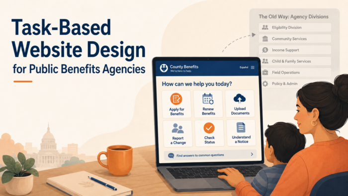
The Homepage Should Prioritize High-Need Actions
A public benefits homepage should not function mainly as a directory of agency divisions. It should help residents reach the most common and most urgent actions quickly. For many agencies, those actions include applying for benefits, renewing benefits, submitting documents, checking case status, reporting changes, replacing cards, finding an office, understanding notices, and getting help in another language or accessible format. These are not secondary links. They are core resident pathways.
When a homepage emphasizes organizational structure over tasks, residents may have to decide which division owns their problem before they can even begin. This is particularly difficult for people who are new to benefits, people managing several programs, people with limited literacy, people using mobile devices, and people under stress. A task-based homepage reduces that burden by giving residents direct entry points into the actions they are most likely to need. The agency can still provide program and division navigation, but those links should not overshadow immediate service pathways.
The hierarchy of the homepage should also reflect urgency. A resident trying to keep benefits from stopping should not have to search through press releases, organizational descriptions, meeting notices, or administrative pages before finding renewal or document instructions. A resident who received a notice should be able to find a plain-language path for understanding what the notice means and how to respond. A resident who needs language assistance should see that support as part of the service pathway, not as a buried compliance link.
This does not mean the homepage should become crowded with every possible task. A strong homepage highlights the highest-volume and highest-consequence actions, then routes residents to more detailed task pages. The goal is to reduce the number of choices residents must make at the start. A clear homepage creates a better first decision, and a better first decision helps residents move through the rest of the site with less confusion.
Task Pages Should Function as Action Guides
A task-based website depends on task pages that do more than describe a program. A task page should guide residents through a specific action. If the page is about renewing benefits, it should explain who needs to renew, how residents will know it is time, what information they may need, how to complete the renewal, what deadlines matter, what happens after submission, and where to get help. If the page is about uploading documents, it should explain what documents may be requested, how to upload them, how to know whether the upload worked, what alternatives exist, and what to do if the document cannot be obtained in time.
This action-guide structure matters because residents often arrive at a task page from a notice, text message, search engine, community partner link, or call center referral. They may not have read the surrounding program pages. The task page should therefore be understandable on its own. It should orient the resident, explain the action, connect to relevant programs, and point to the next step without requiring a long tour of the website. A resident who lands on the page should be able to understand what the page is for within the first few lines.
Task pages should also distinguish between general guidance and case-specific instructions. A website can explain the usual renewal process, but the resident’s actual deadline may be in their notice. A page can explain how to upload documents, but the resident still needs to know which document applies to their case. A page can explain how to report a change, but the effect of that change may depend on program rules. Strong task pages avoid overpromising while still giving residents enough structure to act.
For agencies, task pages become a shared resource across channels. Notices can link to them. Call center scripts can reference them. Community partners can share them. Social media posts can point residents to them during high-volume periods. Lobby staff can print or display them. When task pages are clear and maintained, the website becomes a source of truth for the most common resident actions rather than a passive repository of agency information.
Navigation Should Reflect Resident Intent, Not Internal Ownership
Task-based website design requires agencies to think carefully about what residents are trying to accomplish before deciding where content belongs. Internal ownership may determine who maintains a page, but it should not determine how residents are expected to find it. A resident who needs to submit proof of income should not have to know which program unit owns document processing. A resident who needs to report a household change should not have to understand which eligibility team updates which program record. The website should guide people by intent first, then route them to the right program or process.
This is especially important when one task affects several programs. Reporting a new job, for example, may have implications for SNAP, Medicaid, cash assistance, child care assistance, or another benefit. If each program page explains change reporting separately with different labels and different instructions, residents may not know whether one report covers several benefits or whether separate steps are required. A task-based website can explain the shared concept first, then clarify how program-specific rules may apply. That structure gives residents a clearer path without oversimplifying the underlying program requirements.
Resident intent should also shape menu labels, homepage buttons, search results, page titles, and cross-links. Labels such as “Apply,” “Renew,” “Send documents,” “Report a change,” “Check case status,” and “Understand a notice” are more useful than labels that mirror internal divisions. This does not mean program names disappear. It means program information is connected to actions residents recognize. The agency can maintain internal structure behind the scenes while presenting a public website that feels organized around resident needs.
Search Behavior Should Inform Website Structure
Residents often reveal what they need through the words they type into search bars. They may search for “food stamps renewal,” “upload documents,” “Medicaid letter,” “case closed,” “change address,” “lost EBT card,” “child care proof,” or “where is my case.” These searches are valuable because they show how residents describe their own needs, not how agencies label those needs internally. A task-based website should use this behavior to improve page titles, headings, metadata, internal search results, and content organization.
Search behavior can also expose gaps between agency terminology and resident terminology. If residents repeatedly search for one phrase but the website uses a different formal term, the correct page may be technically present but practically hidden. For example, a page about verification may not help residents who search for “send proof” unless the page includes plain-language wording that connects those ideas. A page about redetermination may not help residents who search for “renew benefits” unless the site intentionally bridges the terms. Strong website design makes those connections visible.
Agencies should treat search data, call center questions, website analytics, and partner feedback as part of the same communication improvement loop. If residents cannot find a task online, they often move to higher-cost channels such as phone calls, lobby visits, partner referrals, or repeat submissions. Improving task visibility on the website can reduce that burden. The goal is not only to improve web traffic. The goal is to help residents resolve common questions through a clear, official source before confusion becomes an operational problem.
Cross-Links Should Guide Residents Across Related Tasks
Residents often arrive at one page but need a related action. A person reading about SNAP renewal may also need to upload documents. A resident checking Medicaid status may need to update contact information. A parent reviewing child care assistance may need to report a work schedule change. If the website treats each page as isolated, residents may finish reading one section and still not know where to go next. Task-based design should use cross-links to reflect the way benefits tasks naturally connect.
These links should be intentional and action-oriented. A page about renewals should link to document upload instructions, case status guidance, help with notices, and language access support where relevant. A page about reporting changes should link to program-specific explanations, proof requirements, and contact options. A page about EBT theft should link to reporting steps, card replacement instructions, and official benefit security guidance. Cross-links should not be generic “related resources” lists that leave residents to interpret their relevance. They should be written as next-step guidance.
Good cross-linking also helps community partners and staff. When a call center representative directs a resident to a task page, the resident should be able to continue from that page to the next related step without starting over. When a food bank, clinic, school, legal aid organization, or library shares a link, the page should help residents move through the broader process. A task-based website becomes stronger when each page functions as part of a guided path rather than a standalone information block.
Program Pages Still Matter, But They Should Not Carry Every Task
Program pages remain important on a public benefits website. Residents still need clear explanations of SNAP, Medicaid, cash assistance, child care assistance, and other programs. They need to understand what a program does, who it serves, how eligibility is generally determined, what documents may be needed, and where to find program-specific details. Program pages also support transparency, compliance, search visibility, and public understanding. Task-based design does not replace program pages. It changes how those pages relate to resident action.
The mistake is expecting program pages to carry every task. If every renewal instruction, document upload path, status explanation, change-reporting rule, and contact option is buried separately inside each program page, residents have to know the program before they can complete the task. That structure may work for residents who already understand the system, but it is less effective for residents who are new, stressed, managing multiple benefits, or trying to interpret a notice. Task pages should provide common pathways, while program pages provide deeper program context.
A strong structure allows both entry points to work together. A resident can start with “Renew your benefits” and then find program-specific renewal details. Another resident can start with a SNAP page and then move to task guidance for renewal, documents, or case status. This dual structure respects the complexity of public benefits administration while giving residents more than one usable path. It also helps agencies maintain content more efficiently because shared tasks can be updated in one place instead of being rewritten inconsistently across multiple program pages.
Website Language Should Reduce the Need for Interpretation
Public benefits websites often ask residents to interpret too much. A page may include a program name, a legal term, a portal link, a form number, and a contact line, but not explain how those pieces fit together. Residents may have to determine whether the page applies to them, whether the action is urgent, whether the form is current, whether the portal link leads to the right task, and whether the information applies to one benefit or several. Each interpretation step increases the chance of error.
Task-based website language should reduce that burden. Pages should use plain headings, direct action statements, clear deadline language, and visible next steps. If a page includes a formal term, it should explain the term in resident-facing language. If a link opens a portal, the page should say what task the resident can complete there. If a form is required, the page should explain who needs it and where it should go. If a resident must rely on a notice for case-specific instructions, the page should say that clearly.
This kind of language strengthens trust because it shows that the agency understands how residents use the site. A resident should not have to read like an eligibility worker to understand a benefits website. The website should translate agency structure into resident action. When language is clear, residents can move faster, staff receive fewer basic clarification questions, and partners can share official pages with more confidence.
Task Pages Should Be Written for Completion, Not Awareness
A task page should help residents finish a specific action. Too many public benefits websites describe a process without guiding residents through it. A page may explain that renewals are required, documents may be requested, or changes must be reported, but still leave residents uncertain about how to complete the task, what information to prepare, where to submit it, and how to know whether the agency received it. Awareness is useful, but it is not enough. Residents need completion-oriented guidance that helps them move from understanding to action.
For public benefits agencies, this means each task page should be structured around a clear action path. A renewal page should explain how residents will know it is time to renew, what they may need before starting, which programs may be involved, how to complete the renewal, how to submit documents, and what happens after submission. A document page should explain what kinds of proof may be requested, how to submit documents, how to avoid unusable uploads, and where to check status. A change-reporting page should explain which changes matter, how to report them, and how different programs may review them.
Completion-oriented pages also help reduce pressure on other service channels. When a resident can understand the task online, the agency may receive fewer calls that begin with basic clarification. Staff can point residents to a page that actually supports the next step, rather than a general program description. Community partners can share a reliable link that helps residents act without requiring the partner to reinterpret agency requirements. A task page should function as a practical service tool, not just a public information page.
Content Hierarchy Should Match the Resident’s Urgency
Residents do not approach every public benefits website page with the same level of urgency. Some may be exploring eligibility before applying. Others may be trying to prevent benefits from stopping. Others may have received a confusing notice, missed a deadline, or discovered that a case has closed. A task-based website should recognize these different levels of urgency and organize content so that the most time-sensitive actions are visible first. The structure of the page should help residents identify the action that matters now before they encounter background detail.
A strong hierarchy usually begins with the core action, the deadline or timing issue when relevant, and the direct path to completion. Supporting information can follow, including program explanations, eligibility context, related rights, frequently asked questions, and links to deeper resources. This order is especially important for pages connected to renewals, verification requests, case closures, interviews, EBT issues, and benefit changes. Residents under pressure should not have to scroll through broad program descriptions before finding the step that protects their benefits.
This does not mean every page should sound urgent. It means the page should distinguish urgency accurately. If action is required, the page should say so plainly. If the resident should check their notice for a case-specific deadline, that instruction should be visible. If the page is informational and no immediate action is required, the page should make that clear as well. Good hierarchy reduces unnecessary worry while still helping residents act quickly when action is needed.
Mobile Use Should Shape the Website From the Beginning
 Many residents interact with benefits websites primarily through a phone. They may open a link from a text message, search from a mobile browser, take photos of documents, read notices in an online account, or try to complete a task while away from a desktop computer. A website that looks organized on a large screen can become difficult to use on a phone if pages are too long, headings are vague, buttons are hard to find, forms are difficult to complete, or PDFs are not mobile-friendly. Task-based design should account for mobile use from the beginning, not after the site is already built around desktop assumptions.
Mobile-friendly public benefits content should be scannable, direct, and structured around short decision points. Residents should be able to see the page’s purpose quickly, find the primary action, identify any deadline, and move to the next step without opening several files or navigating through multiple menus. Long PDFs, large tables, nested accordions, and program-heavy navigation can all create barriers on mobile devices. When agencies rely on these formats for essential actions, they may unintentionally make the website harder for residents with limited technology access to use.
Designing for mobile also supports equity. Residents with lower incomes may be more likely to rely on smartphones, shared devices, public Wi-Fi, or limited data. They may not have easy access to printers, scanners, or desktop computers. A task-based website should therefore explain how residents can complete actions from a phone when possible, while also naming other valid options when a mobile process is not realistic. The goal is not to force every resident into a digital pathway. It is to make the website usable for the devices residents actually have.
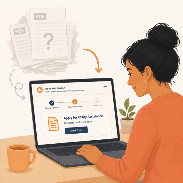
PDFs Should Not Become the Website’s Default Navigation System
Public benefits websites often rely heavily on PDFs because forms, notices, policy materials, and program guides already exist in that format. PDFs can be useful when residents need to download, print, submit, or preserve an official document. But when PDFs become the primary way residents are expected to learn what to do, the website can become harder to navigate. A resident may have to open several files, scan dense text, compare dates, identify the correct form, and determine which document applies to their situation. That is not task-based design. It is file-based navigation.
A stronger approach uses web pages to guide action and PDFs to support specific document needs. The web page should explain the task in plain language, identify the correct form or document when needed, and tell the resident how to use it. If a PDF must be opened, the page should make clear what the PDF is, who needs it, and what to do with it after downloading or completing it. Residents should not have to open a form simply to understand whether it applies to them.
This approach also helps agencies manage updates more responsibly. When important instructions are scattered across many PDFs, outdated guidance can remain online long after a process changes. A maintained task page can serve as the source of truth, while PDFs are linked only where they are truly necessary. That structure reduces confusion for residents and reduces the risk that staff or partners continue sharing old files that no longer reflect the current process.
Task-Based Design Should Support Language Access and Accessibility
Task-based design is not complete if it only works for residents who read English fluently, navigate websites easily, use digital devices comfortably, and understand benefits terminology. Public benefits agencies serve residents with varied literacy levels, language needs, disabilities, technology access, and familiarity with government systems. A task page that is technically accurate but difficult to read, translate, navigate, or use with assistive technology may still fail the people who need it most.
Language access should be considered at the structure stage, not added only after English content is finalized. Clear source content makes translation more accurate and interpretation easier. Pages should use consistent terms for common actions such as apply, renew, upload documents, report a change, check status, and get help. If the English page uses several terms for the same action, translated versions may become even more confusing. A plain, consistent task structure supports better multilingual communication across websites, notices, call centers, and partner materials.
Accessibility also depends on practical design choices. Headings should be meaningful. Links should describe the action they support. Forms and buttons should be clearly labeled. Important information should not appear only in images. Pages should be usable with screen readers and keyboard navigation. The most important resident actions should not be buried inside complex layouts. A task-based website should help every resident understand what they need to do, not only those who can navigate agency terminology and web design conventions easily.
Source-of-Truth Discipline Keeps Task Pages Reliable
Task-based website design only works if residents, staff, and partners can trust that the information is current. Public benefits processes change because of policy updates, system changes, vendor transitions, staffing models, form revisions, emergency procedures, and operational decisions. When a website contains several pages, PDFs, announcements, program descriptions, and old news posts that explain the same task differently, residents are left to decide which version to follow. That is not a reasonable burden to place on someone trying to renew benefits, upload documents, report a change, or understand a notice.
Source-of-truth discipline means the agency identifies one primary public page for each major resident task and maintains that page as the official guidance. There should be a clear place for applying, renewing, submitting documents, reporting changes, checking case status, replacing an EBT card, understanding notices, and finding help. Other channels can point to those pages, but they should not become separate versions of the same instruction. When the process changes, the source page should be updated first, then related materials should be reviewed for consistency.
This approach supports both resident access and internal coordination. Staff should know which public pages to reference when explaining common tasks. Community partners should receive links to maintained pages rather than static attachments that may become outdated. Social media posts, text alerts, lobby flyers, mailed notices, and call center scripts should all direct residents back to current guidance. The website becomes more than an information archive. It becomes the agency’s most reliable public reference point for action.
Each High-Need Task Should Have One Maintained Home
A resident should not have to compare multiple pages to understand how to complete one task. If there are several pages about renewal, several places to upload documents, or multiple explanations of how to report a change, the agency may unintentionally create uncertainty. A maintained task home gives residents one official place to begin and gives staff one page to reference when questions arise.
This does not mean every page must be short or simplistic. A task home can link to program-specific details, forms, portal instructions, accessibility support, and frequently asked questions. The key is that the main action path remains stable. Residents should know where the official instruction begins, even when the task itself involves several steps.
Update Notes Help Residents Trust the Guidance
Visible update notes can strengthen confidence in task-based pages, especially for high-consequence topics such as renewals, document submission, EBT card issues, case status, and benefit changes. When residents see that guidance has been updated recently or that a page is actively maintained, they are more likely to trust it over old screenshots, saved PDFs, or secondhand instructions.
Update notes are also useful for staff and partners. They make it easier to identify whether a page reflects current agency guidance and whether older materials should be retired or replaced. In a public benefits environment where rules, systems, and processes can change, visible update discipline helps prevent outdated information from remaining in circulation.
Content Ownership Should Be Clear Without Making Residents See the Org Chart
A task-based website requires clear internal ownership, but that ownership should remain mostly invisible to residents. Agencies need to know who is responsible for reviewing renewal guidance, document upload instructions, SNAP content, Medicaid updates, child care information, call center language, accessibility support, and technical portal instructions. Without clear ownership, pages can drift out of date or become inconsistent across programs. The resident should not experience that internal complexity as a confusing website structure.
Good content governance assigns responsibility for both program accuracy and resident usability. Program staff may need to confirm rules, forms, eligibility language, and operational details. Communications or customer experience staff may need to improve hierarchy, plain language, page flow, and consistency. Legal or policy teams may need to review required language. Technology teams may need to confirm links, portal instructions, and digital workflows. A strong process brings those perspectives together without allowing the final page to become a dense compilation of internal concerns.
The goal is to create pages that are accurate enough for the agency and usable enough for the resident. That balance does not happen by accident. It requires an agreed review process, update schedule, escalation path, and standard format for common task pages. When content ownership is clear, agencies can maintain public trust without forcing residents to navigate the internal divisions behind the page.
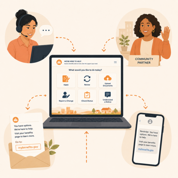
Staff and Partner Guidance Should Mirror the Website
A task-based website is most effective when staff and community partners use the same language residents see online. Residents often move between channels during the same benefits process. They may read a website page, call the agency, visit a local office, ask a food bank for help, or bring a notice to a clinic, school, library, or legal aid organization. If each channel explains the task differently, the website loses some of its value. The resident may begin to wonder whether the online guidance is complete, whether the staff explanation is more current, or whether the partner has a different interpretation.
Human services agencies should treat the website as the foundation for staff scripts and partner materials. If the website says “send documents,” call center scripts should not use unrelated internal terminology unless the connection is explained. If the website explains the difference between receiving and accepting a document, staff should use the same distinction. If the website tells residents to check their notice for a case-specific deadline, partner materials should reinforce that guidance rather than replacing it with a general deadline. Consistency reduces interpretation and helps residents feel that the agency is speaking with one voice.
Partner guidance should be practical and bounded. Community organizations do not need to become eligibility specialists, but they do need accurate language for the most common tasks residents ask about. Agencies can provide partner-ready versions of task pages, short referral language, printable one-page guides, and clear instructions on when residents should be directed back to the agency for case-specific help. When partner guidance mirrors the website, the agency extends its reach without losing message discipline.
Partner Materials Should Be Easy to Share Without Rewriting
Community partners often need short, accurate materials they can share quickly with residents. If the agency provides only long program pages or dense PDFs, partners may summarize the guidance on their own. That can weaken consistency even when partners are trying to help. A task-based website should therefore support shareable language that partners can use in newsletters, front-desk conversations, resource lists, and direct resident support.
These materials should preserve the agency’s core message. They should name the task, explain the resident action, link to the official page, and clarify when case-specific help must come from the agency. The easier the guidance is to share without editing, the more likely partners are to reinforce the official pathway accurately.
Website Analytics Should Be Treated as Resident Confusion Signals
A public benefits website produces useful evidence about where residents are getting stuck. Search terms, page exits, high-traffic pages, low-completion pathways, repeated visits, broken-link reports, mobile usage patterns, translation use, and internal search failures can all show whether the site is helping residents complete tasks. These signals should not be treated only as web metrics. They are communication signals that reveal whether residents can find and use the information they need.
For example, repeated searches for “upload documents” may indicate that document submission is too hard to find. High traffic to a case closure page may suggest that residents need clearer prevention guidance earlier in the process. Frequent searches for “renew Medicaid” or “food stamps renewal” may reveal a mismatch between resident language and agency terminology. A high exit rate on a renewal page may suggest that the next step is not visible enough. These patterns can help agencies improve task labels, page hierarchy, search results, cross-links, and source-of-truth content.
Website analytics should be reviewed alongside call center questions, lobby feedback, partner reports, complaint themes, document submission errors, and procedural closure patterns. When several channels show the same confusion, agencies can target improvements more effectively. The purpose is not to optimize the website for traffic alone. The purpose is to identify where unclear digital guidance is creating avoidable workload, missed action, resident anxiety, or benefit interruptions.
Task-Based Website Design Should Be Part of Broader Communication Strategy
A task-based website should not stand apart from the agency’s wider communication system. It should connect to notices, text reminders, portal language, call center scripts, social media posts, lobby signage, partner materials, and leadership messaging. Residents rarely experience agency communication through one channel at a time. They may receive a mailed notice, search the website, open a portal, call for help, and ask a partner organization to explain the same issue. If the website is task-based but other channels remain program-heavy or terminology-heavy, the resident experience will still feel fragmented.
This is why website design should be planned as part of communication strategy, not only as a web redesign project. The agency should identify the core resident tasks that matter across channels and create consistent language for each one. Applying, renewing, sending documents, reporting changes, checking status, understanding notices, and getting help should be explained in similar terms wherever residents encounter them. The website can serve as the most complete version of that guidance, but every channel should reinforce the same action path.
When task-based design is integrated into the broader communication system, the benefits extend beyond the website. Notices become easier to support with links to clear pages. Call centers can direct residents to reliable guidance. Community partners can share official resources with more confidence. Social media posts can point to maintained task pages instead of trying to explain complex processes in short updates. The agency becomes easier to navigate because its communication is organized around what residents need to do, not just where internal responsibility sits.
Strategic Communication Support for Human Services and Public Benefits Agencies
 Task-based website design is not just a web navigation issue. It is a public benefits communication issue that affects access, workload, resident trust, and the ability of agencies to guide people through high-consequence tasks. When residents need to apply, renew, submit documents, report a change, check case status, understand a notice, replace a card, or find help, the website should make that path visible. If the website is organized mainly around agency divisions, residents may have to understand the agency before they can understand what to do.
Because public benefits websites sit at the intersection of program policy, eligibility systems, digital tools, notices, call centers, partner support, language access, and resident behavior, many agencies benefit from structured communication support. Internal teams may understand the programs deeply, but that knowledge can make it harder to see where residents encounter confusion. A website that seems complete from an agency perspective may still be difficult for residents to use if task pathways are buried, terminology is inconsistent, pages are outdated, or program divisions overshadow common actions.
Stegmeier Consulting Group (SCG) helps human services and public benefits agencies build communication systems that organize information around how residents actually seek help. That support may include website content audits, task-based navigation frameworks, plain-language page templates, source-of-truth page development, resident journey mapping, staff and partner guidance, SEO-informed page structure, and alignment across websites, notices, portals, call center scripts, lobby materials, and community outreach. The goal is not to erase program complexity. The goal is to make the resident’s next step easier to find, understand, and complete.
This kind of support is especially valuable when agencies are redesigning websites, modernizing portals, consolidating benefit information, improving renewal communication, reducing avoidable calls, or trying to make digital guidance more accessible. A task-based website gives residents a clearer path and gives agencies a stronger public communication foundation. It helps the website function as a service tool rather than a static directory of programs, offices, and documents.
Future Trends in Public Benefits Website Design
Human services agencies are likely to place greater emphasis on task-based digital service design as residents continue to rely on websites, portals, mobile devices, search engines, text reminders, and community partner referrals to navigate public benefits. Websites will increasingly be judged not only by whether information is present, but by whether residents can use that information to complete common tasks. Agencies that organize around resident actions will be better positioned to reduce confusion and improve access across programs.
Another likely trend is stronger integration between website content and benefits portals. Residents often move from a public website to an online account, document upload tool, renewal screen, or case status page. If the website uses one set of terms and the portal uses another, the resident experience becomes fragmented. Agencies will need consistent task language that connects public pages, portal labels, notices, reminders, and staff scripts. The website should prepare residents for the digital action, not simply send them to a tool without context.
Agencies may also make more deliberate use of analytics and service data to improve content. Website search terms, call center questions, page exits, mobile behavior, partner feedback, document errors, and procedural closure patterns can all reveal where residents are getting stuck. Public benefits websites will become stronger when agencies treat those signals as evidence for improving task labels, page hierarchy, cross-links, source-of-truth pages, and plain-language guidance.
Finally, website design will likely become more closely tied to equity and language access. Public benefits websites must work for residents with different literacy levels, languages, disabilities, device access, and familiarity with government systems. Agencies that build task-based pages with accessibility, translation, mobile use, and real resident behavior in mind will be better able to support residents before confusion turns into missed deadlines, repeated contacts, or avoidable benefit interruptions.
Conclusion
Public benefits websites should not require residents to understand agency divisions before they can complete essential tasks. Residents come to these sites with practical needs tied to applications, renewals, documents, case status, notices, deadlines, offices, and support options. A website organized mainly around internal structure places too much interpretation burden on people who may already be navigating stress, time pressure, language barriers, technology limits, or multiple benefit programs at once.
Task-based website design gives residents clearer entry points into the actions that matter most. It uses plain language, visible pathways, maintained source-of-truth pages, mobile-friendly structure, accessible design, consistent terminology, and cross-links that reflect how benefits tasks connect. It also supports staff and community partners by giving them reliable pages to reference when residents need help.
In the end, a public benefits website should function as a guide to action. Program pages still matter, but they should not be the only way residents navigate the system. When agencies organize websites around resident questions and high-need tasks, they reduce confusion, strengthen access, improve operational efficiency, and make the benefits system easier for real households to use.
SCG’s Strategic Approach to Communication Systems
Align your agency’s messaging, processes, and public engagement strategies.
Human services and public benefits agencies need communication systems that help residents find the right action quickly, whether they are applying, renewing, sending documents, reporting changes, checking status, or trying to understand a notice. Task-based website design requires more than clearer menus. It requires plain-language structure, source-of-truth discipline, staff alignment, partner-ready guidance, accessible content, and consistent terminology across every channel residents use.
SCG helps agencies create communication frameworks that make public benefits information easier to find, easier to understand, and easier to act on. Whether your agency is redesigning a website, organizing content around resident tasks, improving source-of-truth pages, aligning portal language, preparing staff scripts, or creating clearer partner materials, SCG can help you build a communication system that supports clarity, access, consistency, and trust. Use the form below to connect with our team and explore how a strategic communication system can help your agency organize public benefits communication around resident needs, reduce avoidable confusion, and strengthen the resident experience.