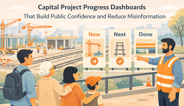
Capital Project Progress Dashboards That Build Public Confidence and Reduce Misinformation
Capital projects shape how the public experiences transit for decades. Station rebuilds, track upgrades, signal modernization, airport connectors, fleet replacements, accessibility improvements, and corridor expansions often require years of work and long periods of disruption. During that time, public confidence can decline quickly if people cannot see progress, understand sequencing, or verify what is happening and why.
A capital project progress dashboard is not a marketing page. It is a trust tool. Done well, it helps residents understand timelines, milestones, impacts, and trade-offs in plain language. It reduces misinformation by providing a clear source of truth that is updated predictably and written for nontechnical audiences. It also protects the agency operationally by reducing rumor-driven call spikes, reducing repetitive public meeting questions, and improving the quality of public input.
Dashboards matter because capital projects are vulnerable to narrative drift. When the public sees fencing and detours for months, they assume nothing is happening. When timelines shift, they assume mismanagement. When a single photo circulates online, it can become the entire story. A well-designed dashboard counters these dynamics with transparency, clear milestones, and honest explanation of what changed and what comes next.
This article provides an evergreen framework for creating capital project progress dashboards that build public confidence and reduce misinformation. It focuses on what to publish, how to explain progress in meaningful ways, how to handle schedule changes credibly, and how to connect dashboards to consistent project communication across channels.
Why Capital Project Dashboards Often Fail to Build Confidence
 Many project dashboards fail because they are written for internal reporting rather than for the public. They rely on technical terms, construction jargon, and milestone labels that do not translate into public meaning. Residents might see percentages, contract package names, and acronyms without understanding what has changed in the built environment or what will change next.
Dashboards also fail when they are too optimistic. When a dashboard emphasizes best-case schedules or uses vague language about “on track,” the public becomes skeptical, especially if visible disruption continues. Trust increases when the dashboard communicates progress with honest markers and clear constraints.
Another failure is irregular updating. A dashboard that is not updated consistently will be treated as abandoned. People will return to social media, neighborhood forums, and word-of-mouth, where misinformation spreads quickly. A predictable update cadence is essential for credibility.
Dashboards also fail when they do not connect progress to impacts. The public wants to know how construction affects access, detours, parking, safety, accessibility, and service reliability. A dashboard that reports progress without connecting it to what the public experiences feels disconnected and unhelpful.
Finally, dashboards fail when they do not explain what changed. Capital project timelines evolve. When changes occur without a clear “what changed and why” explanation, residents assume mismanagement or concealment. Clear change communication is one of the strongest dashboard trust builders.
Public Confidence Declines When Progress Is Invisible
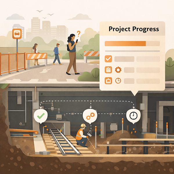
Capital work can be invisible. Utility relocations, underground work, design revisions, procurement, and safety testing often do not look like progress to a passerby. Residents then interpret disruption as delay. A dashboard must translate invisible progress into visible meaning.
Meaning can be created through milestone storytelling. Instead of only listing technical steps, the dashboard can explain what the step enables. For example, “This work allows the new accessible entrance to open,” or “This phase enables faster service once testing is complete.” When people understand what the work unlocks, they perceive progress even when construction looks static.
Visual proof also helps, but it must be curated. Photo updates should be paired with short explanations, time stamps, and clear links to upcoming milestones. Otherwise, photos can be misinterpreted or used selectively in misinformation narratives.
Misinformation Fills Gaps When Updates Are Vague or Irregular
In a long project, people will talk. If the agency is not providing steady, verifiable updates, informal narratives become the default. Misinformation is often not malicious. It often grows from uncertainty, partial information, and frustration.
A dashboard reduces misinformation by being predictable and specific. It should include time stamps, clear milestone status, and a consistent update rhythm. It should also provide a clear “what changed” line when something shifts. This reduces speculation and prevents old screenshots from circulating as the current truth.
Specificity also matters in impacts. If a detour is changing, the dashboard should clarify dates, locations, and accessible routes. If a closure is extending, the dashboard should explain why in plain language and state what the public should do now. Clear guidance reduces rumor-driven behavior changes that can create safety risks.
From Detours to Understanding: Effective Communication Strategies for Transportation Agencies to Improve Safety and Drive Behavioral Change
This article is part of our series on strategic communication for Transportation Agencies, Transit Authorities, and Public Works departments. To learn more and to see the parent article, which links to other content just like this, click the button below.
Define Dashboard Success as Trust, Clarity, and Better Public Behavior
A capital project dashboard succeeds when it helps the public understand what is happening and what to expect next. Trust improves when information is consistent, current, and honest. Clarity improves when the dashboard uses plain language and stable labels. Public behavior improves when people can plan around impacts, follow detours safely, and reduce unnecessary contacts and speculation.
Success also includes better engagement. When the dashboard is clear, public meeting questions become more specific and more useful. Instead of asking whether the project is delayed, residents ask about design choices, mitigation, and future phases. This shifts engagement from frustration to problem-solving.
Finally, dashboard success includes internal benefits. A dashboard provides a shared reference for staff, partners, and leadership. It helps align messaging across communications, customer service, field teams, and contractors. When everyone points to the same source of truth, contradictions decrease and trust improves.
What to Publish: The Small Set of Elements the Public Actually Needs
A public-facing dashboard should publish fewer things, more clearly. Residents do not need every internal schedule line. They need a clear picture of what is happening, what is next, what has changed, and how it affects them. A small set of stable elements makes the dashboard easier to understand and more likely to be used.
A practical dashboard includes a one-paragraph project summary, a current status statement, a milestone timeline, an impacts and access section, and a “what changed” update log. It also includes a clear time stamp and a published update cadence. Each element should be designed for fast scanning and should be written in plain language.
Milestones should be meaningful. Instead of listing contract packages, list milestones that the public can recognize. Examples include “Design complete,” “Utility relocation complete,” “Station entrance closed,” “Temporary platform open,” “New elevator installed,” “Testing underway,” and “Service restored to normal pattern.” The dashboard can still include a technical layer for those who want it, but the default view should focus on public meaning.
Impacts should be specific. Residents want to know what entrances are closed, where detours are routed, whether accessible routes are available, and what to expect for service. The impacts section should include maps or clear text directions where needed. It should also include the verification path for real-time service alerts and a help route for questions.
A “what changed” log is critical. It helps people interpret updates and reduces misinformation. It also helps staff and partners communicate consistently because they can quickly see what is new.
Handle Schedule Changes in a Way That Preserves Credibility
Schedule changes are inevitable in major capital work. Credibility is not lost because a schedule changes. Credibility is lost when changes feel abrupt, unexplained, or inconsistent across channels. A progress dashboard should be designed to make schedule changes understandable and verifiable.
The first credibility practice is to communicate timing as windows when uncertainty is high. A single date invites backlash if it slips. A window, paired with clear update cadence, sets more realistic expectations and reduces the sense of broken promises.
The second practice is a visible “what changed” log. When dates, phases, or impacts shift, the dashboard should state what changed, why it changed, and what the public should expect now. This reduces speculation and prevents outdated information from circulating.
The third practice is consistent sequencing. Even when timing changes, the milestone ladder should still make sense. The public should be able to see that the project is moving through a known sequence. If sequencing changes, the dashboard should explain why.
The fourth practice is alignment. If the dashboard is updated but a press release, flyer, or signage still reflects the old timing, misinformation will spread. A dashboard should be the source of truth, and other channels should route back to it.
Finally, the dashboard should avoid defensive language. It should explain constraints calmly. People can accept safety testing requirements and utility coordination realities when they are stated plainly and paired with what is being done to manage them.
Use a Consistent Change Template for Every Schedule Update
A consistent template reduces confusion. Every schedule change update can include five elements. What changed. Why it changed. What is happening now. What impacts are affected. When the next update will occur.
This structure helps residents understand whether they need to change plans. It also reduces the number of repetitive questions because the update answers the most common concerns in a predictable format.
The template should be concise. It should avoid long narratives. It should also include a time stamp. A time stamp is essential because schedule changes are often shared in screenshots.
Consistency also supports internal teams. Staff can use the same update template in customer service scripts and field messaging, which reduces contradictions.
Separate Date Changes From Impact Changes
Not all schedule changes affect daily life. Some changes affect internal sequencing but do not change closures or access. Others change detours, entrances, and rider behavior. The dashboard should distinguish between these.
When an impact changes, the dashboard should highlight it clearly. For example, if an entrance closure extends, if a temporary platform remains in use longer, or if a bus stop relocation continues, the dashboard should state that plainly. It should also provide updated access guidance and accessible alternatives.
When the schedule changes without immediate impacts, the dashboard should state that clearly as well. This reduces anxiety and prevents overreaction. Residents often assume that any schedule shift means new closures. Clarity reduces rumor-driven behavior changes.
Use Visual Evidence Carefully to Build Confidence Without Creating Confusion
 Photos, videos, and visual progress indicators can build confidence, but they can also create misunderstanding if they are not framed. Visual evidence should be time-stamped, contextualized, and tied to a milestone. Otherwise, a single image can be used as proof that nothing is happening or that the project is mismanaged.
A practical approach uses a small set of curated visuals aligned to the milestone ladder. Instead of posting many images, post a few that clearly show phase progress. Each visual should have a short caption that explains what it shows and why it matters. Captions should be written in plain language.
Visuals should also reflect what the public cares about. People care about accessibility progress, station usability, safety improvements, and when disruptions will end. Visuals that show new elevators, platform surfaces, canopy structures, or signage installation are often more meaningful than abstract construction images.
Progress indicators can also be simple. A milestone ladder with clear status can be more useful than a percentage bar. Percent complete can be misleading because some phases have many small tasks and some have fewer but larger tasks. A milestone view is more interpretable.
Finally, visuals should be consistent with on-site conditions. If the dashboard shows a new pathway, signage should reflect it. Misalignment creates confusion and undermines trust.
Use Before-and-After and “What This Enables” Captions
Before-and-after visuals help the public perceive progress. They should be used sparingly and with clear time stamps. The goal is to show what changed in a way that is easy to understand.
Captions should emphasize what the change enables. For example, “This work enables the new accessible entrance to open in the next phase,” or “This installation allows testing to begin.” This ties visuals to the sequence and helps residents understand that progress is cumulative.
This approach also reduces misinformation. People are less likely to claim nothing is happening when they can see concrete change tied to a milestone.
Captions should avoid exaggeration. They should be factual and grounded. This preserves credibility.
Keep Maps Simple and Use Stable Labels
Maps are often necessary for impacts and detours. However, maps can confuse if they are overly detailed or use inconsistent labels. A dashboard should use simple maps with stable labels that match signage and other public materials.
Maps should include key landmarks and clear access routes. If accessibility routing changes, the map should be updated and time-stamped. A clear “map updated” note prevents riders from relying on an old version.
Maps should also be designed for mobile viewing. Small text and cluttered layers will not work on a phone. Simplicity increases usability and reduces the chance of misinterpretation.
Stable labels also support partner sharing. Community organizations and local institutions will repost maps. Consistent naming reduces drift and helps keep public understanding aligned.
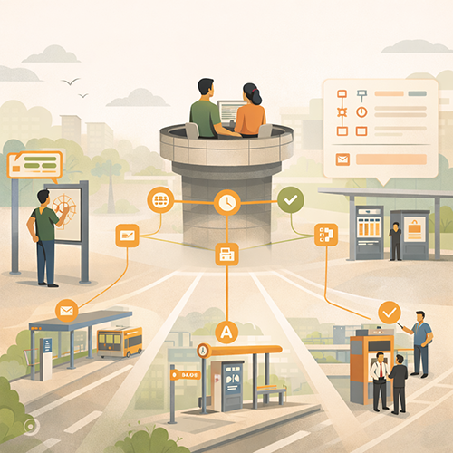
Governance and Channel Integration, Make the Dashboard the Source of Truth
A dashboard builds confidence only when it is trusted as the authoritative reference. That trust requires governance and channel integration. Governance defines who owns the dashboard, how updates are validated, and how changes are coordinated across teams and partners. Integration ensures that every public channel routes back to the dashboard for the most current information.
Dashboard ownership should be explicit. One team or role should be responsible for publishing updates, maintaining time stamps, and coordinating with project managers. Ownership prevents the common failure where the dashboard falls behind because it is everyone’s job and no one’s job.
Update coordination should be built into project routines. When construction phases change, the dashboard should be updated in sync with signage updates, service alert updates, and partner messaging. A dashboard that contradicts a station sign will lose trust immediately.
Channel integration should also include customer service and frontline staff. Staff should have access to the same dashboard view and a short internal message pack that mirrors the public content. When staff use the same language and reference the same time stamps, misinformation and repeat contacts decline.
Finally, the dashboard should include an archive logic. Past updates can remain visible as an update log, but the current status should always be clear. Riders should not have to sort through old posts to find what applies today.
Publish on a Predictable Rhythm and Treat Staleness as a Trust Risk
Staleness is one of the fastest credibility killers. Even if nothing major changed, the dashboard should be updated on a predictable rhythm. A short “no change, next update by” note can preserve trust better than silence.
The rhythm should match project intensity. During major closures or phase transitions, weekly updates may be appropriate. During steadier periods, biweekly or monthly may be sufficient. The key is to state the rhythm publicly and meet it.
If an update is delayed, the dashboard should say so plainly. A short delay notice maintains credibility and reduces speculation that the agency is hiding something.
Predictable updates also support partners and media. When people know when updates arrive, they are more likely to share current information rather than relying on memory.
Use an Update Log That Makes Changes Easy to Verify
An update log is a practical anti-misinformation tool. It allows residents to verify what changed and when. It also helps prevent recycled screenshots because the public can compare an image to the most current log entry.
The log should be scannable. Each entry should include a date, a short “what changed” line, a brief “why” explanation when relevant, and a note about impacts. It should also include the next update expectation.
The update log also supports internal alignment. Staff can reference the same entries in conversations with the public, which reduces conflicting explanations.
A log should not replace the current status view. The dashboard should still lead with the current phase and current impacts. The log is supporting evidence, not the main navigation.
Design for Public Behavior, Reduce Rumors, Improve Input Quality
A capital project dashboard is a communication strategy because it shapes public behavior. When people understand where to go, what to avoid, and what to expect next, they make safer choices and are less likely to flood customer service lines or public meetings with basic questions.
Behavior design begins with clear impacts guidance. If an entrance is closed, the dashboard should show the alternate route clearly. If a detour changes, the dashboard should provide updated maps and time-stamped instructions. This reduces unsafe shortcuts and reduces conflict with staff.
Behavior design also includes clarity about what feedback the agency wants. Dashboards can include a short section about how to ask questions, where to report urgent safety concerns, and what kinds of feedback will influence decisions. When the dashboard routes input properly, public meetings become more productive and less repetitive.
Rumor reduction depends on credibility cues. Time stamps, update rhythm, “what changed” logs, and consistent labels are credibility cues. They help the public verify information quickly and reduce the spread of speculation.
Finally, a dashboard can help protect the public narrative. When the agency publishes honest, structured progress explanations, it becomes harder for misinformation narratives to dominate. The dashboard does not eliminate criticism. It improves the quality of discourse by anchoring conversation in verifiable facts.
Write for Nontechnical Readers and Use a Calm, Factual Tone
Dashboards should be written as if the reader has no project management background. Plain language reduces misunderstanding and reduces the chance that technical terms will be reinterpreted incorrectly in public conversation.
The tone should be calm and factual. It should avoid defensive language. It should avoid exaggerated confidence. People are more willing to accept change when they feel respected and informed.
A calm tone also supports staff. When public language is steady, staff interactions become steadier. This reduces conflict and improves overall public experience during disruption.
Provide Clear Paths for Questions and Separate Urgent Reports From General Feedback
Dashboards should make it clear where people go with questions. A general questions route can reduce scattered emails and social replies. A separate urgent safety route is also important, because urgent issues require immediate attention and should not be buried in general feedback.
Separating these paths reduces frustration. People with urgent issues get faster help. People with general questions get consistent answers and references.
Clear paths also reduce misinformation. When residents have a reliable way to verify and ask, they are less likely to rely on informal threads that spread inaccuracies.
Promoting Long-Term Transportation Outcomes Through Communication
Capital project dashboards build confidence when they help the public understand progress, plan around impacts, and verify what is current. Trust improves when dashboards translate technical work into meaningful milestones, show clear sequencing, and maintain predictable updates with visible time stamps. When residents can see what is happening now, what comes next, and what changed, misinformation has less space to grow.
Clarity also improves public behavior. When access routes and detours are explained plainly, residents make safer choices, avoid restricted areas, and reduce unnecessary travel into closed zones. This reduces stress on field staff and reduces customer service volume driven by confusion. Update logs and stable labels also reduce the spread of outdated screenshots, which is a common driver of rumor cycles.
Equity outcomes improve when dashboards treat impacts and accessibility routes as first-class content. Residents who rely on accessible entrances and predictable travel need clear, time-stamped guidance on closures and alternate routes. A dashboard that makes these pathways visible reduces unequal burden and improves daily usability during long construction periods.
Operational outcomes improve as well. Dashboards become shared references for staff, partners, and leadership, reducing contradictory explanations and improving the quality of public meetings. When progress communication includes honest markers and clear mitigation steps, public input becomes more actionable and less repetitive.
Strategic Communication Support for Your Transportation Agency
 Capital projects create long timelines where the public evaluates competence through clarity and consistency. Dashboards can build confidence, but only when they are written for nontechnical audiences, updated predictably, and integrated with impacts messaging, wayfinding, service alerts, and staff scripts. Many agencies have the project data. The challenge is turning it into a public-facing communication system that reduces misinformation and improves day-to-day usability.
That is why agencies often choose to partner with an external resource like Stegmeier Consulting Group (SCG) to strengthen communication systems. SCG helps transportation agencies design capital project progress dashboards that the public can interpret quickly, including milestone ladders, sequencing panels, impact and access maps, time-stamped update logs, and plain-language “what changed and why” templates. SCG also supports cross-channel integration, so the dashboard remains aligned with station signage, customer service responses, public meeting materials, and partner communications.
SCG’s approach focuses on building credibility through structure and discipline. That includes governance workflows for update cadence and version control, messaging templates that prevent drift across channels, and feedback loops that improve clarity as conditions change. Use the form below to connect with our team and explore how a strategic communication framework can elevate your agency’s impact.
Conclusion
Capital project progress dashboards are trust tools, not marketing pages. Agencies build public confidence by publishing a small set of public-meaning elements, including a milestone ladder, a “now, next, later” sequencing panel, an impacts and access section, and a time-stamped “what changed” log. Credibility is protected through predictable update cadence, calm and factual tone, stable definitions and labels, and transparent handling of schedule changes.
Dashboards reduce misinformation when they are treated as the source of truth and integrated across channels, including signage, service alerts, customer service scripts, and partner sharing. Visual evidence and maps can strengthen confidence when they are time-stamped, clearly captioned, and designed for mobile viewing. Governance keeps the dashboard current, consistent, and aligned with on-the-ground conditions. When these practices are embedded, project dashboards improve public understanding, reduce rumor cycles, and strengthen long-term confidence in transit capital delivery.
SCG’s Strategic Approach to Communication Systems
Align your agency’s messaging, processes, and public engagement strategies
Capital projects can lose public confidence when progress feels invisible, timelines shift without clear explanation, or impacts are hard to plan around. SCG helps transportation agencies turn project information into a clear communication system by designing public-facing dashboards with milestone ladders, “Now. Next. Later.” sequencing, time-stamped updates, and plain-language progress summaries that translate technical work into meaningful outcomes.
SCG also supports the governance behind the dashboard so it stays credible. That includes update cadence discipline, version control and correction protocols, and cross-channel alignment with signage, alerts, customer service scripts, and partner communications. Use the form below to connect with our team and explore how a strategic communication framework can elevate your agency’s impact.