Data Visualization That Works: Turning Reservoir Levels Into Public Understanding
 Reservoir levels influence far more than water supply. They shape how communities experience lakes and shorelines, how local ecosystems function, and how public access and safety conditions change across seasons. As conditions fluctuate more dramatically from year to year, water conservation districts need communication tools that help the public understand why restrictions change, why conservation matters, and how water resources behave over time. Water conservation districts increasingly rely on data visualization to turn complex hydrologic information into clear, understandable communication.
However, the public does not typically think in terms of acre feet, storage capacity, or seasonal inflow patterns. Many people simply see a lake that looks full or empty and draw assumptions that may not reflect reality. District staff often face frustration from lake users, shoreline visitors, and residents who do not understand why a water body is restricted when it looks safe, or why conservation guidelines tighten even when water appears abundant. The challenge is not the data itself but how it is presented. Data visualizations can make reservoir trends intuitive, or they can overwhelm audiences if they rely too heavily on technical language.
When water conservation districts translate reservoir level information into visuals that feel approachable and timely, communities gain a clearer understanding of why certain water related decisions are made. This helps reduce conflict, strengthen trust, and encourage better compliance. Visualization turns an invisible process into something people can see, remember, and act on. With the right communication strategy in place, reservoir data becomes a foundation for shared stewardship rather than a source of confusion.
Why Reservoir Level Communication Matters More Than Ever
Reservoir conditions fluctuate with rainfall patterns, seasonal demand, snowpack, and long term climate shifts. These variables are technical, but the impacts are deeply personal. Water conservation districts may adjust conservation stages, restrict certain uses, modify release strategies, or change operating targets when storage drops. Communities feel these changes through outdoor watering rules, lake access limitations, water quality advisories, and shifting expectations about what is allowed from week to week. Understanding reservoir levels helps the public make sense of these evolving conditions.
Without accessible explanations, people may feel blindsided by restrictions or frustrated by changes that seem inconsistent. A lake that appears usable may conceal hazards like submerged debris, unstable shorelines, or poor water quality. A reservoir that looks nearly full may actually hold significantly less usable water than it did historically due to storage loss or sedimentation. When water conservation districts do not communicate these nuances effectively, misinformation fills the gap. People may assume decisions are political, arbitrary, or overly cautious rather than tied to real hydrologic constraints.
Clear communication helps counter misconceptions. When water conservation districts visualize trends showing how quickly water levels rise or fall, why supply changes across seasons, and how conservation actions influence storage, the public becomes more receptive. Data visualization supports proactive understanding rather than reactive frustration. When people see the bigger picture, they are more willing to adjust their behavior and support conservation goals.
From Scarcity to Sustainability: Effective Communication Strategies for Water Conservation Agencies
This article is part of our series on strategic communication for Water Conservation Special Districts and Public Water and Sewer Utilities. To learn more and to see the parent article, which links to other content just like this, click the button below.
The Psychology of How People Interpret Water Data
People rarely interpret numbers in isolation. They interpret them through emotion, comparison, and visual cues. This means that traditional reports filled with tables or technical metrics rarely resonate with the public. Water conservation districts have learned that audiences respond more strongly to visuals that show change, scale, or risk in ways they can immediately grasp. People form stronger connections when data is paired with clear context about what it means for their daily routines, their community, and the reservoir conditions they can observe.
One key psychological factor is mental anchoring. People anchor their understanding to the most familiar visual reference, such as what the reservoir looked like last summer or how they remember the shoreline from years past. If water levels differ from those memories, they may perceive conditions as abnormal or concerning even if they fall within expected seasonal ranges. Without visualization to show long term patterns, the public may misinterpret normal fluctuations as emergency situations, or misread warning signs as overreactions.
Another factor is perceptual scaling. Many people struggle to interpret percentages or volume measurements unless they can visualize them. For example, a reservoir at 60 percent capacity may sound concerning, but a visualization showing that this level is typical for late August clarifies the situation. Conversely, 90 percent capacity may seem safe until a graphic reveals that the remaining storage is unusually low compared to past decades, or that current inflow trends are declining. Water conservation districts that account for these psychological tendencies design visuals that provide context rather than standalone numbers.
Visualization also influences how people feel about risk. Gradual slopes, clear thresholds, and familiar icons help audiences process information without panic. Sharp drops, overly alarming palettes, or overly technical graphs may induce anxiety or skepticism. The goal is not to downplay real concerns but to communicate them in a way that maintains emotional balance. Effective data visualization keeps communities informed while preserving trust and confidence.
Design Principles That Turn Reservoir Data Into Public Understanding
Design is the difference between information that informs and information that overwhelms. Water conservation districts rely on principles that make data visualization intuitive. One of the most important principles is simplicity. A single chart that clearly shows water level trends over time is more effective than multiple layered graphs that require interpretation. A simple line showing seasonal patterns builds familiarity and helps the public understand what is normal versus abnormal.
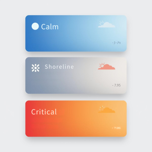
Color plays a crucial role. Many districts use blue to represent healthy storage, yellow for caution, and red for critical levels. This progression mirrors common interpretations of safety and risk, reducing cognitive load. Labels must also be clear and human centered. Instead of technical terms like acre feet or inflow cfs, districts can add everyday equivalents such as shoreline access impacts, typical seasonal ranges, or how long current storage could support community needs under current demand patterns. These translations make complex metrics more relatable for general audiences.
Consistency across platforms strengthens understanding. People who see the same design language on on site signage, district websites, and social media develop quick recognition of reservoir conditions. Districts also benefit from using templates that allow staff to update visuals quickly while preserving branding and clarity. In addition, visuals must be accessible by using high contrast colors, meaningful alt text descriptions, and screen reader friendly formats. When design decisions prioritize inclusion, communication reaches the broadest possible audience.
Mapping Tools That Bring Reservoir Levels to Life
 Maps remain one of the most powerful tools for visualizing water conditions because they connect data to place. Water conservation districts use maps to show which boat ramps, beaches, shoreline access points, and reservoir zones are affected by changing levels. They also use maps to illustrate where restrictions apply, where hazards may exist, and how conditions vary across a single reservoir system.
Spatial visualization helps the public understand why some areas remain open while others restrict access. A color coded map showing open, caution, and closed zones communicates information at a glance. It also reduces the burden on staff by preemptively answering common questions about access and safety. People can plan more effectively when they can visualize conditions before arriving on site. A reservoir that appears accessible from one angle may hide hazards elsewhere. A map reveals the full picture.
Interactive maps deepen engagement. Districts that offer clickable layers, historical comparisons, and hover over explanations help users explore data at their own pace. This turns passive observation into active learning. People can zoom in, compare years, or explore projected conditions. When the community feels empowered to explore data visually, it develops stronger understanding and stronger support for district decisions.
How Water Conservation Districts Shape Public Perception Through Visual Storytelling
Reservoir data becomes meaningful when water conservation districts pair the numbers with stories about what those trends represent. Districts often use visual storytelling to show how lower levels affect boat ramps, swimming areas, shoreline access, and system reliability. They also translate trends into plain explanations about why conservation stages shift and what those changes mean for the community.
Storytelling bridges the gap between technical information and lived experience. A graph alone may communicate change, but a visual narrative helps people understand why that change matters. For example, a time lapse visualization showing shrinking shoreline bands over a summer season has an impact that numbers cannot achieve. People grasp the urgency behind conservation measures when they see how quickly a reservoir responds to heatwaves, high demand, or low inflow. This visual record of change encourages empathy for the resource and helps people interpret restrictions as protective rather than punitive.
Effective storytelling also reduces conflict during periods of scarcity. When districts show the connection between drought, reservoir decline, and safety or reliability risks, communities approach restrictions with more patience. Visuals that link levels to multi year patterns help counter the misconception that one rain event resolves long term shortages. When the public sees these trends consistently through time layered graphics and maps, districts no longer need to rely solely on written explanations. Visualization becomes a persuasive, relatable tool for sustaining community support.
Static vs. Interactive Visualization: Choosing the Right Tool
Static visuals remain one of the most reliable ways to communicate reservoir conditions because they are simple, stable, and easy to post across multiple platforms. Water conservation districts often use static charts on kiosks, shoreline signs, and community boards where internet access is limited. They also use static infographics in newsletters and printed materials where residents prefer straightforward communication.
Static visuals work well when conditions change slowly or when staff need a clear, unchanging reference. They support consistency across platforms because people see the same image on a sign, a website, and a bulletin. This repetition strengthens comprehension and reduces misinterpretation. Static visuals, however, cannot capture rapid shifts or allow users to explore deeper layers of information. They serve best as anchors that establish a baseline understanding.
Interactive visuals serve a different function. These tools allow the public to explore monthly trends, compare years, or toggle between reservoir zones and conditions. People who want deeper insight appreciate interactive tools because they can dig into details on their own terms. Water conservation districts can use these tools to support transparency while keeping the most important takeaways easy to understand.
The strongest communication systems combine both approaches. A static graphic conveys clarity at a glance, while an interactive visual builds nuanced understanding. By offering both, water conservation districts accommodate different learning preferences and ensure that the community can engage with reservoir data regardless of comfort with technology.
Avoiding Common Pitfalls in Reservoir Visualization
Even well intentioned visuals can confuse the public if they rely on overly technical framing. Water conservation districts sometimes publish reservoir charts that mirror engineering dashboards, complete with acronyms and measurement units the public does not understand. Districts may also present data without adequate context, leading people to assume conditions are safer or more dangerous than they actually are. Overcorrection can be equally risky. If visuals oversimplify trends, they can create misunderstandings about long term supply reality.
One of the most common pitfalls is scale misalignment. Charts that compress multiple decades of data into a single narrow range can make normal fluctuations appear catastrophic. Graphs with extremely wide scales may hide significant drops that people need to understand. Districts that adjust scale thoughtfully allow the public to perceive both seasonal variation and long term trends accurately. This ensures that the visual narrative matches reality rather than distorting it.
Another pitfall is inconsistent labeling. Without clear legends, intuitive descriptors, or short explanatory notes, people may interpret visuals incorrectly. If a graph shows storage percentage without indicating historical averages, the public may assume a single value reflects either a crisis or normalcy when neither is true. Districts that accompany visuals with simple context statements help prevent these misinterpretations. A brief sentence clarifying what a reservoir level means relative to a typical year goes a long way toward maintaining understanding.
Helping Visitors Understand Long-Term Trends Through Simplified Graphics
Short term reservoir fluctuations can be confusing without a broader frame of reference. Water conservation districts often use simplified graphics to show how water levels follow seasonal patterns. These visuals help people understand that midsummer declines, for example, are not always signs of crisis but reflections of normal demand cycles. Districts also use long term trend graphics to highlight how small changes accumulate over years and why planning and conservation matter.
Simplified graphics distill complex data into patterns the public can instantly recognize. A rising or falling line across a decade communicates stability or volatility more effectively than a table of historical values. These visuals also encourage people to interpret individual data points within a broader story. A single low measurement becomes less alarming when seen as part of a cyclical pattern. A repeated downward trend becomes more compelling when the pattern is unmistakable.
Long term trend visualization strengthens public cooperation during water scarcity. When communities see years of declining storage or earlier seasonal depletion, they begin to understand that conservation is not a temporary measure. It is a long term necessity. These insights help districts promote sustainable behaviors without relying on fear based communication. Clear visuals turn long term planning into a public partnership rather than a technical exercise.
How Real-Time Visualization Builds Trust During Rapid Changes
Real time reservoir data can shift public perception quickly when visualized effectively. Water conservation districts often rely on real time dashboards to communicate advisories, conservation stage shifts, or access changes as they develop. Timely visualization helps districts avoid confusion or frustration during sudden changes. When people can see a drop reflected immediately on a dashboard or a real time graph, they understand that decisions are rooted in current conditions rather than speculation.
This immediacy builds trust and reinforces the idea that the district’s communication is transparent and responsive. Real time visuals are most effective when coupled with brief explanations that clarify the meaning behind the changes. A graph that shows a rapid decline may invite concern unless the accompanying text frames the cause and expected duration. Districts that combine real time visualization with clear interpretation help the public remain calm, informed, and cooperative even during rapidly shifting conditions.
Designing Visitor-Facing Dashboards That Are Actually Understandable
Dashboards allow water conservation districts to present multiple data points in one place, but their effectiveness depends entirely on clarity. Districts often use dashboards to show reservoir storage, conservation stage, key restrictions, and access related notices. These layers of information must be carefully organized so the public can interpret them without feeling overwhelmed.
The strongest dashboards prioritize simplicity, placing the most important indicators at the top and supporting metrics below. People should understand the message within seconds, not minutes. Districts that use too many charts, colors, or technical labels risk confusing the community. A clean design with intuitive icons and short explanatory text supports comprehension even for people with no hydrologic background. Accessibility features such as high contrast styling, alt text, and mobile friendly layouts ensure that the information reaches as many people as possible.
Dashboards also serve as trust building tools. When the public returns repeatedly and sees consistent updates, the district’s transparency becomes evident. A dashboard that is easy to navigate and frequently refreshed becomes a reliable reference point. This familiarity helps reduce conflict when reservoir conditions force restrictions, because people have already been following the trends. The more intuitive the dashboard, the more likely the community will use it to guide behavior.
Translating Scientific Metrics Into Everyday Language
Reservoir data relies on specialized terminology that can be confusing without translation. Water conservation districts often report storage in acre feet or percentages, units that do not immediately resonate with the general public. Districts may also reference inflow, release rates, or operational targets that make sense internally but feel abstract externally. Without translation, these numbers can seem inaccessible.
The most effective communication strategies convert technical indicators into relatable descriptions. Instead of reporting a reservoir at thirty thousand acre feet, a district can explain what that means in practical terms, such as the seasonal context, the conservation stage implications, or how storage compares to typical conditions for that time of year. When districts consistently translate scientific metrics into plain language, they build a stronger bridge between operations and the public. This strengthens cooperation and reduces resistance during high stress situations such as drought declarations or emergency restrictions.
Why Color Matters in Water Data Visualization
Color influences perception more strongly than most people realize. Water conservation districts often use blue palettes to communicate stability, yellow for caution, and red for critical conditions. These color decisions send subtle but powerful messages about urgency, safety, and responsibility. Color consistency is essential. If a dashboard uses red to indicate critical drought conditions, related signage, maps, and social updates should use the same red for the same meaning. When color systems shift across platforms, people may misinterpret severity.
Color also affects emotional tone. Overuse of alarming colors can cause unnecessary anxiety, while overly muted palettes may underplay seriousness. Water conservation districts must strike a balance between communicating urgency and maintaining calm. Using color intentionally helps guide behavior without inducing fear or confusion. When districts design with emotional impact in mind, color becomes a strategic tool that enhances understanding rather than merely decorating the visual.
Visualizing Risk Without Creating Panic
Conveying risk is one of the most delicate challenges in reservoir communication. Water conservation districts need people to take advisories seriously without interpreting them as signs of widespread danger. Effective risk communication relies on tone and pacing. Visuals that highlight risk zones can use cautionary colors and clear labeling without resorting to ominous imagery. A map showing hazard areas can remain factual and stabilizing by pairing strong cues with concise explanations. People feel more secure when they understand not only where the risks are but why they exist.
Risk visualization also benefits from showing alternatives. If one area becomes unsafe or restricted, districts can highlight safer access points, unaffected zones, or other community options. This demonstrates that protective measures are part of thoughtful planning rather than arbitrary restrictions. When the public sees risk visualized alongside options and reasoning, it interprets decisions as balanced and supportive. This promotes cooperation and encourages voluntary behavior changes.
How Frequency of Data Updates Shapes Public Trust
Update frequency plays a major role in how the public perceives reservoir information. Water conservation districts that update visuals consistently during peak demand seasons help communities feel informed and prepared. Inconsistent updates weaken confidence. A dashboard that remains unchanged for weeks during a drought suggests that the district may not be monitoring conditions closely, even when that is not true. People become confused when outdated visuals clash with observed conditions or new restrictions.
Districts that pair update cadence with clear reasoning strengthen trust even further. Noting that data is updated weekly due to stable measurement cycles helps people calibrate expectations. Clarifying that more frequent updates occur only during extreme conditions sets appropriate boundaries. Update cadence becomes part of the communication system, signaling reliability, care, and operational diligence.
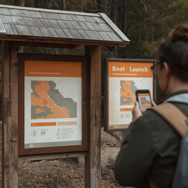
How On-Site Signage Can Reinforce Digital Visualization
On-site signage serves as a bridge between digital communication and real world experience. Water conservation districts often place reservoir level signs near boat ramps, trail entrances, and shoreline access points. These physical touchpoints reinforce digital messaging and help people interpret conditions in context.
Signage is most effective when it mirrors the visual language used online. Colors, icons, and graphics should remain consistent so people do not need to recalibrate their understanding in each setting. When a sign’s design resembles the dashboard or website graphic, the public recognizes meaning quickly. This pattern recognition supports smoother decision making in high traffic areas where people cannot spend much time analyzing details.
On-site signage also provides reassurance. Seeing relevant information at the exact moment a decision is needed helps people feel supported. It confirms that the district is monitoring conditions and has placed protective measures with intention. When people read a sign that explains why an access point is restricted or why conservation stages shifted, they are less likely to become frustrated or distrustful.
Teaching Visitors How to Read Reservoir Visuals
Even the best data visualization fails if people do not know how to interpret it. Water conservation districts sometimes underestimate this barrier, assuming the public will naturally understand charts and infographics. Effective communication includes teaching people how to read the visuals themselves.
Instruction does not need to be formal. Simple guides on dashboards, websites, or within email updates help people learn what each visual represents. A short legend explaining thresholds, labels, and trend lines can reduce confusion. Districts can also offer brief orientation content that walks people through common reservoir graphics. When these guides appear consistently across platforms, communities build understanding through repeated exposure.
Teaching people how to interpret reservoir visuals creates long term benefits. Over time, the public becomes more confident in navigating water information. It notices patterns, asks better questions, and adjusts behavior proactively. By empowering the community with interpretive tools, water conservation districts build shared stewardship rather than relying solely on staff to explain changes repeatedly.
Avoiding Information Overload When Sharing Water Data
Water data can quickly become overwhelming if districts share too much at once. Storage, inflow, outflow, evaporation, conservation stages, and access impacts can compete for attention. Without prioritization, people disengage. When confronted with too many charts or lengthy explanations, the public may skim, guess, or ignore the message. This leads to misunderstandings and incomplete decision making.
Water conservation districts benefit from deciding which metrics matter most for public behavior and which belong in internal reports. A public visualization should highlight indicators that directly influence actions, such as conservation stage, key restrictions, and clear trend context. Supporting data can remain available for those who want deeper insight, but it should not crowd the primary message. Balancing detail and simplicity requires restraint, and it preserves clarity for the widest audience.
How Data Dashboards Improve Operational Decision Making
Public facing dashboards support communication goals, and they also support internal operations. Water conservation districts use dashboards to monitor thresholds that may trigger conservation stage shifts, operational changes, or public advisories. Dashboards help teams make faster, more confident decisions. When staff see trends visualized clearly, they can anticipate when conditions will become unsafe or unsustainable. This reduces last minute adjustments that frustrate the public and strain resources.
Operational confidence translates into a better public experience. When districts make timely decisions based on clear data, people encounter fewer surprises and more consistent communication. Staff can point to the same visuals the public sees, grounding conversations in transparent, shared information. Strong internal reliance on dashboards reinforces credibility and strengthens the district’s overall communication ecosystem.
The Value of Longitudinal Visualization for Policy and Planning
Long term visualization helps water conservation districts understand how reservoir conditions evolve over multiple years or decades. Districts use these trends to plan for supply strategies, conservation programs, infrastructure investments, and drought response improvements. Longitudinal visualization reveals whether declining reservoir levels reflect a temporary drought or a structural shift in the watershed. These insights influence policy decisions such as conservation targets, operating rules, and long range planning priorities.
Sharing long term trends with the public builds transparency and prepares communities for policy shifts. Residents better understand new restrictions or conservation programs when they see visual evidence of long term decline or increased volatility. This shared understanding reduces resistance to change and supports a sense of collective responsibility. Longitudinal visualization becomes not only a planning tool but a foundation for public engagement and long term stewardship.
Strategic Communication Support for Your Water Conservation District
 Reservoir data only becomes meaningful when it is translated into communication that people can understand, trust, and use to guide behavior. Many water conservation districts choose to partner with an external resource like Stegmeier Consulting Group (SCG) because reservoir communication requires careful coordination between operational insight, design clarity, and public interpretation. Districts often have the data, but not the bandwidth to transform it into dashboards, maps, signage, and outreach tools that consistently resonate with the public.
SCG helps districts interpret reservoir data, structure communication workflows, and design visualization systems that fit operational realities. This includes developing templates, update schedules, messaging frameworks, and on site integration so that staff are not overwhelmed and the community receives clear, unified information. When communication systems become more structured and predictable, districts experience fewer conflicts, smoother operations during changing conditions, and stronger public understanding of the decisions they make.
By partnering with SCG, districts gain a strategic foundation that ensures conservation messaging remains accurate, accessible, and aligned across platforms. Reservoir fluctuations will always occur, but communication challenges do not have to. With strong systems in place, districts can maintain public trust, help communities understand the stakes behind every restriction or advisory, and build long term stewardship rooted in shared understanding.
Conclusion
Reservoirs reflect complex interactions between climate, demand, inflow, and long term watershed conditions. Without effective communication, these dynamics remain invisible to the public and can lead to misunderstanding, frustration, or resistance. Water conservation districts benefit when reservoir information is presented through clear visuals that translate complexity into accessible meaning. Visualization helps people understand why restrictions change, why some areas restrict access, and why conservation behaviors matter.
When water conservation districts use maps, trend graphics, dashboards, and simple explanatory visuals, communities form a clearer picture of how reservoir systems behave over time. This transparency strengthens trust, reduces conflict, and helps the public make informed decisions at home and at the lake. Visualization also supports staff by aligning internal communication with the tools used for public outreach, ensuring that everyone operates from the same set of information.
As water conditions become more variable, districts must continue refining how they communicate reservoir data. Data visualization is not just a technical exercise. It is a bridge that connects complex systems to community understanding. When designed thoughtfully and communicated consistently, reservoir visuals become powerful tools for public education and stewardship, helping communities adapt to changing water realities with confidence and cooperation.
SCG’s Strategic Approach to Communication Systems
Align your district’s messaging, processes, and public engagement strategies
Agencies that communicate effectively build stronger trust with staff, stakeholders, and the public. Whether you are implementing QR code systems, improving internal communication workflows, or strengthening agency-wide alignment, SCG can help you develop a communication system that supports consistent decision-making and long-term organizational success. Use the form below to connect with our team and explore how a strategic communication framework can elevate your agency’s impact.