
Results Dashboards People Trust: Design and Messaging for Election Offices on Election Night
Election night dashboards are often treated as a technical publishing tool. They are discussed in terms of maps, filters, precinct reporting counts, turnout tables, and refresh rates. For the public, however, a results dashboard is not just a display. It is the place where the election office makes its process visible in real time. It is where people decide whether the office appears organized, transparent, and credible under pressure. A dashboard that is accurate but poorly explained can still generate confusion. A dashboard that is clear, calm, and well structured can strengthen public confidence even when results remain incomplete for hours.
This is what makes election-night dashboard design so consequential. The public does not approach results as administrators do. Most viewers are not thinking first about reporting pipelines, unofficial status labels, absentee ballot batches, adjudication timing, or canvass procedures. They are trying to understand what they are seeing, what it means, what remains unknown, and whether the office appears in control of the process. If the dashboard answers those questions clearly, it becomes a trust-building tool. If it leaves those questions unresolved, viewers often fill the gap with speculation, frustration, or suspicion.
That dynamic is especially important because election night compresses attention and uncertainty into a short, intense window. Reporters, campaigns, party observers, community leaders, advocacy groups, and ordinary voters all watch the same public interface, often while social media accelerates partial interpretations of what appears on screen. Under those conditions, even small design or messaging weaknesses can carry outsized consequences. A missing timestamp can make the dashboard feel abandoned. A percentage without context can make reporting appear complete when it is not. A map can imply finality before the office has clearly explained what still needs to be counted. The problem is not always bad data. Often, it is the absence of interpretive guidance.
This is why trustworthy election-night dashboards require more than visual polish. They require communication strategy. They need to tell the truth about what the numbers show, what they do not yet show, and how the reporting process works over time. They need to help viewers interpret incompleteness without mistaking it for failure. They need to make uncertainty legible rather than leaving uncertainty to be narrated by others. In that sense, the most effective dashboard is not the one that merely publishes results fastest. It is the one that gives the public the clearest and most durable understanding of what election night data actually represents.
Election Night Dashboards as Public Trust Infrastructure
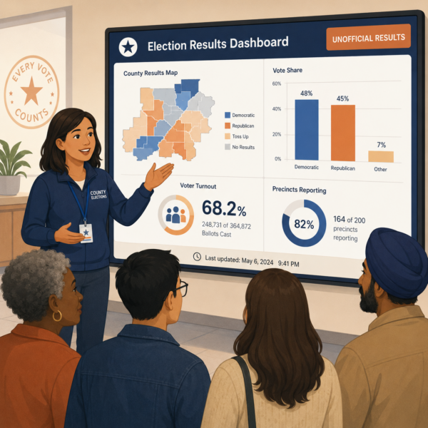 Election offices sometimes view the dashboard as the final step in reporting. The office gathers results, validates the feed, publishes the numbers, and updates as new information arrives. Operationally, that sequence makes sense. Publicly, though, the dashboard functions as something larger. It becomes the office’s most visible proof that results are being handled through an organized process. On election night, many people do not see the staff workflow, the controls behind uploads, the review steps, or the reporting checks. They see the dashboard. That means the dashboard often carries more trust weight than offices initially realize.
A results dashboard shapes confidence because it turns a complicated administrative process into a public-facing narrative. The narrative may not be written as prose, but viewers still read it that way. They look for signals of order. They notice whether the page feels current, whether labels are understandable, whether totals align across views, whether updates appear purposeful, and whether the office is helping them distinguish between early returns and broader reporting progress. When those signals are strong, the dashboard tells a story of institutional control. When they are weak, it can tell a story of uncertainty even if the underlying process is sound.
This is especially true because dashboards are not consumed in isolation. They are interpreted through stress, expectation, and comparison. Viewers may be looking at media coverage at the same time, comparing local results to state feeds, or reacting to fast-moving commentary online. In that environment, the dashboard cannot assume patient reading. It has to communicate core truths quickly and repeatedly. The results are unofficial. More ballots or precincts remain outstanding. Reporting will continue over time. Time stamps matter. Categories must be clear. The office cannot rely on viewers to infer these points from layout alone.
A trustworthy dashboard therefore performs two jobs at once. It publishes results, and it interprets the reporting process responsibly. That second job is often where trust is won or lost. If the office treats the dashboard as a neutral data container, it risks leaving the public alone with incomplete numbers and strong assumptions. If the office treats the dashboard as part of election-night communication strategy, it can guide interpretation before confusion hardens. That is why design choices on election night are never purely visual. They are part of how the office demonstrates transparency in real time.
Why Correct Data Can Still Produce Distrust
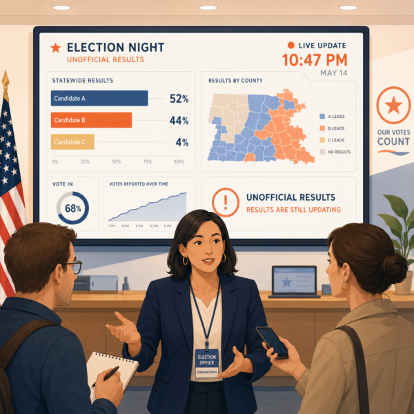
Election offices sometimes assume that if the numbers are correct, the dashboard is doing its job. Accuracy is essential, but on election night it is not enough by itself. Correct data can still produce distrust if the interface does not explain timing, status, scope, or reporting sequence clearly enough for ordinary viewers to understand what they are seeing. Incomplete interpretation often looks like incomplete credibility.
One common reason this happens is that election professionals and public viewers do not read results the same way. The office understands that early returns may reflect only certain ballot types, certain reporting units, or certain stages of processing. The public often sees a percentage, a lead margin, or a colored map and assumes those visuals represent the election more completely than they actually do. If the dashboard does not actively clarify what has been reported and what remains outstanding, it can unintentionally invite premature conclusions. Later updates may then appear suspicious rather than routine because the office did not prepare viewers for change.
Another reason distrust grows is that many dashboards communicate data more clearly than they communicate processes. They display totals, but not enough context. They show reporting percentages, but not what those percentages refer to. They present county or precinct maps, but not the cautions needed to interpret early-stage returns responsibly. They refresh numbers, but fail to make update timing obvious. In each case, the data may be accurate, yet the public still lacks the message architecture needed to understand it. The result is a dashboard that feels precise while remaining interpretively fragile.
There is also an emotional dimension to this problem. Election night audiences are not neutral viewers calmly studying a public database. Many are anxious, impatient, hopeful, skeptical, or primed by prior narratives about delay and legitimacy. Under those conditions, viewers notice ambiguity quickly. If the dashboard seems incomplete without explanation, the office may look unprepared. If labels feel technical or inconsistent, the office may look opaque. If the page does not clearly indicate when it was last updated, the office may look unresponsive. These judgments are not always fair to the underlying administration, but they are predictable, which means they must be designed for.
For election offices, the lesson is clear. Trustworthy dashboards do not emerge from data accuracy alone. They emerge from the combination of accurate reporting, clear explanation, disciplined labeling, visible update logic, and a public-facing structure that helps viewers understand what election-night results can and cannot yet tell them. When those elements are missing, even solid results reporting can be misread as instability. When they are present, the dashboard becomes a stronger tool for both transparency and trust.
Beyond the Ballot: Election Office Communication Strategies for County Clerks, Secretaries of State, and Boards of Election
This article is part of our series on strategic communication for Election Offices, Election Administration Agencies, and Boards of Elections. To learn more and to see the parent article, which links to other content just like this, click the button below.
Designing the Dashboard for Interpretation, Not Just Display
Trustworthy election-night dashboards do more than publish numbers. They help the public interpret what those numbers mean at each stage of the reporting process. This distinction matters because most viewers are not looking for raw data alone. They are looking for orientation. They want to know whether the results are early or mature, whether more updates are expected, whether certain ballot types are still being counted, and whether visible changes later in the night should be seen as normal. If the dashboard does not provide that context clearly, viewers often impose their own interpretation on incomplete information.
This is why dashboard design should begin with public meaning rather than visual features. Maps, charts, filters, and sortable tables can all be useful, but they should serve the office’s communication goals rather than drive them. A dashboard that looks sophisticated but leaves viewers uncertain about reporting status will not feel transparent. It will feel incomplete. By contrast, a simpler interface can build more trust if it explains the reporting process clearly and makes update logic visible.
Election-night dashboard design works best when it is organized around a few core truths the office wants every viewer to understand. Results are unofficial on election night. Different ballot types may be reported at different times. Reporting progress does not always move in a smooth or uniform pattern. Margins can shift as additional results are added. Updates occur through a process, not through constant uninterrupted motion. These points may seem obvious inside the office, but they are not obvious to every viewer, especially under election-night pressure. The dashboard should reinforce them repeatedly through structure, labels, and short explanatory language.
This is one reason the most important part of a results dashboard is often not the map or the table. It is the explanatory layer around those elements. A brief statement at the top of the page, a clearly visible timestamp, a plain-language note about what reporting percentages mean, and concise guidance about what remains outstanding can do more to build trust than another visual feature. These elements tell the public that the office understands the dashboard as a communication environment, not just a data portal.
Good dashboard design also accounts for the fact that viewers often scan before they read. They may see a headline race total, a reporting percentage, and a map color pattern before they notice any explanatory notes. That means the first visual signals on the page need to be disciplined. If the dashboard highlights a result without equally visible context about unofficial status or incomplete reporting, it may accidentally suggest more finality than the office intends. The problem is not the presence of headline numbers. It is whether those numbers are framed responsibly within the page’s overall communication system.
Another important principle is that the dashboard should reduce the amount of interpretation the public has to perform on its own. People should not need deep election administration knowledge to understand what the page is showing. If a reporting percentage refers only to precincts, but large categories of ballots remain outside that percentage, the office should say so clearly. If updates are expected in batches, the office should prepare viewers for that rhythm. If certain contests may lag because of local reporting patterns, the office should make that understandable in plain language. Trust grows when the office explains these realities before they are misread as irregularities.
Labels, Timestamps, and the Messaging Architecture of Trust
 Some of the most trust-shaping elements on an election-night dashboard are also the easiest to underestimate. Labels, timestamps, status language, and short explanatory notes may seem secondary compared with the vote totals themselves, but they often determine whether the public experiences the dashboard as credible. These small messaging choices are not decorative. They are the architecture that tells viewers how to read the page.
The clearest example is the timestamp. A results dashboard without a prominent, understandable update time can quickly feel unreliable, even if the underlying reporting process is functioning well. Viewers want to know whether the page is current, when the numbers were last refreshed, and whether more updates are likely. If that timing is vague, hard to find, or missing altogether, people may assume the office is slow, uncertain, or no longer actively managing the page. A visible timestamp does not solve every concern, but it reassures viewers that the office is maintaining a live public process rather than leaving them to guess.
Labels matter just as much. Election offices often use terms that are perfectly familiar internally but less clear to the public on a fast-moving election night. Words such as unofficial, reporting, complete, precincts in, ballots counted, or update posted may all carry specific operational meaning. The public may read them more loosely. That gap can create confusion quickly. A reporting percentage, for example, is only useful if the viewer understands what is being counted in that percentage. A total labeled unofficial is only helpful if the dashboard also explains what unofficial means in practice on election night. Good label design closes that gap by making the office’s meaning easier to follow.
This is where plain language becomes essential again. The office does not need to oversimplify. It does need to explain terms in ways that reduce assumption. If the page says unofficial results, it should also help viewers understand that election-night reporting is an ongoing process and that results will continue to be updated as more ballots or reporting units are added. If the page includes precinct reporting, it should clarify whether that measure reflects all votes expected in the contest or only one part of the reporting structure. Viewers should not have to infer these meanings from context alone.
Short explanatory notes are also critical because they help the office shape interpretation before confusion takes hold. A concise note about why margins may change, why some categories report later, or why certain contests may appear incomplete can do important preventive work. It keeps normal election-night developments from being misread as surprises. The most effective notes are brief, visible, and written in ordinary language. They do not overwhelm the page with process detail. They give viewers just enough context to interpret the numbers more responsibly.
Consistency across the page is another trust signal. If different parts of the dashboard use slightly different labels for the same idea, confidence can weaken quickly. A page that refers to updated results in one place, reported results in another, and complete results elsewhere may create uncertainty even if the data is correct. The office should sound like one institution using one clear vocabulary. That consistency helps viewers feel that the reporting process is organized and intentional.
These messaging details also matter because the dashboard will often be quoted, screen-captured, and discussed elsewhere without its full context. A timestamp, a label, or a short note may travel beyond the page itself through news coverage or social media screenshots. If those elements are clear, they help preserve meaning even when the dashboard is viewed indirectly. If they are weak or ambiguous, the office loses control of interpretation more quickly. In this way, dashboard messaging is not confined to the dashboard. It shapes how election-night reporting is understood across the wider information environment.
Election offices that design these elements carefully are doing more than improving usability. They are making their reporting process easier to trust. They are showing that transparency is not just about posting numbers quickly. It is about giving the public the tools to read those numbers accurately, calmly, and in context. On election night, that kind of disciplined messaging can be just as important as the data itself.
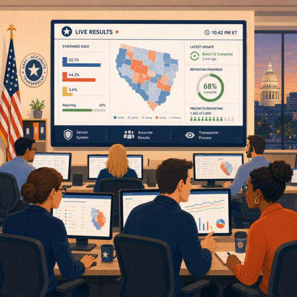
Maps, Charts, and the Risk of False Certainty
Election-night dashboards often lean heavily on visual elements because visuals help people scan quickly. Maps, bar charts, shaded counties, precinct tables, and reporting meters can all make results easier to follow. They can also create false certainty if they are not framed carefully. A map filled with color can look complete before the underlying reporting is mature. A chart with a visible lead can feel decisive before large categories of ballots are added. A reporting bar can imply near-finality even when the viewer does not understand what that percentage actually represents. In each case, the design may be technically correct while still encouraging the wrong public conclusion.
This is why election offices need to treat visual emphasis as a messaging choice, not just a layout choice. The more visually dominant an element is, the more likely viewers are to treat it as the main truth of the page. If the office highlights a county map but gives limited context about reporting status, many viewers will read the map as the story. If the office centers a candidate margin but downplays the fact that results remain unofficial and incomplete, viewers may interpret later movement as suspicious instead of expected. Visual clarity is important, but interpretive balance is even more important.
Maps are especially sensitive because they communicate emotional meaning very quickly. They can make a contest appear settled long before the office intends to signal that anything is settled. Large geographic areas also tend to carry more visual weight than dense population patterns, which means a map can exaggerate the sense of dominance or certainty if it is not paired with strong context. The office does not need to remove maps from the dashboard. It does need to make sure maps are presented as one view of early or ongoing reporting, not as a standalone conclusion.
Charts create a similar challenge. They are useful for showing race margins and comparative vote totals, but they can flatten the distinction between reported results and final outcomes if the dashboard does not clearly reinforce that the data is still developing. A well-designed chart should help people compare numbers. It should not quietly suggest that the story is complete. That is why trustworthy dashboards usually pair visuals with visible unofficial labels, strong timestamps, and plain-language notes that remind viewers what remains unknown.
Reporting Percentages and the Public Meaning of Incompleteness
Few dashboard elements create more confusion than reporting percentages. Election offices often understand exactly what a reporting figure means, but the public may not. A viewer may see ninety percent reporting and assume the contest is nearly final, even though that number may refer only to precincts, or only to one reporting stream, while large categories of ballots remain outside that measure. If the dashboard does not explain the scope of the percentage clearly, it can unintentionally create one of the most damaging election-night impressions, which is that later movement must be abnormal because the page earlier looked almost done.
That is why reporting percentages need explanation, not just display. The office should not assume that the label speaks for itself. It should help viewers understand what is being measured and what is not. If the percentage reflects precincts reporting, the page should make clear that this is not always the same thing as all ballots counted. If different ballot types arrive on different timelines, that reality should be visible in the page’s messaging architecture. The goal is not to overload the public with process detail. It is to prevent one number from carrying more certainty than it deserves.
This is also where incompleteness needs to be communicated as normal and structured rather than vague. A trustworthy dashboard helps viewers understand that election night is a reporting process, not a single moment of arrival. Results come in over time. Different contests may mature at different speeds. Some updates appear in batches rather than as constant movement. When the office makes that rhythm visible, incompleteness feels less like a gap and more like a known part of administration.
Election offices gain trust when they explain what remains outstanding with the same clarity they use to display what has already been reported. That might mean describing whether more precincts are expected, whether additional ballot categories remain to be processed, or whether the next update will follow a known schedule rather than a continuous refresh pattern. This kind of context reduces the chance that the public will interpret every pause, surge, or shift as a sign of instability.
In the end, reporting percentages are not just numerical aids. They are interpretive signals. If those signals are weak or ambiguous, the dashboard can look more certain than the office intends. If they are clear and responsibly framed, they help the public read election-night results with more patience and more trust. That is one of the most valuable things a results dashboard can do.
Update Cadence and the Importance of Visible Rhythm
Election-night dashboards build trust not only through what they show, but through how they change over time. Viewers quickly notice whether updates feel steady, explainable, and purposeful. If numbers change without clear timing, the dashboard can feel erratic. If the page appears frozen without explanation, it can feel abandoned. That is why update cadence matters so much. The office does not need to promise constant motion. It does need to make the rhythm of updates understandable.
A trustworthy dashboard helps viewers know when the page was last updated and what to expect next. If updates happen in batches, the page should prepare viewers for that. If results are posted after review steps rather than continuous feed movement, that should be made plain. The public usually tolerates waiting better than uncertainty. What creates frustration is not simply delay, but the feeling that no one has explained whether the process is moving or why the numbers have paused.
This is one reason visible rhythm is such an important communication tool. A clear timestamp, short update note, and consistent language about reporting flow can do a great deal to calm speculation. They help viewers understand that pauses, jumps, and refreshes are part of a controlled reporting process rather than evidence of disorder. That explanation becomes especially important when social commentary outside the dashboard is moving faster than the reporting itself.
Explanatory Notes That Prevent Misreading
The strongest election-night dashboards do not rely on numbers alone. They also use short explanatory notes to help viewers interpret what they are seeing before confusion takes hold. These notes should not overwhelm the page or bury the data. Their role is narrower and more strategic. They give just enough context to prevent common misunderstandings about unofficial status, incomplete reporting, later-arriving ballot categories, update timing, and normal shifts in margins.
This matters because election-night viewers often scan quickly and draw conclusions even faster. A brief note explaining that results remain unofficial, that additional ballots or precincts are still expected, or that updates occur in reviewed batches can do important preventive work. It reduces the chance that ordinary reporting patterns will be misread as irregularities. It also signals that the office is actively guiding the public through the process rather than merely posting numbers and leaving interpretation to others.
The most effective notes are plain, visible, and consistent with the rest of the dashboard. They should sound like part of the office’s public voice, not like legal disclaimers dropped into the page. Good explanatory language does not compete with the data. It helps the data remain trustworthy by giving viewers a better frame for reading it.
Accessibility and Cross-Device Clarity on Election Night
A results dashboard cannot build trust if large parts of the public struggle to use it. Election-night pages are often viewed on phones, laptops, tablets, assistive technologies, and shared screens in stressful, fast-moving conditions. That makes accessibility and cross-device clarity essential. A dashboard that works well only on a desktop monitor or only for highly experienced users is not fully serving its public role.
Clear headings, readable text, strong contrast, consistent labels, and simple navigation all matter here. So do mobile layouts that preserve meaning rather than forcing viewers to pinch, scroll excessively, or guess where critical information has gone. If timestamps, unofficial labels, explanatory notes, or contest status cues disappear or become hard to find on smaller screens, the dashboard may lose the very trust signals that matter most.
Accessibility also includes how information is structured for assistive technologies. If the page is visually polished but difficult to navigate with a screen reader or confusing when read aloud, then transparency is reaching some users more effectively than others. On election night, that gap matters. A trustworthy dashboard should make core information understandable across devices, across user needs, and across viewing conditions. That is not just a usability issue. It is part of how the office demonstrates fairness and public readiness in real time.
Strategic Communication Support for Election Offices
 Election-night dashboards are often treated as a publishing tool, but they are really a public-trust tool. They shape how voters, media, campaigns, and community observers interpret the office’s competence in real time. When the dashboard is clear, well structured, and well explained, it helps the public understand not only what the numbers show, but how the reporting process is unfolding. When it is poorly framed, even accurate results can produce confusion or distrust.
Because of these stakes, many election offices find that effective dashboard communication stretches beyond internal capacity or specialized expertise. Teams are often balancing multiple operational demands at once, and may not have the dedicated focus, external perspective, or specialized communication design experience needed to ensure the dashboard performs as a clear and trusted public-facing tool under pressure. For this reason, agencies often choose to partner with an external resource like Stegmeier Consulting Group (SCG) to strengthen clarity, reduce risk, and support public confidence during high-visibility reporting moments.
SCG helps election offices approach dashboard design as part of a larger communication system. That includes clarifying what viewers most need to understand on election night, improving labels and explanatory language, aligning dashboard messaging with the office’s broader reporting process, and making sure visual design supports trust rather than false certainty. This work helps offices move beyond simply posting numbers and toward building a results environment the public can follow with more confidence.
This support is especially valuable because dashboard communication has to do several things at once. It must be accurate, readable, timely, and calm under pressure. It must help viewers understand incomplete reporting without mistaking it for disorder. It must also hold together across devices, public commentary, and fast-moving election-night expectations. In that sense, trustworthy dashboard design is not separate from election readiness. It is one of the clearest ways readiness becomes visible.
Future Trends in Election-Night Results Dashboards
Election-night dashboards are likely to become more explanation-driven and less dependent on raw display alone. The public increasingly expects results pages to show not only numbers, but also enough context to understand what those numbers mean and what remains incomplete. This will likely push offices toward stronger message architecture, clearer update logic, and more visible guidance about unofficial status, reporting sequence, and later-arriving results.
Another likely trend is greater emphasis on mobile clarity and accessibility. More viewers now follow election-night results on phones or through shared links, screenshots, and social posts. That means timestamps, explanatory notes, reporting labels, and contest status cues will need to remain visible and understandable even in compressed formats. Dashboards that lose clarity on smaller screens will have a harder time sustaining trust.
Election offices may also invest more in designing dashboards as part of a broader public communication strategy. Instead of treating the page as a standalone data product, they are likely to connect it more tightly to spokesperson language, media briefings, social updates, and public education about what election-night reporting does and does not mean. That shift will matter because trust increasingly depends on whether the office can make results legible across the full information environment, not just on one webpage.
Conclusion
Results dashboards people trust are not built through visual polish alone. They are built through the combination of accurate reporting, clear labels, visible update logic, explanatory context, and a structure that helps viewers interpret incompleteness responsibly. On election night, the dashboard becomes one of the most visible expressions of whether the office appears organized, transparent, and in control of the reporting process.
That is why dashboard design should be treated as a communication responsibility as much as a technical one. The public does not simply need numbers. It needs help understanding what those numbers represent, what remains outstanding, and why shifts over time are often a normal part of election-night reporting. When offices provide that guidance clearly, the dashboard becomes more than a results page. It becomes a stabilizing tool in a high-pressure public environment.
In the end, trustworthy dashboards help election offices do something larger than display returns. They help make the reporting process understandable. That strengthens confidence not because the office asks for trust, but because it shows the public how to read the process more clearly in real time.
SCG’s Strategic Approach to Communication Systems
Align your agency’s messaging, processes, and public engagement strategies
Election offices need communication systems that hold up under pressure, especially when the public is watching results unfold in real time. Whether your office is refining election-night dashboards, improving results messaging, standardizing explanatory language, or strengthening how reporting updates are communicated across channels, SCG can help you build a communication framework that supports clarity, consistency, and public trust.
Use the form below to connect with our team and explore how a strategic communication system can strengthen your election-night reporting and voter confidence.