Designing Election Office Websites Around Voter Questions, Not Agency Structure
Most voters do not arrive at an election office website wanting to understand the office’s internal structure. They arrive needing to complete a task, confirm a requirement, or solve a problem quickly. They want to register, check their status, find a polling place, confirm ID rules, track a ballot, or learn how and when to vote. When a website is organized around departments, divisions, or agency terminology instead of those voter tasks, the voter has to do extra interpretive work before getting an answer. Federal plain-language guidance says public content should be written for its specific audience, and the U.S. Election Assistance Commission’s 2026 design resource defines election materials, including online voter information materials, as communication products that should be clear, understandable, accessible, and usable.
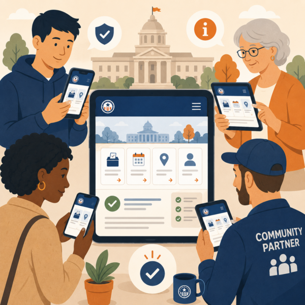
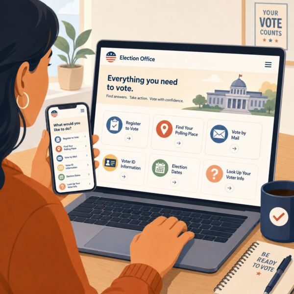
Election office websites work best when they function like decision tools rather than digital filing cabinets. The National Association of Secretaries of State’s Can I Vote site is a strong public example of this approach. It was created by state election officials to help eligible voters figure out how and where to vote, and it organizes the experience by practical tasks such as registering, checking registration status, finding a polling place, checking valid forms of ID, and learning about absentee and early voting. That structure matters because it reflects how voters think when they are trying to act.
This article provides an evergreen communication framework for election offices that want to design websites around voter questions instead of agency structure. It focuses on task-based navigation, plain-language page design, source-of-truth discipline, and the difference between a site that publishes election information and a site that actually helps voters find what they need on the first try. The EAC’s current design guidance specifically says that information design should use plain language, hierarchy, and structure to organize content, and that usability, clarity, and accuracy can make the difference between successful communication and confusion.
Voters Come to the Website With Tasks, Deadlines, and Friction
 Election office websites often underperform because they are built from the inside out. They reflect the agency chart, the office’s internal ownership of content, or the way election professionals divide responsibilities. Voters do not experience the site that way. They experience it from the outside in, usually while trying to complete something under time pressure. They may be checking registration after a move, looking up at a polling place on the way to vote, trying to understand mail ballot instructions, or confirming whether identification is required. If the website makes them translate those needs into the office’s internal structure, the site adds friction at exactly the wrong moment. Federal plain-language guidance emphasizes writing and designing for the audience’s understanding, and the EAC’s 2026 design resource specifically identifies “knowing your audience” and using hierarchy and structure to organize content as core design principles.
This is one reason task-based election websites feel more trustworthy than structurally organized ones. A voter who can quickly find “Find Your Polling Place” or “Valid Forms of ID” experiences the office as clear and prepared. A voter who must guess whether those answers live under Elections Division, Voter Services, Voting Information, Administration, or Resources experiences the office as harder to navigate than it needs to be. Can I Vote demonstrates the public value of task-first organization by presenting major voter needs as direct categories instead of as institutional content silos.
Friction also builds when the website treats all information as equally important. Many election sites still rely on long menu structures, dense page groupings, or news-style posting patterns that make urgent voter tasks compete with lower-priority content. The EAC’s design guidance says that information design should prioritize usability, clarity, and accuracy, and its resource page notes that even implementing one or two design improvements can be impactful. In practical terms, that means a voter’s highest-value tasks should be easier to find than organizational detail, archived materials, or niche administrative content.
Task-based design also helps under conditions of stress. Election periods create compressed decision windows, and the website often becomes the office’s most visible public touchpoint. If the navigation is built around the voter’s job rather than the office’s chart, the site becomes easier to use on mobile, easier to scan quickly, and easier for community partners, media, and staff to reference consistently. The EAC’s design framework explicitly includes online voter information materials as one of the major categories election officials should design well, which reinforces that the election website is not just an archive. It is a frontline voter communication tool.
Beyond the Ballot: Election Office Communication Strategies for County Clerks, Secretaries of State, and Boards of Election
This article is part of our series on strategic communication for Election Offices, Election Administration Agencies, and Boards of Elections. To learn more and to see the parent article, which links to other content just like this, click the button below.
Define the Website as a Question-Answering System, Not a Content Repository
Election offices communicate more effectively online when they define the website as a question-answering system. The site should help voters answer the most common practical questions quickly, then move to fuller detail only when needed. That is different from treating the website as a place where every office document, announcement, and resource simply gets posted and stored. The EAC’s design guidance describes effective election materials as grounded in information design best practices and highlights plain language, hierarchy, and structure as core tools for helping people understand and use information.
A question-answering system starts by recognizing what voters most often need in real life. They need to know whether they are registered, where they vote, what ID rules apply, how to vote early or by mail, what to bring, and where to get help. The Can I Vote site shows the value of this approach by organizing its public interface around exactly those kinds of voter needs. That model does not replace local election office websites, but it does illustrate a stronger organizing principle than agency structure alone.
This approach also aligns with federal plain-language expectations. Digital.gov’s plain-language guide states that public content should be clear and easy to understand, that it should be written for its specific audience, and that design should support understanding. That means election office websites should not expect voters to decode procedural vocabulary, navigate by internal program names, or read multiple pages before finding the answer to a basic voting task.
A better model is to place major voter tasks and questions at the top of the experience, then use structure to support deeper exploration for those who need more detail. That does not mean eliminating all institutional content. It means ranking content by public utility. The website should first answer the voter’s practical question, then explain the policy or procedure behind it if needed. The EAC’s design guidance makes clear that usability and clarity are central to successful election communication, which is exactly why the site’s organizing logic matters so much.
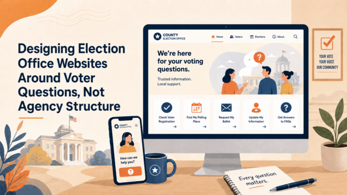
Organize the Homepage Around the Top Voter Tasks
An election office homepage should behave like a starting point for action, not like a summary of the agency. The most important voter tasks should appear first and visibly. Official election design guidance from the U.S. Election Assistance Commission says election materials, including online voter information materials, should be clear, understandable, accessible, and usable, and it highlights hierarchy and structure as core design principles. Can I Vote provides a strong public model by leading with direct voter tasks such as registering, checking registration status, finding a polling place, and checking ID requirements.
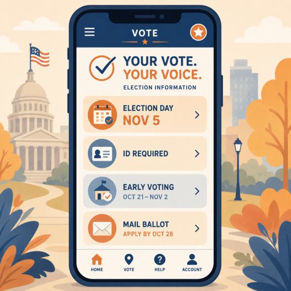
For most election office websites, the homepage should quickly route people to a short set of high-demand actions. These usually include registering to vote, checking registration, finding where to vote, learning how to vote by mail or early, checking voter ID rules, and getting election dates and deadlines. When those tasks are buried under department names, board information, or general news, the site makes the voter work harder than necessary. Plain language guidance for public content stresses writing and designing for the audience’s real needs, and the EAC’s design guidance similarly centers usability rather than organizational completeness.
This does not mean every homepage must look identical. It means the homepage should answer the voter’s first practical need before it presents the office’s internal structure. Agency information can still exist, but it should not compete with high-urgency voter tasks. A voter trying to verify a polling place or registration record should not have to think like a staff member to find the answer. Can I Vote’s task-first structure is useful here because it shows how a voter-facing election service can stay simple while still routing users to the right official source.
Use Public Labels, Not Internal Office Terms
Navigation labels should sound like what voters say, not like what the office says internally. “Find Your Polling Place” is clearer than “Precinct Locator Services.” “Check Registration Status” is clearer than “Voter File Inquiry.” “Voting by Mail” is clearer than “Absentee Ballot Administration.” Can I Vote consistently uses plain public labels like these, which helps users understand the task before they click. Federal plain-language guidance likewise says content should be written for its specific audience, and the EAC’s design materials emphasize understandable communication.
This matters because navigation language shapes confidence. A voter who sees familiar task wording feels that the office understands what people actually come to the site to do. A voter who sees internal program names has to interpret the office before using the office. That extra step adds friction, especially on mobile devices or during time-sensitive moments. The EAC’s design guidance and voter education materials both support plain-language, audience-centered communication, which makes public task labels a stronger default than internal terminology.
Group Related Tasks the Way Voters Think About Them
Voters do not always think in isolated categories. They often think in sequences. A recently moved voter may want to register or update information, then check registration status, then confirm where to vote. A first-time voter may want to know what to bring, where to go, and whether early or absentee voting is available. A useful homepage helps people move through these related tasks without forcing them back to the beginning each time. Can I Vote’s structure shows this logic clearly by presenting related voting tasks as distinct but connected entry points.
That kind of grouping also makes the site easier for staff, partners, and local media to reference. When the office can say “use the Register to Vote section” or “go to Find Your Polling Place,” the direction is clearer than pointing people toward a department page or a news archive. The EAC’s design guidance and plain-language resources both support organizing public information around understandability and practical use, not just around institutional ownership.
Build the Homepage as a Voter Entry Point, Not a Departmental Directory
A homepage should help voters start, not browse aimlessly. That means it should prioritize a small number of clear pathways instead of presenting every office division, publication type, and update category at equal weight. The EAC’s design resource says hierarchy and structure should organize content so people can understand and use it, and Digital.gov’s plain-language guidance similarly emphasizes designing for the audience’s understanding.
A stronger homepage usually gives prominent space to the highest-value actions, then uses secondary navigation for deeper content. News, board agendas, procurement notices, campaign finance materials, or administrative resources may all matter, but they should not crowd out the voter’s immediate path to voting information. This is especially important close to major deadlines and on mobile devices, when voters are most likely to visit with a narrow task in mind. Can I Vote succeeds in part because the entry experience is simple and action-oriented rather than directory-oriented.
A voter-centered homepage also benefits from visible “right now” information when timing matters. Registration deadlines, election dates, early voting windows, polling place lookup, and absentee or mail voting options should be easier to find than internal agency pages. The EAC’s design resources and voter education materials both support making important public information easier to locate and use, not merely available somewhere on the site.
Write Page Titles and Openings Around Real Voter Questions
 Election office web pages are easier to use when the page title tells the voter exactly what answer is waiting there. A title such as “Check Your Registration Status” performs better than “Voter Registration Services” because it reflects the task the voter came to complete. Federal plain-language guidance says public content should be written for its specific audience, and the EAC’s design resource emphasizes plain language, hierarchy, and structure so people can understand and use election information quickly.
The opening lines of a page matter just as much as the title. Many election pages begin with office-centered language, policy framing, or background explanation before telling the voter what to do. A stronger opening starts with the voter’s immediate need and then moves to detail. For example, a polling place page should begin by helping the voter find the correct location, while a voter ID page should begin by telling the voter where to verify accepted forms of identification in that jurisdiction. This approach matches the structure used by Can I Vote, which leads with direct voter tasks and then routes users to state-specific official information.
This kind of page writing also reduces the burden on mobile users and deadline-driven visitors. A voter checking a site on the way to work or while standing in line does not need a long introductory paragraph that explains the mission of the office. That voter needs a clear answer path at the top of the page. The EAC’s design guidance specifically treats online voter information materials as a design category that should be clear, understandable, accessible, and usable, which supports writing page openings for fast comprehension rather than formal completeness.
Use the Voter’s Language in Page Names and Headers
Page names and headers should reflect the words voters are most likely to use when searching or scanning. “Find Your Polling Place,” “Register to Vote,” “Voting by Mail,” and “Valid Forms of ID” are easier to understand than labels built from office terminology. Can I Vote uses exactly this kind of public-facing language, which is one reason it works so well as a voter entry point.
This is not only a style preference. It is a usability choice. When page labels match the voter’s mental model, people find information faster and trust the site more. PlainLanguage.gov states that public content should be created so the specific audience understands it, and the EAC’s design materials reinforce that usability and clarity are central to successful election communication.
Put the Action Link Near the Top of the Page
A voter should not have to read several paragraphs before reaching the tool or link that actually answers the question. If the page exists to help someone check registration, find a polling place, or review early voting options, the action link or lookup path should appear near the top. Can I Vote pages consistently put the state-selection or action step close to the opening text, which helps users move from question to task quickly.
This structure is especially important for pages that serve as source-of-truth destinations during election periods. The page should still contain supporting explanations, but the first screen should help the voter act. The EAC’s design resource and plain-language guidance both support this kind of action-first structure because it reduces interpretive work and makes the content easier to use under time pressure.
Protect Source-of-Truth Pages and Design for Mobile, Deadlines, and Stress
Election office websites often have a few pages that matter far more than the rest during active election periods. Registration lookup, polling place lookup, early voting information, absentee and mail ballot guidance, voter ID requirements, and election dates become source-of-truth pages for voters, staff, media, and community partners. Those pages should be easier to find than organizational background pages, archived news, or lower-priority content. Can I Vote’s structure shows this priority clearly by centering high-demand voter tasks rather than giving them equal weight with everything else.
Protecting those pages also means resisting the tendency to bury updates inside press releases or news posts. A voter looking for an early voting site, a deadline, or a current rule should not have to infer that the latest answer is hidden in a dated announcement. The EAC’s design guidance emphasizes hierarchy and structure, which means critical voter information should have stable homes on the site even when new developments occur.
Mobile use raises the stakes further. Many voters will reach the website from a phone while traveling, waiting, or preparing to vote. Long introductions, crowded menus, and buried tools become even harder to use on a small screen. The EAC’s design framework explicitly includes online voter information materials and usability as core concerns, which supports keeping the most important voter actions visible and reachable with minimal scrolling or interpretation.
Deadline pressure changes behavior as well. Near registration cutoffs, early voting windows, and Election Day itself, voters visit with narrower goals and less patience. A homepage or landing page that works reasonably well in a quiet month may fail badly under deadline conditions if it does not surface the right information immediately. Plain-language guidance and the EAC’s design materials both support designing for the audience’s real context of use, and election websites should assume that many visitors are arriving under time pressure.
The strongest election office websites therefore act like calm triage systems during busy periods. They help the voter identify the task, reach the right source-of-truth page quickly, and complete the next action without guessing where the answer lives. That is a different philosophy from agency-structure design, and it is much closer to the voter-centered approach modeled by Can I Vote and encouraged by current EAC design guidance.
Promoting Long-Term Election and Voter Confidence Through Voter-Centered Website Design
A voter-centered election website does more than make one task easier in one election cycle. It helps the public build a stable habit of turning to the election office for clear, official answers. The National Association of Secretaries of State’s Can I Vote site is explicitly built to help eligible voters figure out how and where to vote, and NASS’s #TrustedInfo2026 initiative promotes election officials as the trusted sources of election information. That combination matters because a task-based site teaches voters that official election information is meant to be usable, not merely posted.
This kind of design also reduces repeat confusion. When pages are organized around real voter tasks such as registering, checking registration status, finding a polling place, voting early, or reviewing ID rules, voters do not have to relearn the site every time they return. The EAC’s design resource specifically says election materials, including online voter information materials, should be clear, understandable, accessible, and usable, and it identifies hierarchy and structure as core design principles.
Operationally, stronger website design lowers pressure on staff. A site that answers common voter questions clearly can reduce preventable calls, repeated email inquiries, and confusion-driven complaints because people can solve more problems on their own. Federal plain-language guidance says public content should be written for its specific audience so that audience understands it, and Digital.gov defines plain language as communication that is clear and easy to understand for the target audience. Those principles support a website model that is built for voter use rather than office convenience.
There is also a trust benefit during high-attention periods. When registration deadlines, early voting windows, mail ballot questions, polling place lookup, and ID requirements all have stable, easy-to-find source-of-truth pages, the office is less dependent on scattered announcements or dated news posts to carry critical information. The EAC’s design resource is presented as a blueprint for creating clear communication materials across printed voter information, online voter information, polling place materials, ballots, mail voting materials, and post-election materials, which reinforces that website clarity is part of the broader public confidence system.
Voter-centered design also improves accessibility in a broader sense. A site that uses familiar labels, clear hierarchy, and straightforward page openings is easier to use on mobile devices, easier to scan under deadline pressure, and easier for community partners or local media to reference accurately. The EAC’s 2024 best-practices guide for voter education materials says those materials should be grounded in plain language, information design, and user testing, which supports treating the website as a practical user experience rather than an internal content map.
Strategic Communication Support for Election Offices and Voter Services Teams
 Election offices often have accurate information online, but that does not always mean the website is organized in a way voters can use quickly. A site may contain the right deadlines, lookup tools, and voting rules while still forcing users to navigate by agency structure, internal terminology, or scattered content types. The EAC’s design guidance makes clear that usable election communication depends on plain language, hierarchy, and structure, not just on whether the information exists somewhere on the site.
That is why agencies often choose to partner with an external resource like Stegmeier Consulting Group (SCG) to strengthen communication systems. SCG supports election offices, boards of elections, clerks, and voter services teams by helping them build task-based homepage structures, clearer page titles and openings, stronger source-of-truth pages, simpler navigation labels, and more consistent website architecture so voters can move from question to answer with less friction. This kind of work aligns closely with the EAC’s current design blueprint and with federal plain-language guidance focused on user understanding.
SCG can also help offices identify where voters are most likely to get lost, simplify high-demand digital journeys such as registration lookup or polling place lookup, and connect website content more effectively to partner outreach, FAQs, and staff guidance. Those practices help reduce confusion, improve trust in official information, and make the election office website feel like a voter service tool rather than a digital org chart.
Future Trends in Voter-Centered Election Website Design
Election offices will likely continue shifting away from websites organized around agency structure and toward websites built around voter tasks, deadlines, and decisions. More offices will likely recognize that voters come to the site to complete something quickly, not to understand the office chart, and that a task-based homepage can reduce confusion before it turns into distrust or missed action.
Another likely trend is stronger use of source-of-truth pages designed for high-demand voter questions. Offices will increasingly benefit from giving major topics such as registration status, polling place lookup, early voting, voter ID requirements, mail ballot guidance, and election dates their own stable, easy-to-find pages rather than scattering updates across announcements or departmental sections. That shift will matter because voters, staff, media, and community partners all need one clear place to verify current information when timing becomes urgent.
Election offices may also connect website design more closely to mobile use, deadline pressure, and repeatable public language. Instead of relying on dense page openings, internal terminology, and layered menus, more offices will likely use simpler page titles, clearer action links near the top, and more consistent voter-facing labels across websites, FAQs, staff guidance, and partner materials. That change will matter because a voter-centered website works best when it feels less like a digital filing cabinet and more like a practical tool for getting the next step right on the first try.
Conclusion
Election office websites work best when they are built around what voters need to do, not around how the office organizes itself internally. Federal plain-language guidance says public content should be written for its specific audience so the audience can understand and use it, and the Election Assistance Commission’s current design resource defines online voter information materials as election communication products that should be clear, understandable, accessible, and usable.
That means the strongest sites make major voter tasks easy to find, use public-facing labels instead of internal office terms, and protect source-of-truth pages for the questions people ask most often. The Can I Vote site created by state election officials illustrates this task-first approach by organizing around actions such as registering, checking registration status, finding a polling place, and reviewing voting options.
The goal is not simply to publish election information online. The goal is to help voters reach the right answer quickly, especially on mobile devices and under deadline pressure. Election offices that design their websites around voter questions reduce repeat confusion, lower avoidable staff burden, and strengthen public trust in the office as the official place to verify what is true and what to do next.
SCG’s Strategic Approach to Communication Systems
Align your agency’s messaging, processes, and public engagement strategies
Stegmeier Consulting Group (SCG) helps election offices build communication systems that make digital voter information easier to find and easier to use. For election office websites, that can include task-based homepage structure, clearer navigation labels, stronger source-of-truth pages, simpler page openings, and more consistent coordination between website content, FAQs, partner messaging, and staff guidance.
SCG also supports governance and operational coordination so websites, voter service language, public updates, and support channels work together as one coherent public information system. Use the form below to connect with our team and explore how a strategic communication framework can elevate your agency’s impact.