Detours and Stop Relocations Without Confusion: Map-First Messaging for Urban Transit
Detours and stop relocations are routine in urban transit. Road work, special events, utility repairs, emergencies, and capital projects can force routes to shift with little warning. Riders can tolerate detours. What they struggle with is uncertainty. When messaging is unclear, riders show up at the wrong stop, miss trips, crowd at closed locations, and flood customer service channels with the same questions.
Map-first messaging is one of the most practical ways to reduce confusion. Riders do not want long explanations. They want to know where to board, where the bus will go instead, and how to reach the correct temporary stop safely. A clear map, paired with short plain-language guidance, can turn a frustrating detour into a manageable change.
Map-first does not mean map-only. Many riders will glance at a map and still need a single sentence that confirms what to do next. Others rely on text, audio announcements, or staff direction. The goal is to create one coherent decision-support message that works across channels and that stays consistent from the first alert to the final day of the detour.
This article provides an evergreen framework for detours and stop relocations without confusion, using map-first messaging tailored for urban transit. It focuses on how to design maps that riders can use on phones, how to write short guidance that prevents misinterpretation, how to keep labels consistent across channels, and how to maintain trust through time stamps and predictable updates.
Why Detour Messaging Breaks Down in Cities
 Urban detours are difficult because the environment is complex. Stops are close together, streets have one-way patterns, and riders may be navigating crowded sidewalks, construction barriers, and unfamiliar intersections. If messaging is not precise, riders can easily interpret it in multiple ways.
Detour messaging also breaks down when agencies rely on text-heavy descriptions. Street-by-street directions are hard to scan and easy to misread, especially on a phone. Riders often need a visual cue to understand the shape of the detour and the new boarding location.
Another common failure is inconsistent labeling. A temporary stop may be described using a cross street in one channel, a landmark in another, and a stop ID in another. Riders then cannot match what they read to what they see. Inconsistent labels also cause staff to improvise, which multiplies confusion.
Timing issues compound the problem. Detours often change. A stop relocation may move again due to construction phasing. If updates are not time-stamped and “what changed” is not stated clearly, riders will rely on outdated screenshots or old posts. That is how misinformation spreads during routine detours.
Finally, detour messaging can break down due to missing accessibility and safety guidance. A relocation might require crossing a busy street or navigating around barriers. If alternate accessible routes are not described clearly, riders who need them face disproportionate risk and frustration.
Riders Decide Visually, Then Confirm With One Sentence
Most riders do not read long instructions when they are in motion. They look for a visual pattern. Where is the stop now? Which direction will the bus go? What is the nearest boarding point? A map answers these questions quickly.
After the visual, riders need confirmation. A one-sentence instruction that states the action step removes doubt. For example, directing riders to board at a specific temporary stop and naming a clear reference point. This sentence prevents the common failure where riders misinterpret the map or assume they can still board at the original stop.
A visual-first, sentence-confirmed approach also reduces conflict with staff. Riders arrive at the correct place more often, and staff spend less time redirecting confused riders.
The Biggest Confusion Points Are Naming, Not Geometry
Most detours are easy to draw. The hard part is naming things consistently. If the temporary stop is not labeled clearly, the map is less useful. If the stop name differs between the map and the app, riders lose confidence.
Naming confusion also arises when agencies use internal stop IDs or technical route descriptors that are not visible in the environment. Riders need names that match signage, streets, and landmarks.
Consistent naming should therefore be treated as part of the detour plan. If the agency cannot name the temporary stop clearly and consistently, it should not expect riders to find it reliably.
From Detours to Understanding: Effective Communication Strategies for Transportation Agencies to Improve Safety and Drive Behavioral Change
This article is part of our series on strategic communication for Transportation Agencies, Transit Authorities, and Public Works departments. To learn more and to see the parent article, which links to other content just like this, click the button below.
Define Map-First Messaging as Decision Support, Not Illustration
Map-first messaging works when the map is designed as a decision tool. The map must show what changed, where to go, and how to reach the correct boarding point. It should prioritize the rider action, not the engineering detail.
A map-first approach also requires a stable message spine. The spine includes the impact statement, the time window, the affected stops, the new boarding location, the detour path, and the verification path. The map is the central artifact, but the spine ensures the message remains consistent across channels.
A map-first message should also be designed for mobile use. Riders will often see it in a social post, an alert link, or a web page on a phone. Maps must be readable at small sizes and should avoid clutter.
Finally, map-first messaging must include an accessible alternative when needed. If the relocated stop changes the accessible path, the map and text should show the accessible route clearly, not as a footnote.
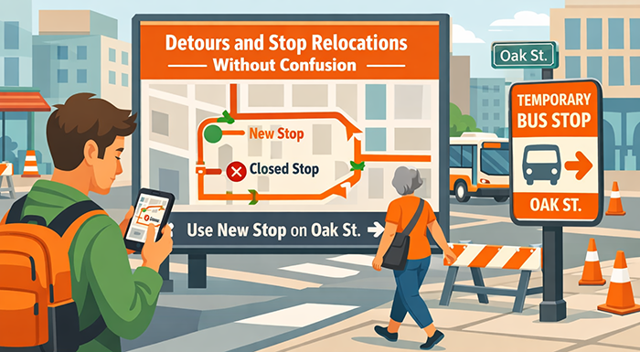
What to Publish: The Map Package Riders Can Use Quickly
Map-first messaging works best when agencies publish a consistent map package, not a one-off graphic. A map package includes a primary map that shows the detour shape and the boarding change, a simple zoomed view for the stop relocation area, and a short text block that confirms the rider action step. This combination supports fast scanning on mobile while still providing enough detail for riders who need to orient themselves.
The primary map should show the detour route, the affected segment, and the key decision points. It should make the new boarding location unmistakable. It should also show the closed stop with a clear marker so riders understand the change. The zoomed view should focus on the immediate walking environment around the temporary stop. It should include cross streets, a small number of landmarks, and a clear boarding marker.
The text block should be short and consistent across channels. It should state what to do, where to go, and how long the change lasts. It should also include a time stamp and a verification path. Riders rely on time stamps to avoid outdated detour screenshots. A published “last updated” line reduces misinformation and repeat contacts.
For longer detours, the package should include a phase indicator. Construction detours often shift. A phase label, paired with “what changed,” helps riders understand whether they are seeing the current version.
Use One Map Standard. One Color Logic, One Symbol Set, One Label Style
Urban detours create confusion when each map looks different. A consistent standard builds recognition. Riders learn the agency’s map language and can interpret changes faster.
A map standard can define how closures are shown, how temporary stops are shown, and how the detour path is shown. It can define how direction is indicated and how walking routes are represented. It can also define a limited set of icons so the map stays readable at small size.
Label style matters as well. Use one naming convention for temporary stops and keep it consistent across the map, the app, and signage. Avoid internal stop IDs as the primary label. If an ID is needed, it can be secondary.
Consistency also improves partner sharing. Community organizations and local institutions can repost maps without rewriting labels. That reduces drift and preserves meaning.
Publish a Short Text Companion That Matches the Map Exactly
A map alone can be misread, especially on a phone. A short text companion reduces ambiguity. It should be one to three short paragraphs, written in plain language, that confirms the boarding change and the time window.
The text should repeat the temporary stop name exactly as it appears on the map. It should also name the cross streets or landmarks used on the map. This prevents the common failure where the map uses one cue and the text uses another.
The companion should include the time stamp, the “what changed” line when updates occur, and the verification path. It should also include a help route for riders who cannot find the stop.
Consistency between map and text is one of the strongest ways to reduce confusion and repeat contacts.
How to Design Maps That Work on Phones and in the Street
Most riders will see detour maps on a small screen, then try to use them in a crowded, changing street environment. A map that is technically accurate can still fail if it is visually cluttered or missing the cues riders use to orient themselves.
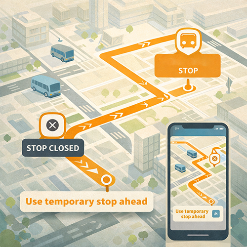
Mobile maps should be simple and bold. They should show only the elements necessary to make the decision. Too many street labels, too many route lines, and too many symbols reduce readability. A detour map should prioritize the closed stop marker, the new boarding marker, and the detour path. Everything else is supporting detail.
Maps should also include a small orientation cue, such as a north arrow and a “you are here” reference when appropriate. In many cases, the best orientation cue is a clear landmark label, such as a major intersection, a station entrance, a civic building, or a well-known corridor.
Walking guidance should be clear but minimal. If the temporary stop requires a specific walking route due to barriers or unsafe crossings, the map should show the preferred walking path. If walking is straightforward, the map can avoid drawing every pedestrian movement and instead focus on the relocation point.
Finally, maps must match reality. If a temporary stop sign is placed at a specific corner, the map should match that corner. If barriers or fences change the walking route, the map should be updated promptly and time-stamped.
Keep the Map Tight. Show the One Block That Matters
A detour map should focus on the area where riders decide what to do. That is often one or two blocks. A wide-area map may show the detour shape but can hide the details riders need to find the new stop.
A tight map makes the boarding point visible. It reduces noise and helps riders understand where to stand. It also improves readability on mobile.
If the detour is long, agencies can use a two-map approach. One map shows the corridor-level detour shape. The second map shows the stop-level relocation detail. This keeps each map readable.
Tight maps also reduce misinterpretation. Riders are less likely to assume they can board at the original stop when the relocation is visually dominant.
Use Landmarks and Cross Streets That Riders Can Recognize
Riders orient using visible cues. Cross streets, station entrances, major buildings, and common retail anchors can help riders match the map to the environment. The goal is to reduce the need for interpretation.
Landmarks should be chosen carefully. They should be stable and likely to be recognized. They should also be limited in number so they do not clutter the map.
Cross street labeling should be consistent with signage. If the temporary stop sign uses a street label, the map should use the same label. Alignment between map and physical cues is essential for trust.
This approach supports visitors and occasional riders. It also supports riders who are moving quickly and do not have time to read long text.
Write Map-First Copy That Prevents Misinterpretation
Map-first messaging still needs strong writing. The text should be short, consistent, and action-oriented. It should confirm what changed, what riders should do now, and how long the change lasts. It should also be designed to survive sharing, since detour posts are often screenshot and reposted without context.
A reliable text structure includes five elements. The impact statement, the affected stop or segment, the new boarding location, the time window, and the verification path. This structure keeps the message practical and prevents drifting into long explanations that riders will not read.
Language should be plain and concrete. Avoid technical terms like “temporary relocation of boarding activity.” Use direct language that states where to board and where not to board. Clarity reduces the most common error, which is riders waiting at the closed stop because the message sounded optional.
The copy should also include a short “if you are already at the stop” line for high-impact relocations. That line can tell riders where to walk and what to look for. This reduces last-minute panic and reduces conflict with staff.
Finally, the copy should include a time stamp and a “what changed” line when updates occur. That practice reduces misinformation because riders can verify whether a post is current.
Use Action Verbs and Avoid Conditional Language
Detour messaging becomes confusing when it sounds tentative. Riders interpret “may” and “might” as optional. Use clear action verbs such as “Board at,” “Use,” and “Walk to.” State closures directly, such as “Do not board at” or “Stop closed.”
Action language should also be specific. Name the temporary stop and include the cross street or landmark that appears on the map. Avoid generic phrasing like “nearby stop” unless it is tied to a clear label.
This approach also supports staff. Staff can repeat the same action language consistently. Consistency reduces escalations and repeat contacts.
Clear action language does not require harsh tone. It can be calm and respectful while still being direct.
Use a Short “What Changed” Line to Keep Updates Scannable
When detours shift, riders need to know what is new. A “what changed” line can state the change in one sentence, such as a new boarding corner, a changed detour path, or an extended time window.
This line should appear near the top, after the time stamp. It should be consistent across channels so riders learn where to look for it.
A “what changed” line also prevents fatigue. Riders stop reading repeated messages if they cannot tell what is different. Clear change lines keep attention focused on the new information.
This practice also reduces misinformation because older screenshots are easier to identify as outdated.
Keep Labels Consistent Across Map, App, Signs, Alerts, and Staff Scripts
 Detour confusion is often caused by label drift. The map uses one name, the app uses another, the sign uses a third, and staff use a fourth. Riders then lose confidence and assume the agency is disorganized.
Consistency requires a label system. Temporary stops should have a standard naming pattern and that pattern should be used everywhere. If the agency uses stop IDs internally, the public-facing label should still be the same across channels and visible on the temporary stop sign.
Consistency also requires coordination with digital tools. If the app shows the old stop name during the detour, riders will go to the wrong place. The detour map and the trip planner must match. When they do not, customer service contacts spike and trust declines.
Signs must also match maps. A common failure is placing a temporary stop sign in a slightly different location than the map indicates. That small mismatch can cause large confusion, especially in dense environments. Field validation should be part of the detour workflow.
Staff scripts should reinforce the same labels. Operators and station staff should not invent new descriptions. They should use the exact temporary stop name and the same landmark cues used on the map.
Create a Temporary Stop Naming Convention That Works Citywide
A citywide naming convention reduces confusion across multiple detours. Riders learn the pattern and can interpret temporary stop names more quickly.
The convention should be short and readable. It should include the route, direction when needed, and a clear location cue such as a cross street. It should also avoid long phrases that do not fit on signs.
The convention should be used in maps, alerts, trip planners, and signage. If one system cannot display the full name, the shortened version should still match in core meaning.
Consistent naming also supports accessibility and multilingual communication. Stable labels translate more reliably and are easier to communicate in audio announcements.
Validate On the Ground and Update Fast When Reality Shifts
Urban environments change quickly. A construction barrier can move. A curb lane can be closed. A corner can become unsafe to stand on. When conditions shift, maps and text must be updated promptly.
Field validation should be built into the detour workflow. If the temporary stop is placed, someone should confirm that the map matches the physical marker, that the boarding location is visible, and that the walking route is reasonable.
When changes occur, updates should include a new time stamp and a clear “what changed” line. Old maps should be removed or clearly marked as outdated. This prevents riders from using the wrong version.
Fast updates also protect staff. Staff are less likely to be confronted with mismatched information when updates are disciplined and timely.
Accessibility and Safety, Make the Relocation Usable for Everyone
Detours and stop relocations can create hidden barriers. A temporary stop might require crossing a busy arterial, navigating around fencing, walking on uneven surfaces, or using a route that is not accessible for mobility devices. Map-first messaging must therefore include accessibility and safety as core content, not as a footnote.
Accessibility starts with clearly identifying whether the temporary stop is accessible and how riders should reach it using an accessible path. If an accessible route is different from the shortest walking route, the map should show it clearly and the text should confirm it. If accessibility cannot be maintained fully, the message should explain the closest workable alternative and the help route for riders who need assistance.
Safety guidance should be specific but concise. If a crossing is required, the map should point riders to the safest crossing location. If riders should avoid a certain corner due to barriers, the map should not place the boarding marker there. The goal is to reduce unsafe improvisation.
Urban detours also create crowding risk. When riders are unsure, they cluster around closed stops and block sidewalks. Clear maps and clear action text reduce this. They also reduce conflict with staff and reduce complaints about unclear information.
Finally, accessibility and safety guidance should be consistent across channels. The same accessible route should appear on the map, in the alert text, on the sign, and in staff scripts. Consistency preserves dignity and reduces unequal harm.
Always Publish an Accessible Route When the Default Walking Path Is Not Accessible
If the relocation changes the accessible path, the accessible route should be published as part of the primary message, not hidden in a secondary link. The map should show the accessible path clearly, and the text should include a direct line that confirms where to go.
The accessible route should use stable landmarks and cross street cues. It should also match the built environment. If a curb cut is missing or a sidewalk segment is blocked, the route should be updated to reflect reality.
Accessible route guidance should also include what to do if the route is blocked. A help route and a clear way to request assistance reduces panic and prevents riders from being stranded.
Publishing accessible routes also reduces customer service burden because riders are less likely to call for basic accessibility navigation information.
Include a Safety Cue When the Relocation Requires a Specific Crossing
Urban relocations often require crossing streets. If a safe crossing is not obvious, riders will cross where it is convenient. That can create real risk.
A map-first message can include a simple safety cue. For example, indicating the nearest signalized intersection or the preferred crosswalk route. The cue should be simple and not overloaded with warning language. It should guide behavior, not frighten.
Safety cues also protect operations. When riders cross unpredictably, vehicles may be delayed and staff may face conflict. Clear safe-crossing guidance improves flow and reduces incident risk.
Operations and Governance, Keep Detour Messaging Accurate Through Change
Detours are rarely static. Construction phases shift. Events change schedule. Emergency repairs evolve. A map-first system must therefore include governance that keeps messaging accurate over time and prevents outdated maps from circulating.
Governance begins with a single source of truth for the detour package. The detour package includes the current maps, the current text, the current time stamp, and the current “what changed” line. All channels should route back to that package. When updates occur, the package is updated first, then other channels are refreshed using the same content.
A clear internal update sequence prevents contradictions. Operations confirms the change. Communications updates the map package. Customer service and field supervisors receive the updated message pack and script. Then public channels are updated. This sequencing can be fast, but it must be consistent.
Governance also includes lifecycle management. Detour messaging must be removed or clearly closed when the detour ends. Old signs should come down. Old web pages should be archived. Digital assets should be marked as expired. Closure prevents long-term confusion and reduces misinformation.
Finally, governance should include monitoring. If customer service receives repeated reports that riders cannot find the stop, that is a signal that the map package needs refinement. Feedback should drive quick improvements.
Treat the Map Package as a Versioned Product With Clear Update Rules
Versioning prevents confusion. Every map package should have a clear date and time stamp and a version indicator when changes occur. Riders and staff can then confirm they are looking at the current guidance.
Update rules should be defined in advance. A change in boarding location should trigger a new map and a new time stamp. A change in time window should trigger an updated text block and an updated time stamp. Minor clarifications can be updated, but they should still be time-stamped so riders see that information is current.
Versioning also supports partner sharing. Community organizations can share the correct version and avoid circulating older graphics.
Clear update rules reduce internal debate and speed up corrections.
Close the Loop With Detour End Messaging and Cleanup
Detours end, but confusion can persist if cleanup does not happen. Riders may continue to go to temporary stops if signs remain or if a map link still circulates.
Detour end messaging should be clear and time-stamped. It should state that normal service has resumed and that the temporary stop is no longer in use. It should also include the verification path for current stop information.
Cleanup should include removing old signs and archiving or redirecting old web pages. If old social posts are still being shared, the agency can publish a short clarification post that routes riders to the source of truth.
Closure is a trust practice. Riders notice when detour messaging is maintained responsibly. That increases confidence in the agency’s information during the next disruption.
Promoting Long-Term Transportation Outcomes Through Communication
Map-first detour messaging strengthens transit outcomes because it reduces uncertainty at the exact moment riders must make decisions. When riders can see the detour shape, find the correct temporary boarding point, and confirm the action step in one short sentence, they are less likely to miss trips, crowd closed stops, or flood customer service with repeat questions. Over time, this reduces frustration and improves trust because the agency’s information becomes more usable and more consistent.
Trust also improves when detour communication is treated as a system. Consistent labels across maps, apps, signs, alerts, and staff scripts reduce contradictory guidance. Time stamps, “what changed” lines, and versioned map packages reduce the spread of outdated screenshots. Clear accessible routes and simple safety cues reduce unequal harm and support safer rider behavior during dense urban construction and event conditions.
Operational outcomes improve as well. Clear detour packages reduce staff burden because fewer riders require redirection. Governance practices and internal update sequencing prevent drift and allow fast corrections when the built environment changes. Clear detour end messaging and cleanup prevent long-term confusion and protect credibility for the next disruption.
Strategic Communication Support for Your Transportation Agency
 Urban detours and stop relocations often fail not because the detour is complex, but because the information system is fragmented. If maps, alerts, trip planning tools, signage, and staff language drift out of alignment, riders experience the agency as inconsistent. That inconsistency increases missed boardings, creates sidewalk crowding, and triggers repeat contacts and escalations. A map-first approach works best when it is operationalized as a repeatable communication workflow, not a one-off graphic.
That is why agencies often choose to partner with an external resource like Stegmeier Consulting Group (SCG) to strengthen communication systems. SCG supports transportation agencies by designing map-first detour packages that riders can use quickly, including mobile-friendly map standards, consistent temporary stop naming conventions, short action-first copy blocks, and accessible route overlays when needed. SCG also helps build the governance behind detour communications, including version control practices, “what changed” templates, rapid internal update sequencing, partner copy blocks, and cleanup protocols so old detour information does not linger and confuse riders.
SCG can also help agencies integrate detour messaging across channels so riders encounter one coherent story. That includes aligning trip planner labels with temporary stop signage, creating customer service scripts that match the map package exactly, and designing field-ready messaging for operators and station staff. When the detour communication system is consistent, riders make safer choices, staff spend less time redirecting confused riders, and public trust improves even during frequent urban disruptions.
Conclusion
Detours and stop relocations can be managed without confusion when agencies communicate visually first and confirm action in plain language. A rider-usable detour package includes a tight mobile-friendly map, a zoomed stop-level view, and a short text companion that matches the map exactly. Consistent labeling across maps, apps, signage, alerts, and staff scripts prevents drift, which is one of the main drivers of missed trips and repeat contacts.
Accessibility and safety should be built into the primary message. Publishing accessible routes and simple safe-crossing cues reduces unequal harm and supports safer rider behavior. Governance practices, including versioned map packages, time stamps, “what changed” lines, internal update sequencing, and detour end cleanup, preserve credibility as conditions shift. When map-first messaging is treated as a repeatable communication system, riders plan more confidently, staff spend less time redirecting confusion, and misinformation loses its momentum.
SCG’s Strategic Approach to Communication Systems
Align your agency’s messaging, processes, and public engagement strategies
Detour communication builds trust when it is consistent, current, and easy to act on. SCG helps agencies create map-first communication systems that include standardized map templates, stable labels that match on-street signage and digital tools, and action-first message spines that reduce ambiguity at decision points.
SCG also supports the operational backbone behind detour messaging through governance workflows such as version control, time-stamped updates, rapid internal alignment, and coordinated channel refresh so the public always sees one source of truth. Use the form below to connect with our team and explore how a strategic communication framework can elevate your agency’s impact.